6 Simple Tricks To Make Your e-Learning Course Stand Out
09 Nov

Table of Contents
Togglee-Learning is a dramatically expanding industry and way too many e-Learning courses are pumping into the market every day. But many of the e-Learning courses are poorly made. A good e-learning course is all about providing a good user experience and the right content. Here are 6 easy ways to make your eLearning course stand out and create a rockstar learning experience.
The continued growth of the e-Learning industry is dependent on just one single thing: effective, elegant content. There are many quality tools available to e-Learning course developers now, each with its own unique advantages. Creators have access to a plethora of pre-existing templates which can easily be used to build their own e-Learning courses. All of this makes the job very easy for e-Learning developers. A little too easy, I dare say.
You see, the problem with having too many resources is that it confuses people. The people involved tend to get a touch too creative, adding features just for the heck of it and paying less attention to their functionality and their effect on the user experience. This sets them up for failure.
So what’s the solution? Not being creative and using the same cookie-cutter approach to develop each and every e-Learning course? No, of e-Learning course not. Creativity is essential, and you can never have a one-size-fits-all template that you may apply to all your projects. You want to make your e-Learning course stand out, but not at the expense of user experience or learning objectives.
I’m going to tell you 6 things -yep, just 6- to build a rockstar e-Learning course that stands out the right way.
1. Make it motivating and interactive.
This is extremely important because I have seen so many people (mostly adults) lose motivation early in the e-Learning course. Heck, even I have put off e-Learning courses for later and never touched them simply because I didn’t find them interesting. Learning something new is a difficult process and you don’t want to make it harder on the student by creating a bland e-Learning course. Get creative and add interactive elements to your e-Learning course. Even if they’re small things, the student will appreciate them. And make sure you provide clear instructions for the interactive elements wherever necessary. You can also use gamification techniques to make things interesting. But again, don’t use it just for the sake of using it or because it’s the in thing right now. Do it to solve a problem or to impart a vital lesson.
2. Test rigorously and review often.
You want your e-Learning course to look polished and your data to be as accurate as possible. Besides that, you also want to ensure that everything functions smoothly, from the sync-up between audio and video to that little button on the last slide. For this, you need to test your e-Learning course thoroughly and review it many times with all of your stakeholders: Subject Matter Experts, designers, developers, managers, and clients. zipBoard and Litmos Author Review Tool are some of the best tools you can use to test and review your e-Learning courses.
3. Structure your content.
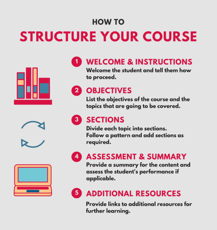
What if your driving instructor told you to take the wheel from the get-go and that he’ll tell you about the traffic rules and gears later? Or what if you enrolled in a robotics class and the teacher asked you to build a robot on the very first day without telling you about the basics? It doesn’t work that way. You’ll get frustrated and leave; or if you’re feeling a little adventurous, you’ll try your hand at it, fail, get frustrated, and leave. My point? You need to structure your content well if you want the student to understand everything and stay engaged. You can change little things in it, but the basic structure of your e-Learning course more or less remains the same.

Here’s a standard layout for an e-Learning course.
4. Chunk it down.
If you are a Subject Matter Expert, you really want to transfer all your knowledge, so it’s easy to go overboard with information when designing an e-learning course. You will be tempted to add facts, figures, graphs, and everything. But don’t go for it unless completely necessary. You may think that you’re helping the students, but really, you’ll just be overwhelming them. Take your content and divide it into small chunks of data that you’ll give to the student at every step. Think of creative and powerful ways to deliver those chunks, so the student can digest them well. This will make your e-Learning course so much better.
5. Mix and match different media.
Adding graphics and other media is a great way to keep the student engaged. Try to incorporate useful and clever images in your text every now and then. You can also add infographics, videos, audio, and other media. Our brains are designed to remember these things much more vividly than plain text, so it’s always a breath of fresh air when you see the text accompanied by relevant media — stress on “relevant”. Unnecessary media is a waste of both the student’s and your time. That cat photo may be funny, but without a clear purpose for it, you’re not doing anyone a favor by adding it to your e-Learning course.
6. Evaluate, evaluate, evaluate!
I can’t stress this one enough. Evaluation of your e-Learning courses is so tremendously important because, without that, your whole development process is flawed and incomplete. Without evaluation, you can’t find out what works and what doesn’t. You can’t gain insights into what the students like and what they don’t. You can’t analyze which elements and ways of presentation work best for different demographics. All of this information allows you to grow fast and develop better e-Learning courses each time. So take time to frame questions that you want users to answer and politely ask them after the end of every e-Learning course.
So go ahead and follow these simple ways to make your e-Learning course stand out from the crowd.
Originally published at elearningindustry.com on November 8, 2015.
Request Demo
Request a personalized demo to upload your SCORM file and get started. Add team members as collaborators, share feedback, iterate over multiple versions and much more
Get DemoRelated Post
Recent Posts
- How Construction Teams Manage Drawing Reviews (Without the Chaos) March 24, 2026
- Technical Writers Best Toolkit: Review & Documentation Calculator March 16, 2026
- User-Friendly E-Learning Review Tools: Trends for Teams in 2026 February 20, 2026
- Your Digital Asset Review Workflow Is Broken (And How to Fix It) February 3, 2026
- Best Practices for Efficient Document Reviews and Collaboration December 18, 2025
©️ Copyright 2025 zipBoard Tech. All rights reserved.


