Font Size Guidelines for a Responsive Website
12 Apr

Table of Contents
ToggleDiscover how the right font size can elevate the user experience on your responsive website. Plus, learn how zipBoard can streamline your design and testing processes.
Understanding Font Size in Responsive Design
A responsive website is a dream of every website owner. If your website is not responsive and the website font size isn’t optimized for it then people are not gonna bother about it, which would be a great loss.
One might think here, what makes an unresponsive site, or what should be done to make it noticed among people? We all know that fonts play an essential role in this regard.
If you are aware of how to make a font selection, you will lead in this place without any doubt.
I have seen many questions regarding website font size, so I thought, why not make a complete guide to properly define font size and how the designer should pick it? Because while creating a new website there are many aspects that we should keep in mind. From web design to web development, everything has its importance.
Similarly, choosing the right website font size has its importance. Without wasting further time, Let’s move ahead and discuss the points in detail to avoid spending extra cost to update your website in the future.
Mobile Web Typography
I have divided this guide into 2 basic elements i.e., mobile web typography and desktop web typography.
It’s worth noting that typography is pivotal to web design. We all are familiar that your maximum users visit your site from mobiles so it is more important to make it responsive.
There is no definitive rule applied to it yet, but you have to consider a few notable things to avoid future concerns.
Let’s start with Mobile Typography and see which things to avoid and which things to pick.
Website Font Size for Body
Let’s start with the website’s font size for the body where you have to define the important message for which you have written a particular blog or article. It has a specific meaning so the body should be legible to make people understand what you’re trying to deliver. To have a professional website design, I recommend that you keep the body size at 16px. Here, another confusion arises that you can’t go for 16px for every font type.
There are a few typefaces where 16px would go best but on the other hand, there are some typefaces where 16px will make the text hard to read. Now, what should be done here? Suppose you are using Helvetica font and you start from 16px size, the size will be appropriate and easy to read so you can go for it. However, if you find it a bit hard to read, you can easily adjust its size or consider using another one which suits your body text.
Test Your Website Font Size with Users through zipBoard
Easily gather contextual feedback on body, input, and secondary text readability directly on mobile views without switching devices.
Try zipBoard for FreeInput Text Size
This is another important part where you should be anxious about the size. There is no specified rule, but I would still recommend that you start from 16px. However, there is one thing to consider here. Make sure that your text input size is big enough for the users to understand without having to zoom in. Have you ever experienced a particular site where you had to zoom in just to read the text? Don’t make the same mistake.
E.g., You’ve created a site specifically catering to the needs of a desktop user. The texts on the site aren’t optimized for mobile users. No matter how well you’ve crafted the content of your site, the majority of people won’t bother reading it.
Website Font Size for Secondary Text
Now comes the secondary font that you use on your website and mainly for the captions or labels. Always make sure that your secondary font size is 2 times smaller than your paragraph text size so that people can easily acknowledge the difference.
For instance, if you have set the paragraph text to 16px, go for 14px for the secondary text size. If you choose 15px, it won’t make that much of a difference so better to take 2 steps behind. You don’t want people being unclear about which is the subpoint and which is the main.
Furthermore, sometimes you can highlight or style a particular text for better communication. To attract the user, highlight the text in a light shade color.
[Free Checklist]
Website QA Testing Checklist
Grab your free copy of the Website QA checklist in Excel to aid in testing fonts and more. Save time and leave no website element untested.
Download the ChecklistRead the GuideCheck the website font size from Real Device
The major issue occurs when you are setting your website for mobile users and viewing the site from Laptop. Your laptop and mobile are different in screen sizes so you can’t make this blunder. If you are setting all the specifications for mobile users, view your website from mobile where you will get the real idea of whether it is appropriate or not.
E.g., Your site might have been created on a laptop and optimized accordingly. However, when a user views it from a mobile/tablet, the difference in the screen size is such that your content becomes painful to read. For this, you need an online proofing tool that can help you with testing and creating a responsive website.

Get contextual website feedback from internal and external stakeholders on website font sizes – right in zipBoard
Ensure Responsive Website Font Size with zipBoard
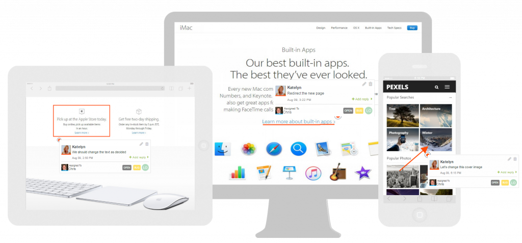
zipBoard allows real-time feedback and annotations on live websites and prototypes (in different viewing modes), making it easier to ensure responsive typography on mobile, desktops, and tablets.
Get Started for FreeDesktop Web Typography
Now comes another essential element, which is Desktop Web Typography. This is equally important to be considered. When we talk about Desktop web typography, we divide the designs into 2 types i.e Text-heavy pages and Interaction-heavy pages. Let’s talk about both in detail.
Text-Heavy Pages
Content or text-heavy pages comprises the most important pages i.e Blogs, Articles, News, etc. These pages are the main reason why the user is on your website, and they usually benefit from larger font sizes. Think 18px to 20px.
Even though these pages are not very interactive, you still need to set a large font size so that people won’t find it hard to read. Let’s start from 16px that is the ideal font size. However, in this case, 16px won’t be ideal as it will make the text hard to read.
If we consider 18px, it would be better than 16 but if we move a little further and go for 20px, you might consider it extra-large yet it is the best font size for Text-heavy pages.
Not sure about the font size that works best for your text-heavy pages?
Sign up for a free zipBoard trial and invite your team to collaborate on font consistency and readability.
Get Started for FreeInteraction Heavy Pages
Interactive pages require a balance of font size and functionality. These pages involve all the clicking and searching. Hence, for Interaction heavy pages, a small size would be appropriate but it also depends on the amount of data you are showing to the user.
Sometimes 18px size would be extremely large and awkward and 13px would be the best choice to make.
💡 Pro-Tip: Choose a small size for less important things and go for a bit large size for more important things.
The simplest way is to experiment with your chosen website font size from different devices and make sure it is readable and understandable everywhere. This is how you can get a better idea of whether to go for a particular text size or not.
Test Your Website's Font Size Across Devices with zipBoard
Sign up for a free zipBoard trial and invite your team to collaborate on font consistency and readability.
Get Started for FreeThe gist: Allocate the website font size based on the importance of particular content.
If you want the text to be highlighted, then it’s best to make it stand out. Either by increasing the font size to a considerable amount or by literally highlighting the color of the text.
On the other hand, if the content is less important, allocate a font size that is distinguishably smaller than the highlighted (more important) text.
Click to watch video👆
Final Words
A responsive website is a goal and dream of everyone. And it is relatively simple if we have a review tool that can easily switch our live website between different screen sizes and review it as per need.
So are you taking all the steps to make it worth using?
Fonts are the main elements of every website so taking them for granted can cost you. Apart from suitable font selection, you should also be concerned about the font size that will make your website or content legible.
I have enlisted those important points regarding website font size that will make your website responsive. I hope this guide will be informative for you in the future and will help you to set the appropriate font size for your texts.
Now that you’ve created a pixel-perfect website, the only thing missing is usability testing, then your website is ready to face the world!
Recommended Reading:
https://zipboard.co/blog/ui-ux/usability-testing/
Streamline Your Website Design Reviews with zipBoard
Start your free trial today, or book a demo to see how we can help improve your design review processes.
Book DemoStart Free TrialFAQs
The ideal font size for body text on websites is typically 16px for readability, but it can range from 16px to 18px depending on the typeface and target audience.
For print, standard font sizes are often 11pt or 12pt. However, for web content, 16px is considered the standard for body text to ensure readability on screens.
Common standard web fonts include Arial, Helvetica, and Verdana due to their clarity and legibility. Google Fonts like Roboto and Open Sans are also popular for modern web design.
To ensure responsive font sizing, use relative units like em or rem instead of fixed pixel sizes, implement media queries for different screen sizes, and test typography across devices. Prioritize readability and adjust line height and spacing for various viewports.
zipBoard allows teams to review fonts across devices with real-time feedback and annotations, ensuring consistent typography.
Words from the Author

Hi, I’m Sofia Kenin, a typography designer and professional article writer. I have written a number of guides on font and typography and have already helped thousands of people choose the right fonts for their businesses and websites to make them more user-friendly and easy to understand. I love to play tennis and boating is my favorite hobby.
Related Post
Recent Posts
- How Construction Teams Manage Drawing Reviews (Without the Chaos) March 24, 2026
- Technical Writers Best Toolkit: Review & Documentation Calculator March 16, 2026
- User-Friendly E-Learning Review Tools: Trends for Teams in 2026 February 20, 2026
- Your Digital Asset Review Workflow Is Broken (And How to Fix It) February 3, 2026
- Best Practices for Efficient Document Reviews and Collaboration December 18, 2025
©️ Copyright 2025 zipBoard Tech. All rights reserved.


