13 Sep
Understanding typography can help create an appealing website
Every day you are perceiving a huge amount of different information. Moreover, the are so many ways, through which you are getting your ‘brain meal’. Among them are tabloids, social media networks, personal or corporate blogs, online magazines, films. There is something that almost all of the visual information flows have in common. The text. As a result, it is a great tool of influence. So, in this article we look at how typography matters and how you can use it better when designing your websites.
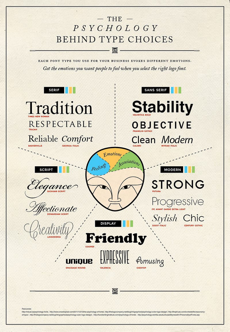
There are plenty of studies on font psychology available on the web. Every day, more and more people are launching their personal blogs, corporate websites, online stores, etc. And obviously, each website will want to stand out. Typography is one of the ways to create that distinct look.
The combination of fonts you choose can have a marked impact on your visitors. Typography greatly influences how visitors perceive your website. It can help build a visual hierarchy on the web page that will draw the user’s focus to the points of importance, in the order you’d like them to look. Whether you run an informative blog or an eCommerce site, it would be difficult to guide the users’ attention to the most valuable pieces of content unless you make the right choice of fonts.
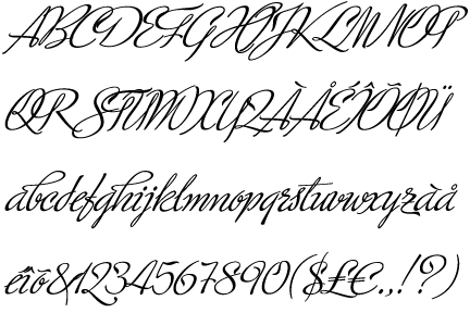
Each niche has a certain visual identity associated with it. That visual identity is built on the colors and the text that are chosen. Although, choosing a font for your website may seem as an extremely easy task, it is one of the most crucial decisions. Choosing the right combination and size of fonts is one important part of it. There are a number of resources that can also help in this such as TypeTester, WhatTheFont, Typophile, FontShop, and myFontBook.
There are plenty of possibilities to build an appealing online presence, coupled with using certain techniques, you can boost up your business to the next level. In fact, as the strategic design and consulting studio, iA aptly put it:
Web design is 95% typography.
Optimizing typography is optimizing readability, accessibility, usability(!), overall graphic balance.
This article discusses some tips that will help you understand typography better for your projects. Using these suggestions, you can provide your website visitors with a better user experience, improve the readability of your content and even increase the conversion rate.
Size matters
One of the main focuses of typography is to encourage the readability of text. In order to effectively communicate the messages on the site, set the size of the elements as per their importance.
Greater the importance of the text, larger should be the font size. This helps create the visual hierarchy mentioned above. The mind scans through web pages and instantly gravitates towards elements that stand out. This is why most web pages today feature landing pages with large text and hero images.
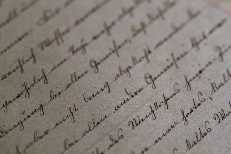
How wide is the text block
In order to improve the readability of your website, try to limit your line length. Line length is how wide the block of text is on your web page.
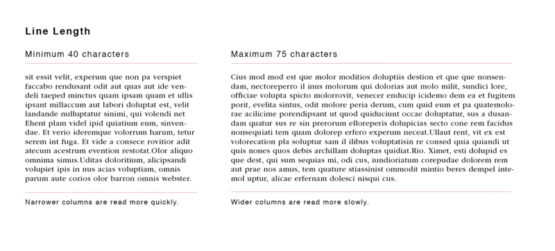
Line length influences how quickly users can read through the text and the level of comprehension. Very long lines distract from the actual function of the text and also place a greater demand on the attention of the user. This can decrease the legibility of the text. A very common example of optimum line length can be seen in newspapers. Since they have long vertical columns, the width, a.k.a line length is kept shorter to make it easy to track text.
Optimum length is somewhere between 45–80 characters per line. But since so many users now access content via mobile devices, their perspective has to be taken into account as well. On smartphones and tablets, viewing area is lesser and consequently, the line length should also be reduced to maintain design consistency and clarity of the text. In case of mobiles, it easier to read text that is 30–40 characters per line. On tablets, about 60 characters per line is a good thumb rule to abide by. To learn more about line length, read this article by UX research group, Baynard Institute: Read here
Or this more in-depth article about reading patterns and line length by Smashing Magazine: Read here
Ensure readability with well-spaced fonts
Clearly, legibility is one of the main concerns in choosing typography. If you don’t want to confuse your potential customers, a font with distinguishable letters is a great choice. If the content is easy to read then users can focus on the function of the text, which draw focus on your product or service. Obviously, this can be a major factor in how your web design influences conversions.
Choosing typefaces where letters are placed at a decent distance across different sizes helps maintain readability on different devices. A font that is more commonly used, like Arial or Open Sans, makes it easier for users to read through quicker and comprehend the text better.
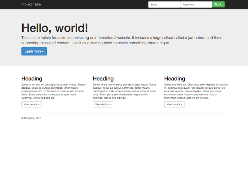
Don’t play around with too many fonts
The first piece of advice on choosing typography for your website: try to minimize the distinct number of typefaces in your website’s content.
By keeping the number of fonts on the lower side, you prevent overwhelming readers of the web page. The optimum number of typefaces to use is between 2–4, depending on the function of the page. Limiting the number of typefaces to around this number helps maintain balance and it leads to consistency in design. Readers can associate each typeface with a particular function on the page and thus convey the significance of each piece of text appropriately. Using more than 3 or 4 fonts leads to confusion in how a user perceives information and the importance they associate with it.
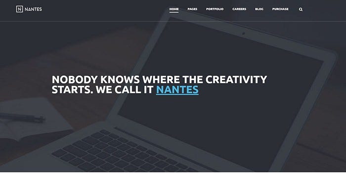
An example of managing a different number of fonts is this theme from TemplateMonster.
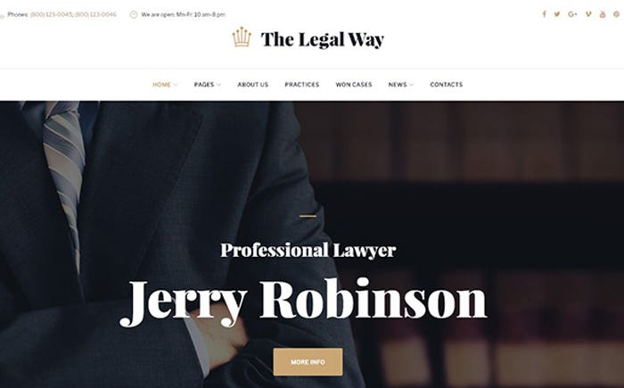
There are distinct fonts for the header section and navigation sections. Attention is immediately drawn to the header section featuring a serif font and the navigation section uses a sans-serif font both to illustrate the difference in significance and because readability is better in sans-serif fonts at a smaller size.
Pay attention to alignment
Alignment is a major factor in how users perceive the information being displayed. The structure and flow of your web page depending on the text is arranged.
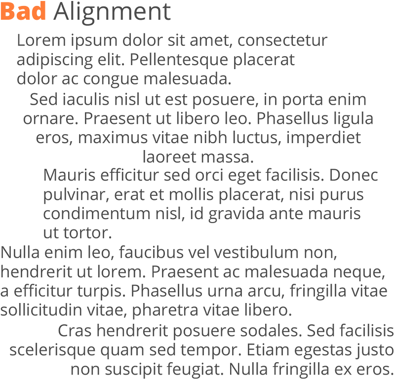
Text that is well indented and follows a margin is more pleasing to the eye of the reader. Otherwise, you get the impression of a scattered flow, like in the image shown above. A lot of web pages will stick to one kind of alignment throughout to develop a consistent flow of information, whether that’s left aligned, justified, or in alternate columns with images.
Since left alignment reflects how traditionally we read text, it is a popular choice for many web pages. You will often see right alignment being used to convey special information which needs to specifically draw the attention of the user. Justified alignment is commonly found in newspapers or magazines, but used carelessly it can result in awkward-looking spaces and seemingly broken text.
Final thoughts
Typography is a major factor in how readable and legible the content on web pages is, which is why paying attention to it during the web design process should be a priority. Understanding its effect and applying the practices suggested is one of the simplest ways to stand out in your niche and create an identity for your brand or product.
A tool that can help in judging how well your web page does in terms of readability is this one: Read here
What are some of the best practices you have seen when it comes to typography? Share them with us in the comments.
With inputs from TemplateMonster.