10 Principles For An Effective Web Design
14 Mar
Today, owning a brilliant website seems to be a must-have for a successful business! In light of that, here are some insights that will certainly help create an ideal online platform. Are you interested? Let’s go!
Remember about the Proportions!
You may be familiar with the concepts of the Fibonacci sequence and Golden ratio found in mathematics, but let’s recap some general but useful information about these old rules in order to make your future online project absolutely marvelous! The golden ratio (numerically, 1.618) is a rule of proportion such that the ratio of two quantities is the same as the ratio of their sum to the larger of the two quantities. Many architects, sculptors, and artists used the rule to make their works look aesthetically pleasing. If you look at the Parthenon in Ancient Greece, you will notice that this famous building was also made to approximately replicate the rule. This is how the Golden ratio looks:

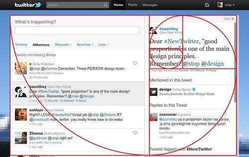
Don’t you think that building a successful website is a real art of the 21st Century? All in all, you may be surprised by the fact that there are a plethora of popular websites that use the Golden ratio rule for their design. Still, have some doubts? Just take a closer look at Twitter’s appearance!
Here is another awesome example of the excellent proportions! Look at the logo.

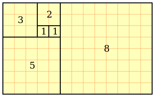
Coming back to the Fibonacci sequence; it shows us that every term is defined as the sum of 2 previous terms. For example: 0, 1, 1, 2, 3, 5, 8, 13, 21, 34, 55, 89 and so on and so forth. Thus here is another fascinating fact: with this rule, we have two seemingly unrelated topics that produce the same exact number! Now take a look at the picture below and at the Golden ratio again. As you can see, all the most important and useful principles of the effective building were already found and tested many years ago, so today all you need to do is to remember about them!
‘F’ Pattern Design
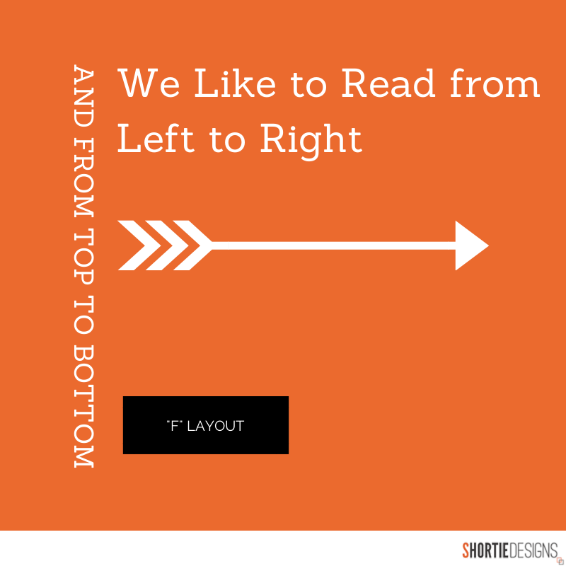
Although the next principle is quite simple, it is also a vital thing for the creation of a successful web design. Have you ever heard about the ‘F’ pattern? To make a long story short, it has been discovered that people usually scan the information from the screens in an ‘F’ pattern! According to research, web audiences mostly see the top and the left part of the screen while the right one is rarely viewed. Learn to anticipate your visitors’ behavior and display the content left to right and top to bottom in order of its importance. Needless to say, such a simple trick will help easily introduce the most important information to the guests of your online project as well as make it more convenient and readable to them!
Don’t Forget about Fonts!
Generally speaking, today people are estimated to use more than 55,000 different fonts, and so everyone is able to find something unique for the appearance of their websites. Still, keep in mind that ‘unusual and rare’ does not always mean comfortable or readable when we are talking about fonts! Besides, it is not a secret that Sans Serif fonts (contemporary looking fonts without some decorative finishes, e.g. Arial, Circular, Gotham, Futura, Avenir, Verdana, Franklin Gothic, etc.) are easier to read online. Another useful fact is that the perfect font size for comfortable online reading is 16px. Stick to a maximum of 3 typefaces and a maximum of 3 font sizes to have the design of your pages look well-organized. All in all, you should prefer readable fonts to impressive ones, if you would like your website to be popular. Still, prefer the intricate fonts? Well, you can always use them for a stunning tattoo!
The Colors
Unquestionably, a well-chosen palette of colors for any site quickly evokes pleasant emotions among its guests, and gets them engaged effortlessly! Here is the next useful fact: nearly 85 % of all the online users said that the color scheme of a website is the first thing that makes them take a look at the items or services offered, and even buy them! In the end, you get both a gorgeous appearance for your online project and a greater possibility to prompt the visitors to buy the products they are interested in! The colors always create balance in your website, so think twice about them to achieve a harmonious look.
Choose the Right Images
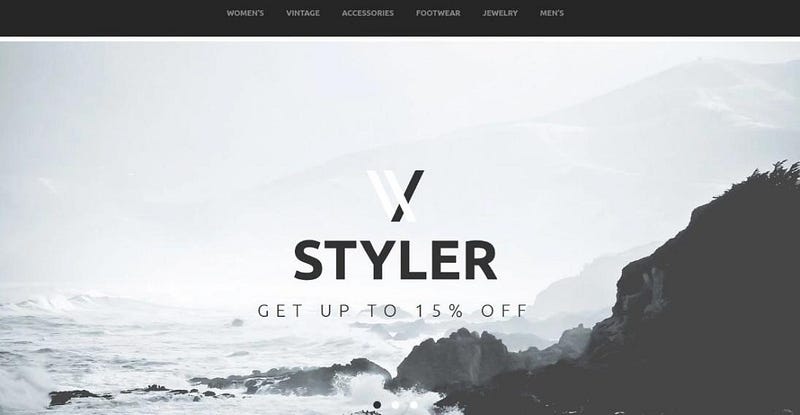
What is another aspect that has always been in trend? Quality, of course! Thus, remember that the quality of images and pictures used for your future website must add to its functionality! Moreover, inimitable pictures are a real eye-catcher in today’s notable websites. That is why you need to think more carefully about the images that you use for your website. Naturally, a lot of admired companies and popular web designers even use the services of professional photographers to have some unique pictures for their online projects. All in all, you do not need to spend a lot of money, as the expensive things are not always the good ones! Just do your best to get authentic images for the site you would like to set up because it will certainly help you stand out from the crowd.
In case you are looking for stock images to use in your website, here is a list of resources where you can find those.
Finer Touches
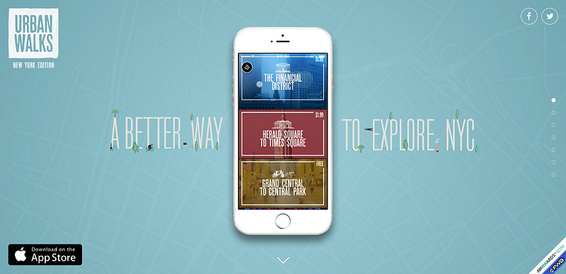
In addition, don’t forget to use infographics, images, videos, SVGs, and other visual aids that add to the creative and pleasant online project. For example, let’s take a closer look at the Parallax effect. To catch you up, parallax scrolling is a recent and popular web design trend, which involves the background moving at a slower rate to the foreground and makes a wonderful 3D effect when a person is scrolling the page. In short, such an effect brings you a sense of delightful depth and motion. At first, this technique was made to be used in video games but today it is one of the most featured and indispensable options for any modern site. Sounds cool, doesn’t it?
Navigation
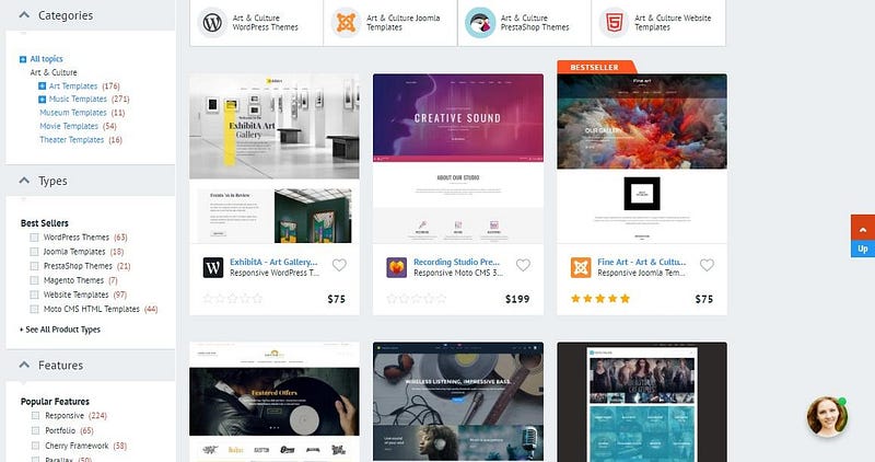
Hick’s law says that every additional choice means increasing the time one needs to make a decision. I’m sure that you’ve felt it a lot of times sitting in the restaurants that have their menus with a number of options or surfing through the webspace with websites full of additional information. Here is the Paradox of Choice — when more choice is given to you, lesser are your chances of choosing anything at all. Hence, if a person encounters more options while browsing through your site, it will be more difficult for him/her to choose something! Naturally, your online business may be huge, so you can’t just delete a lot of options to eliminate choice… So there is a decision to be made! Categorize your items carefully and use simple filters for easier decision-making. A good example is TemplateMonster’s website. The company itself designs website templates and navigation through their samples is also swift and simple!
Think about Grid-Based Layouts
Keep in mind that placing the content randomly on your website will end giving it a chaotic appearance that certainly looks messy! That is why I suggest you think about grid-based layouts, as this feature allows you to arrange your content into boxes, columns, and sections that are quite balanced. As a result, you will definitely improve the look of your site.
Improve the Load Time
It’s a fact that people hate waiting, so no one likes a website that takes ages to load. Thus, you need to be sure that the brilliant functionality of your site is also quick to render! Believe me, people will not enjoy the site (even if it is the most modern, beautiful, and stylish one) when it works slowly. Here are some features that will help you resolve this issue: optimizing image sizes (size and scale), combining code into a central CSS or JavaScript file (this reduces HTTP requests), and minify HTML, CSS, JavaScript.
Clarify the Purpose of Your Pages
To finish with, you have to make sure that the message on your page is clear and concise. Keep in mind that ‘one page equals one message’. That is why, be sure that whatever it is that you want your visitors to find, that is the central theme of your page Remember that clients may navigate to the website from search engines, so anticipate what people want to see when they click the link to your site in search results. Make it relevant to what people expect when they actually get to your website.
So, now you know 10 principles for an effective web design. What are the principles you follow when creating a website? Tell us about them in the comments below.
This is a guest post by TemplateMonster for zipBoard.
Request Demo
Request a personalized demo of zipBoard to communicate effectively between all stakeholders — designers, web developers, clients, etc.
Get DemoRelated Post
Recent Posts
- The 5 Best SCORM Review Tools for 2026: Why Friction-Free is Winning April 14, 2026
- The Project Manager’s Guide to Drawing Approvals and Submittal Tracking April 10, 2026
- How Construction Teams Manage Drawing Reviews (Without the Chaos) March 24, 2026
- Technical Writers Best Toolkit: Review & Documentation Calculator March 16, 2026
- User-Friendly E-Learning Review Tools: Trends for Teams in 2026 February 20, 2026
©️ Copyright 2025 zipBoard Tech. All rights reserved.


