21 Jun

Alternatives to the hamburger menu icon
Written by Shubham Gupta for the zipBoard blog.
The 3 stacked line icon that you normally see on the top left or right corner of your website or app is known as the hamburger menu (often referred to as a hamburger option or sandwich).
Before getting into why it was used prominently, why its use has been reduced now, and what are the alternatives for the Hamburger menu, let’s take a look at when it came into existence.
The history behind the Hamburger menu
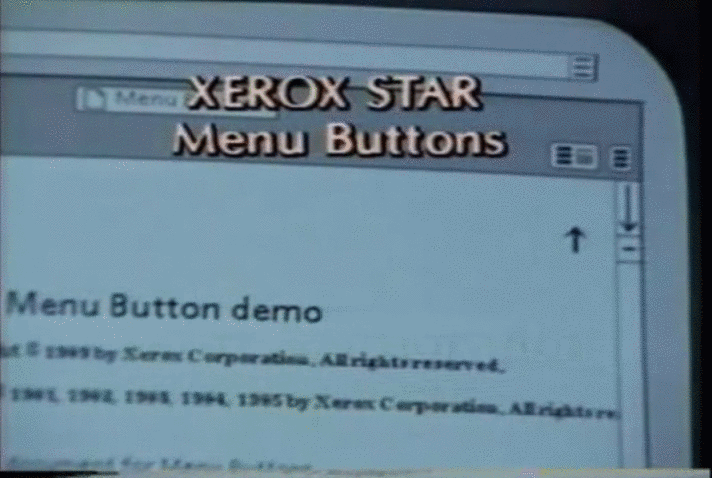
Developed in 1990, by Norm Cox for the Xerox Star, featuring the world’s first graphical user interface. The icon was designed to meet a specific need within the interface of the Xerox Star; constrained by the display limit at that time, the hamburger icon worked well at the time to link to other information and enhance navigation. In this interview, Norm Cox talks about why he thought it would work and what was his idea behind the icon design.
From there on, many websites and apps started deploying the hamburger icon in their UI design.
Why it came into the picture?
The hamburger menu came into existence in the mid-90s, from then it served the purpose of UX designers and web designers in many ways which include:
- It saves screen space. The hamburger icon allows all your features other than the primary ones to be tucked away nicely. It helps the user to concentrate on the core functions that he wants to see.
- It makes your headers and menus of the design uncluttered and clean which helps the user get rid of overloaded choices.
- The Hamburger icon allows direct navigational access where the user can directly select the preferred item without going through the content serially.
Let me demonstrate this with some examples:
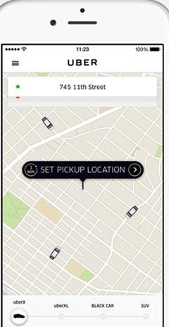
Take a glance at the UI of Uber cabs. The main aim of the app is to provide the user information about the status of nearby cabs and transporting from point A to B. Rest of the things like user profile and the status of rides are secondary features. Here hamburger menu hides the secondary features to have a clear display and to allow the user to focus on the primary feature i.e. to book a cab.
Now take a look at the UI of the Amazon app. Now, Amazon literally sells everything. You can see it uses the hamburger icons as well. It is basically making a trade-off because it cannot practically list every possible type of product. Amazon makes up for it by providing a long search bar, which is omnipresent throughout the UI and can be used to search for the item you are looking for.

How it created ambiguity?
But, all is not well when using the hamburger menu. There are disadvantages to using the hamburger icon in websites and apps. These problems include:-
- Content discoverability becomes low because users have no idea where to look for some information as the content is hidden under the hamburger icon.
- Navigation time becomes high since users have to click on more things to access the information and change more screens.
- Task difficulty increases since the user had to do multiple clicks and navigate through many pages.
All the problems mentioned above led to controversial opinions among UX designers when it came to hamburger menus.
Evidence to show
Research shows that using the hamburger menu in your websites and apps actually costs you user engagement and leads to other problems on your websites and apps. This research by Nielsen Norman Group, a leader in UX research, and A/B Testing by Zeebox(now Beamly) support this case.
UX research by Nielsen Norman Group
The following graph depicts navigation usage as a function of device type (desktop, mobile) and navigation type (visible, hidden, combo). Let’s take a look at each of the navigation.
Hidden navigation– All the major links and content are placed under the hamburger icon and hence require explicit user action to be displayed.
Visible navigation– All the main navigation links are placed on the screen and hence can be easily visualized.
Combo navigation– Some of the navigation links are visible on the screen whereas others are hidden under the hamburger icon.
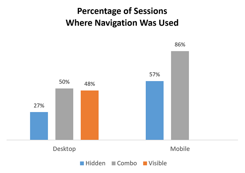
The graph clearly indicates that hidden navigation was preferred least. On the desktop, people used a hidden menu in only 27% of the cases, while for visible and combo navigation this was almost double and users had more ease in usage. On mobile platforms, hidden navigation was used by 57% of the users whereas the percentage significantly increases to 86% for combo navigation.
To get complete information about the UX research conducted by Nielsen Norman Group clicks here.
A/B Testing
Case study on A/B testing of the hamburger menu
Zeebox(now relaunched as Beamly), a social network for TV conducted A/B testing on their UI designs one having side navigation and the other with the top navigation. The results were shocking to the company.
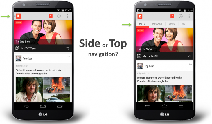
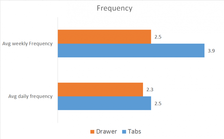
The company’s analysis showed that when they shifted their UI to sidebar navigation featuring a hamburger menu, the user engagement became half of what it was, as evidenced by the fact that the weekly and the average frequency decreased. The average weekly engagement was significantly greater for tabbed navigation.
For more evidence related to the effects of the hamburger menu on websites and apps click here.
What are the alternatives?
There are other options to use instead of hamburger menus. Some of these are:
Scrolling menu navigation
Sometimes the situation arises when prioritizing the contents or menu options become difficult. In that case, you have to include all the sections and provide a UI toggle to scroll between them.
Pros:
- This navigation is used for numerous categories which have no priorities.
- It requires less screen space.
Cons:
- Since we have to scroll to access the categories, it could be a problem for people with poor visualization skills.
Medium is an example of this.
Medium, in its UI for iOS users, has scrollbar navigation which allows you to switch to any option by using a single swipe. A great navigation pattern implemented have got them rid of the Hamburger menu
Google App is another example.
Google App uses scrollable navigation in its app where you can scroll to look for the multiple categories mentioned.
Tabbed navigation
Tabs provide a great aspect of vision and clarity to the users interacting with the website or app. They organize the content in categories and are very much understandable to the users.
Pros:
- It requires less screen space.
- As the categories are arranged priority-wise, they give a user a better idea of the workflow of the design.
Cons:
- Its use is limited to only 5 or 6 categories. However, you can expand your categories by including a ‘More’ option.
Twitter follows tabbed navigation
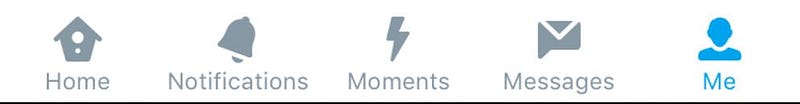
Above is the navigation pattern used in the Twitter app. Here the tabbed navigation is used in which the Me tab is currently highlighted.
YouTube is an example of this.
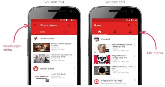
YouTube launched its new UI in 2015, which proved to be an excellent example of getting the hamburger menu removed by using a top navigation pattern in its UI design. It helped the users to view the features of the app immediately.
Tabs with ‘more’ option
It is simply an enhancement of tabbed navigation. It is useful when you have more than 5 categories or sections to be displayed. You can simply add your four tabs based on priority and then the more section will take care of all your secondary features. However, it hides your information under the More tab but still is effective over Hamburger Menu.
Again, take a look at how Google implements this.
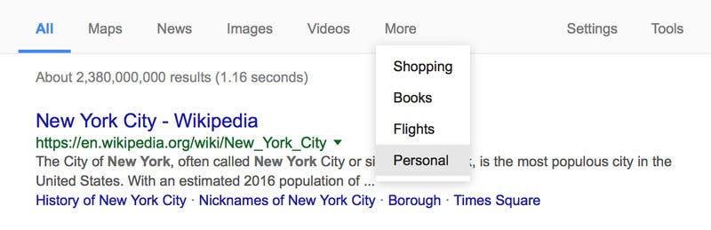
Google uses the More option along with other tabs that represent other categories.
Navigation with vertical lettering
It is a brand new navigation pattern that is increasingly becoming popular on websites. Here the contents are vertically oriented.
Pros:
- It uses less space like that of a narrow line.
- Since it stretches almost to the height of the screen the content present becomes compact and informative.
Cons:
- It is not suitable for mobile interfaces.
Check out VR Session’s website for an example of vertical lettering.
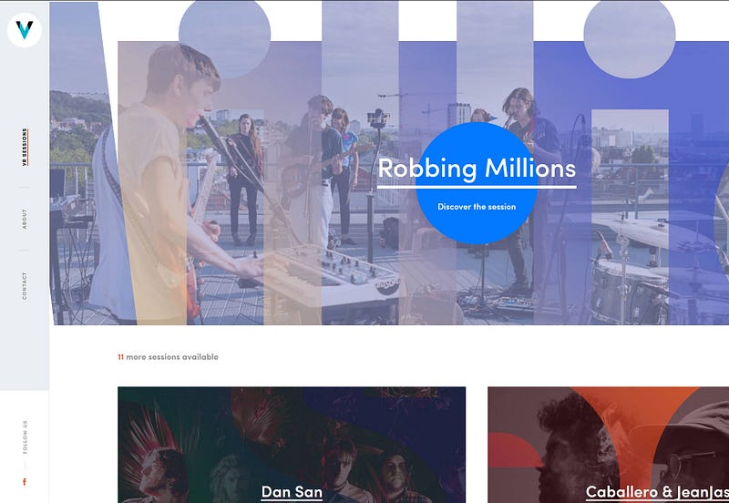
The contents are vertically oriented on the website and use minimum space, while efficiently engaging with the user.
Priority+ navigation
The idea of priority+ navigation is new and it supports the navigation among items based on their importance to the user. It utilizes the display efficiently and hides the items depending on the screen size of the browser window or device.
Pros:
- This navigation is used for handling categories based on priority.
- It is responsive in nature.
Cons:
- It is not suitable for mobile interfaces and finally has to include ‘more’ options for accessibility of all options.
Amazon Web Services is an example of this.
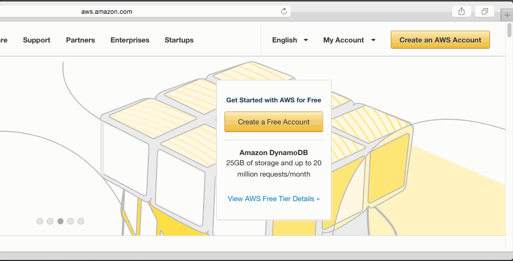
AWS has a priority+ navigation pattern on its website where the menus gradually disappear based on priority according to display size. This makes the site to be responsive and adaptable to any resolution.
Have a look at BBC’s site. The menu shrinks and expands based on the space available on the screen.
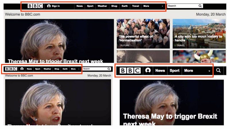
The UI of BBC adjusts according to the screen width and the menus progressively collapse by the priority.
3D Touch
This technology was introduced by Apple when they launched the iPhone 6s and 6s Plus. It works for mobile interfaces very well. This technology has a great future ahead and can be implemented in websites and apps. Check out Pressure.js, which is a JavaScript library for implementing 3D Touch, force touch, and pointer pressure on the web.
Pros:
- It allows the user to perform certain tasks based on the pressure applied to the menu when clicking on the icon.
- It requires the minimum space for its operation.
Cons:
- It is still in its nascent stage and lacks ubiquity.
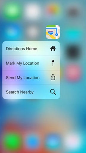
By just measuring the amount of pressure on the icon, the system generates a custom menu with varying options, depending on the app in context, suggesting alternate actions without actually opening the app.
Dropdown menus
Drop-down menus are used when the accessibility and visibility of other sections are not essential. It is simply a better way to abstract the information rather than using the hamburger icon.
Pros:
- It is simple and a common navigation method among users.
- It organizes all of your content into smaller sub-categories that are easy to navigate.
Cons:
- It requires much screen space for its operation and hence not suitable for mobile interfaces.
Samsung is a good example of this.
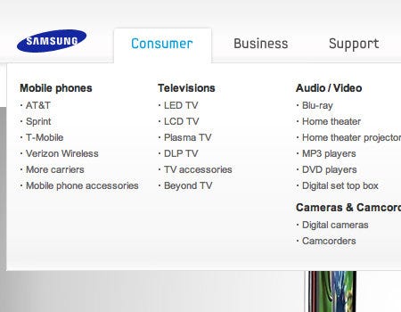
When clicking on the Consumer menu, it displays a drop-down menu that displays all types of customer categories based on products they have. It helps clean up a busy layout and makes it more user-friendly.
Here is another example from Logitech’s site.
Logitech’s website uses different categories under which sub-categories can be accessed via drop-down menus. In this case, it’s more efficient than a hamburger icon.
Segmented Control
Segmented controls are commonly seen in iOS applications. It is a linear set of 2 or more segments that work as mutually exclusive sections and are a great replacement for the hamburger menu.
Pros:
- It provides a single view with all options accessed by a single click.
- It requires less screen space for its operation.
Cons:
- It is preferred for only a limited number of segments.
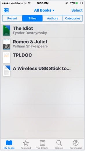
The segmented control feature in iBooks allows the user to select titles, authors, and categories. It is preferable if you have a limited number of sections to be displayed.
Conclusion
Good UI is a lot about habits, as much it is about logic. Over time, users have taken to the hamburger menu and indeed, as Norm Cox has said, it worked for the Xerox Star UI then which is why it was used.
So what it comes down to are context and suitability. If a hamburger menu suits the interface’s context, as it does in Amazon’s app, then it’s a good option to use. But the hamburger menu cannot be an excuse for a lazy information architecture or navigation. If there’s a better alternative that simplifies workflow for the user, then that certainly calls for ditching the hamburger menu.
Even out of the alternatives given here, there isn’t a solution that fits in all instances.
Other great navigation patterns solve the problem of the hamburger menu. Which one should be added to the list? Let us know in the comments section.
Liked this post? Explore alternatives to static progress indicators for enhancing your UI here and follow the zipBoard publication for more great posts on design and UX.