Types of Client Feedback You Need To Build Better Website Prototypes
03 Apr

Table of Contents
ToggleIf a picture is worth a thousand words then a prototype is worth a thousand pictures. Prototyping is not an easy art to practice. But timely feedback from clients can make your prototyping journey quick and rewarding. It could help you build better website prototypes.
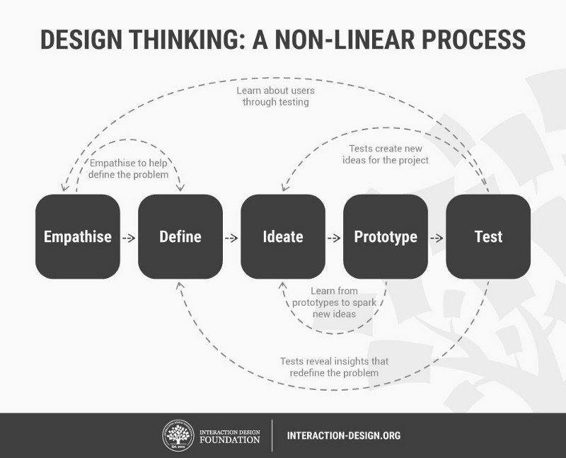
Before we step ahead towards types of client feedback, lets first have a look at how the design cycle progresses.

The workflow clearly indicates the importance of testing the prototype. It is the testing phase when you understand the problem better and get new ideas to build better website prototypes. When you are in the initial phase of designing, prototyping and testing iterations become all the more important
Initial Prototypes are quick visualizations of your solutions to the problems that your clients have put on the table. These quick references need to be polished and refined to a great extent before you reach the state to call it a reflection of the final product. The stage and intent of the prototype greatly define the course of testing iterations and the testing audience as well.
When the client initially coins the problem statement, you try to empathize and ideate possible solutions. You might come up with multiple thoughts. You cannot present them all to your client. They are preoccupied. At this stage, your teammates and other colleagues serve as your testing audience. When you have a consolidated idea on which you and the team agree, that is when your client comes into the picture. You present your idea and try to explain how this is going to serve your client’s purpose. Then you expect feedback from your client that can help you reach closer to what your client expects from you.
As a process to align better with your client requirements there are certain types of website feedback that you need from your clients. The website is the first face of the product/service your client is offering. Your clients are the best source of feedback to estimate end-user response before you can actually carry out any user testing.
Emotional Feedback
How well are your concerns understood?
The first thing that you need to know is, have you understood the concerns that the client came up with. Next, you need to know the level of understanding you have achieved in the current prototype stage. This gives you insight on — are you and your client on the same page.
How well is the problem addressed?
Understanding the concerns of your client is one aspect. Next, you need to get feedback on the ideation of the problem solution you projected to your client. The client might have some better ideas for portraying problem solutions. Getting feedback on this sets you in the right shoes.
How well can we communicate?
The basic idea of building websites is to communicate to end-users what you have for them and can you make their life easier. Your client too would wish the same. You need to get feedback on — is the prototype able to convey the right message. Does the website require live chat options and how the information transfer can be made two-way?
Design Feedback
Any unnecessary information/elements.
You need to check with your client if they feel any information that you have incorporated is redundant. The design is about keeping things simple and clear. If you can further optimize info and elements added that’s better. If you do it in the early prototyping stages then the design gets sorted.
Color scheme, fonts, etc.
Although colors and fonts are a never-ending zone of discussion. But when it comes to client feedback it becomes an important aspect to get feedback on. These pitty monsters can trouble you hell in the final design stages. Better deal with them in the initial prototyping phases.
UX feedback
Is the information easy to find?
If the website makes the user think about where to find an option for something, it loses 50% more visitors. Your clients can give you unbiased feedback on — is the CTA prominent enough, is the navigation obvious, and is easy to reach out to you for end-users in case of any queries. When these things are discussed at the beginning itself it makes you come up with clutter-free prototypes.
Are the error messages user-friendly?
Everyone has bad days but if don’t wish your client to stumble in such times, you need to be prepared. Imagine you visit a webpage as a user, that is down for some reason and the webpage just gives you a blank screen or just a loader, would it be a great experience for you? Obviously not. The user always expects the ‘why’ to be answered straightforward. If you do that by default, this might save your customer a hefty deal. So do get your client’s feedback on the error messaging.
Are the hover events, progress bar, and load status indicators serving their respective purpose right?
I know you must be thinking why am I mentioning these elements. These elements are rarely talked about during the initial prototyping phases. But I share a different opinion. These elements should be part of your prototypes(maybe can up in later iterations)and need your clients’ attention as well. These small elements make a huge difference in user experience.
Ease of use
If it’s not easy to use, it’s going to be bashed. No matter how great the design is, if the workflows are messy, it will cost your clients. Better you check with your clients if the website can be used with ease, if the onboarding dealt with right, etc.
Last but not least…
Brand feedback
Consistency with brand image and tone
Another important feedback that you require from your clients is — if the website prototype is consistent with their brand tone and image. Consistency is necessary and clients know their brand and target audience well. Hence can provide you with the best feedback in this respect.
Conclusion
I have tried to jot down the various types of client feedback in order to build better website prototypes. One thing I would like to add is that, do ask for the physical context of the feedback that your client shares and don’t forget to document the feedback well. It always turns out to be a great source to refer back to.
As important as prototyping is, so is collecting feedback from your clients and teammates on the prototype and putting that feedback to use. zipBoard is a tool to help you do just that. Get reviews and feedback from various stakeholders on your prototypes in one place with zipBoard, and track it as actionable tasks.
Recent Posts
- The 5 Best SCORM Review Tools for 2026: Why Friction-Free is Winning April 14, 2026
- The Project Manager’s Guide to Drawing Approvals and Submittal Tracking April 10, 2026
- How Construction Teams Manage Drawing Reviews (Without the Chaos) March 24, 2026
- Technical Writers Best Toolkit: Review & Documentation Calculator March 16, 2026
- User-Friendly E-Learning Review Tools: Trends for Teams in 2026 February 20, 2026
©️ Copyright 2025 zipBoard Tech. All rights reserved.


