Web Design Trends: Predictions From Experts [Updated]
06 Feb

Web design trends change all the time, which is a reaction to cultural changes and technological advancements. If you own a brand, it’s up to you whether or not to follow the latest design trends. Some of them are going to disappear quickly, while others may stay for years to come. The main reason why keeping up with web design trends is a good idea is that they can make your brand look fresh and therefore more attractive for the target audience.
The relevant design offers you a competitive advantage. However, it’s important to understand what trends are worth following them. Quite often, incorporating a new style takes a lot of effort so you should clearly understand what you’re doing and why you’re doing it. Here is a list of powerful design trends that will likely dominate in 2020. We recommend that you check them out and don’t hesitate to refresh your website’s design so that people will want to visit it.
Minimalism
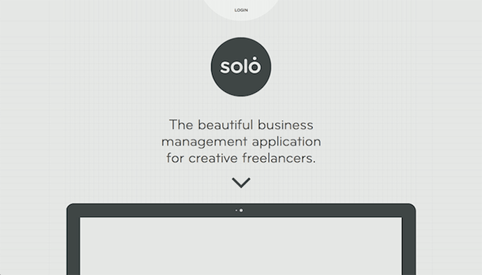
Minimalism isn’t a new trend in web design. It has been around for a while and now it’s easy to see that this trend isn’t going to disappear anytime soon. Also known as flat design, minimalism used to be associated with lots of white space, with Apple being the best example of using such an approach.

However, minimalistic design isn’t necessarily white. In fact, many brands choose colorful minimalism that allows you to both keep things simple and to demonstrate your authenticity. For example, Shopify combines minimalistic elements, clean text, and bold background color, having an eye-catching design that is also calm and simple.
Dark Mode
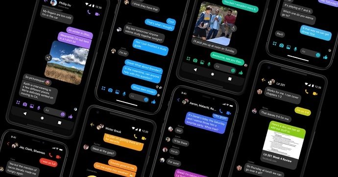
Dark design is another trend that will likely dominate in 2020. Dark design is easy on the eyes, while also increasing contrast and highlighting colors. The dark design also has its practical purpose. Dark solutions are better for smartphone and tablet screens because they save power and also allow screens to live longer.

It makes sense to expect more and more websites and apps to give users an opportunity to switch between light and dark themes. Besides, dark design works well with other hot trends, such as futuristic styles and glowing neon. A dark background will make your accent colors more visible so that the whole design will look more dynamic.
Abstract Illustrations
Using a distinctive illustration style is a great solution if you want to make your brand stand out. The thing is that your competitors can easily copy your colors or fonts, but your illustrations will remain unique. Illustrations were extremely popular in 2019. Brands like Google, MailChimp, Shopify, and many others, often use simple, abstract illustrations that don’t distract visitors from the content while also making the design of a website more memorable and authentic.

Abstract illustrations are easy to match with the necessary brand style. The main thing is to make sure that your visitors can interpret them. If you use too abstract illustrations, they will lose their business value. Make sure that your illustrations serve a specific purpose and act as a functional element.
Collaborative Design
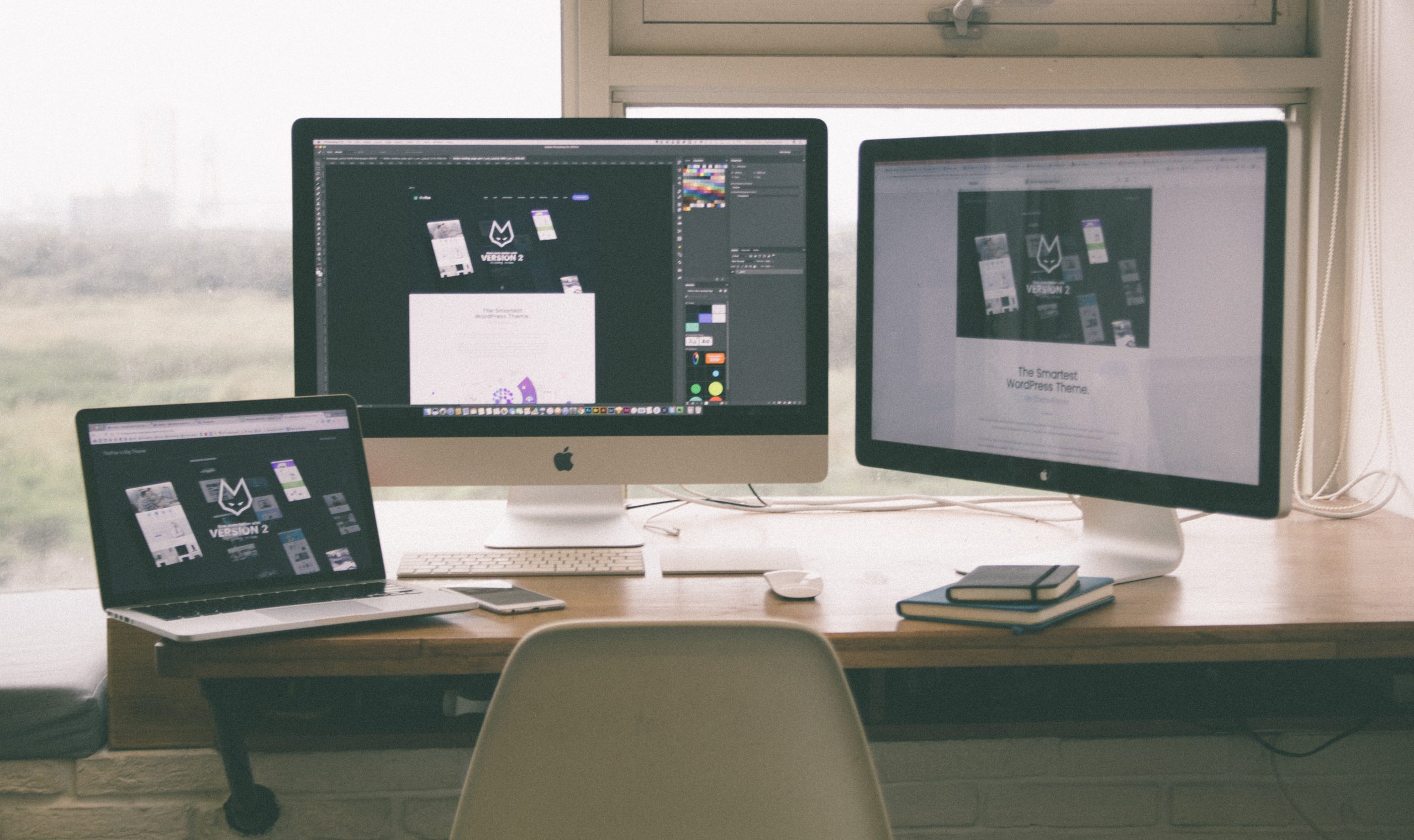
Collaborative web design is a great solution for creative agencies and marketing. It can help you improve the overall efficiency and speed when building websites. The collaborative design makes the feedback process more intuitive and helps eliminate some common slow-downs during different stages of the design process.

Collaboration allows creative agencies to focus on the process instead of particular activities, reducing bottlenecks and repetitive work. ZipBoard is a great example of a tool that will help you manage feedback and bug reports. It will help you streamline the design process, enabling efficient tracking.
Bold Fonts
A headline is the first thing that grabs your visitors’ attention so there’s no surprise that new design trends impact the way brands present their headlines. You may have noticed that many brands choose large bold fonts that help emphasize the main message and lead readers in the right direction. Bold fonts will give your web design a modern look, while also improving readability and content comprehension.
Bold headlines are a distinctive feature of Apple iOS 13, appearing in countless iOS apps. Although bold fonts improve the visual hierarchy of web elements and create contrast, we suggest that you don’t overuse them. Such fonts can be overwhelming when you have a lot of textual content so it’s better to use them only for headers or subheaders.
We also recommend that you make sure that your fonts look well regardless of the chosen language, as different alphabets may work differently in terms of readability. We suggest that you use a reliable localization service, such as The Word Point, to adapt your content to different audiences and then test your fonts to make sure that everything is easy to read.
Micro Animation
Micro animations are a very useful tool that can help you guide your visitors through the website. Besides, they add a playful element to your design, making it more memorable and fun. Micro animation has been around for a few years but it became especially popular in 2019 and it will certainly continue to grow in popularity in 2020.
Ecommerce websites can benefit from micro animations more than others, since they can improve the user experience, enabling potential buyers to see what various products look like in action. For example, clothing stores can use micro animation to demonstrate how different clothes move when real people wear them.
Mixing Graphics and Photography
You can deliver a truly customized message if you mix illustrations or graphics with photos. Such an approach can help you stand out among the competitors, creating memorable visuals that encourage creativity and versatility. This collage-like approach helps communicate abstract or complicated concepts, while also making your design more personal and unique.
We recommend that you make sure to match the style of your illustrations with your brand image. Let your visitors interpret your graphics, creating a more personal experience. Authenticity and personality are very strong upcoming web design trends, by itself.
Thumb-Friendly Navigation
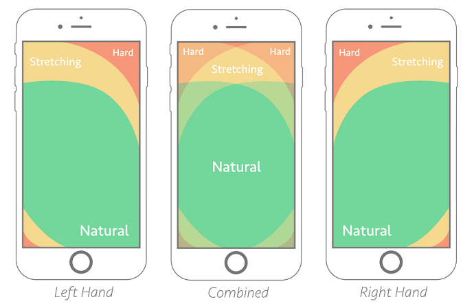
While responsive web design is nothing new, modern brands keep looking for new ways to improve the user experience. When it comes to mobile, it’s especially important to take into account the way mobile users interact with your content, and one of the main features of mobile devices is thumb navigation.

Make sure that the most important elements of your website, such as the menu, navigation bar, and contact buttons are easy to access when using your thumb. The top area of the screen is the hardest to reach so you may want to move important navigation elements a little. If you don’t want them to distract your visitors from the content, you can use animation.
Here are some of the main web design trends of 2020. Some of them may be familiar to you, while others might look completely new. We recommend that you don’t rush to adopt all of these trends at once, considering them in the context of your products and taking into account the purpose of your website. Nevertheless, it’s important to know these trends because they can help you provide your visitors with better user experience, while also enabling you to deliver your message in a more efficient and authentic way.
About The Author
Frank Hamilton is a blogger and translator from Manchester. He is a professional writing expert in such topics as blogging, digital marketing and self-education. He also loves traveling and speaks Spanish, French, German and English.
Related Post
Recent Posts
- How Construction Teams Manage Drawing Reviews (Without the Chaos) March 24, 2026
- Technical Writers Best Toolkit: Review & Documentation Calculator March 16, 2026
- User-Friendly E-Learning Review Tools: Trends for Teams in 2026 February 20, 2026
- Your Digital Asset Review Workflow Is Broken (And How to Fix It) February 3, 2026
- Best Practices for Efficient Document Reviews and Collaboration December 18, 2025
©️ Copyright 2025 zipBoard Tech. All rights reserved.


