Finding Your Inner Marie Kondo: Apply Minimalism in Design
05 Aug

Table of Contents
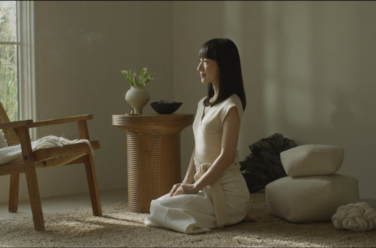
ToggleFind what sparks joy—this is Marie Kondo’s message to the world. She’s something of a household name by now because of her bestselling books and the Netflix series Tidying Up with Marie Kondo, and many people are enthusiastically throwing away years of clutter in pursuit of “joy”.
The KonMari Method
Kondo’s idea of what sparks joy is not simply a suggestion to get rid of junk. On her website, she explains she doesn’t advocate tossing possessions for the sake of it; on the contrary, she focuses on choosing what to keep. A painstaking process, the method suggests that you gather your possessions in separate categories, examine them one by one, and choose what you wish to keep—choose only what you will cherish.
Each item needs its special place; each possession is desired and appreciated. Marie Kondo doesn’t in fact consider her philosophy as minimalist, because the “less is more” ideology might not be something that sparks joy for every individual. Instead, she views it as choosing carefully what belongs and what doesn’t. For some that may be minimalism, but not for all. The emphasis is on cherishing what you decide to keep, whether that’s the bare essentials or items with emotional significance.
Tidying Up
Of course, you can’t choose what to toss and what to keep without some tidying and organizing. Taking stock of everything you have and deciding whether or not you need it (or like it) is a necessary part of life, but if you want something more than tidy surfaces, you need to pay attention to what you want and what you’ll cherish.
This applies to many areas of life—your home, your social media profiles—and for designers, it is a way of curating the features that come together to make a website. Instead of literal bags of old clothes and ornaments, a designer must sift through ideas to find the most effective combination, one that will spark joy for users.
Interior Design vs Web Design
Everyone wants their homes to feel comfortable and aligned with their taste. Imagine suddenly moving into a house decorated by someone whose taste is totally unlike yours—if you had to stay there, you’d probably redecorate!
The same goes for websites. If you’re trying to shop online, you’ll naturally gravitate towards sites you find appealing and accessible. The web designer is the decorator and must choose elements that users will enjoy.
If we look at examples of minimalistic interior design, Scandi style—or Scandinavian style springs to mind. This type of minimalist design focuses on simplicity, purity, and calm. The objects that are chosen for a room or the colors are all about functionality and quality.
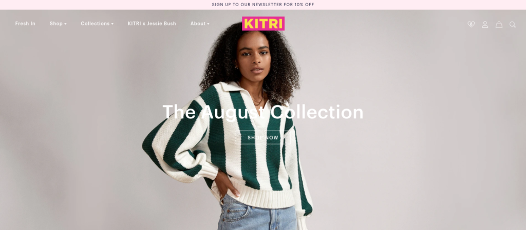
If you compare this to web design, a similar example would be Playa Beauty or clothing brand Kitri. Both brands have stripped away all unnecessary elements and created a crisp, simple design that focuses on quality rather than quantity.

Web Design Meets UX
Website users behave similarly to customers in a physical store: they glance around to appraise their surroundings and choose a path based on first impressions. In a shop they can turn around and walk away—online they have the Back button.
User experience (UX), the concept encapsulating the relationship between a site and its users, must always be a consideration when constructing the perfect website. Websites with clean lines, balance between content and white space, ease of navigation and compelling graphics are the ones that attract users the most.
Uber is perhaps one of the best examples of great UX and minimalism all rolled into one. The site is clean and clear, with a black and white color scheme. Although it’s packed full of information, it’s easy to navigate and the overall experience is seamless. The designers took a concept that could easily become incredibly complicated and worked out how to communicate the point to users in the most minimalistic yet effective way possible.
Using the house metaphor once more, it’s obvious why—who would want to visit a house and have to sift through boxes of random items to find something? UX research will reveal the tastes of a particular target group and designers need to work with this in mind.
What Is Minimalism In Design?
“Minimalism is not the lack of something. It’s simply the perfect amount of something.”—Nicholas Burroughs
Web designers have already learned that users have attention spans that are only getting shorter. There’s also the need for instant gratification. With these principles in mind, they are already using at least some elements of minimalist design to accommodate this. They know people don’t have the time or motivation to read through paragraphs when two words and a graphic will convey the same message.
Various studies reveal that, in general, users want specific things:
- Simplicity
- Ease of use
- Clarity
- Efficacy
- Adequate negative space (room to think, in other words)
- Speed
These are all in line with minimalism, even when users wouldn’t normally consider themselves minimalists.
From KonMari To The Web
Although Marie Kondo doesn’t market her method as strictly minimalist, the basic principles align closely to what users want.
The KonMari Method advocates careful curation: surround yourself with things you cherish and let go of things you don’t. Although a digital designer might not create a website with their own desires in mind, they do work with the knowledge that users have certain likes and dislikes, and users seem to like a dash of minimalism.
Minimalism may mean different things online, but the core principles all focus on creating a site that has:
- A clean layout
- Easy to follow navigation
- Industry-appropriate design
- A clear call to action
- Mobile optimization
Any website that immediately has users feeling overwhelmed or lost misses the mark completely. eCommerce site Arngren is a typical example of why minimalism is important in design. The site is so cluttered and confusing that users battle to know what to look at first, the navigation is unclear, and you’re bombarded with information that’s not categorized in any way.

On a mobile phone, the issues are compound as space is at a minimum. When compared to other ecommerce sites like Amazon and eBay it’s easy to see why they have risen to the top and have an enormous customer base.
What Will You Cherish?
One principle that sets the KonMari Method apart from basic minimalism is the importance of keeping things you love. Rather than getting rid of all superfluous elements based purely on functionality, Kondo’s philosophy suggests that it’s also important to consider the individual’s feelings.
Yes, some users will find a stripped-down site most aesthetically pleasing, but most people prefer something a little less spartan. Of course, it’s difficult to strike the balance between pure functional simplicity and an effective combination of minimalism and visual appeal.
Depending on the type of website, designers might be able to infer what things a user might appreciate. If the user is looking for information on a specific topic, they will likely want large and clear headings that summarize content. The theme of that information will determine to some extent the graphics, level of detail, decoration, and color palette.
Here’s how a graphic designer can get pinpoint contextual feedback and collaborate with stakeholders:
Just as some people will fill their homes with abstract art, some website users will gravitate towards abstract graphics. While some enjoy pastel hues, others will want bold colors and contrasts that look great on screen, and when printed with a photo printer.
UX research is an important step in the process of curating these design elements. Some principles may be widely applicable, such as eliminating clutter, while others differ with individual preferences—color palette, perhaps.
Minimalism doesn’t have to mean boring or stock-standard and stripped away. The bold use of color in Measponte’s site proves this, and highlights why less is more. The impact of the site is immediate and users are intrigued from the moment they arrive. Small snippets of text encourage the user to scroll down, and the striking yet simple images convey the brand’s ethos perfectly.

Tidying vs Creation
The KonMari Method is at least partially aimed at people needing to tidy an existing space—organizing things that are already present.
In web design, this process might be easier to implement when starting from scratch, with no initial clutter to manage. Nevertheless, design will still involve the distinction between what is necessary, what could be “cherished” and what is superfluous.
Design and Collaborate on digital products better
Request a Personalized Demo to Know More About zipBoard
Request NowAuthor Bio
Alisa Taylor, editor at large and content monster, shares awesome vibes and magic words wherever she drops her ink. Her strongest areas are business, graphic design and education, but she’s always looking to refresh knowledge and widen expertise. She loves taking her dogs for long walks in the woods, and after that, she spends her breaks on gaming and reading.
Related Post
Recent Posts
- The 5 Best SCORM Review Tools for 2026: Why Friction-Free is Winning April 14, 2026
- The Project Manager’s Guide to Drawing Approvals and Submittal Tracking April 10, 2026
- How Construction Teams Manage Drawing Reviews (Without the Chaos) March 24, 2026
- Technical Writers Best Toolkit: Review & Documentation Calculator March 16, 2026
- User-Friendly E-Learning Review Tools: Trends for Teams in 2026 February 20, 2026
©️ Copyright 2025 zipBoard Tech. All rights reserved.


