01 Aug

Good practices that one must follow when designing web forms
Web forms are ubiquitous and are a part and parcel of almost every website. Users interact with websites most commonly via forms. Be it to enter credit card details, fill in personal details, or sign up for a service. They act as a user interface for your web application. Hence, the user interface for web forms has to be as simple and as intuitive as possible. This will simplify one of the most common user interactions with any website and make it more endearing.
The challenge then in designing web forms is that they cast a significant impression on the user with regard to the overall UI of the application. No matter what the underlying complexity of the application is, the web form must be abstracted to be as user-friendly as possible.
Here are some of the points that you must keep in mind while designing a user-friendly web form.
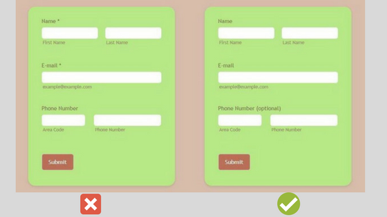
Use concise labels
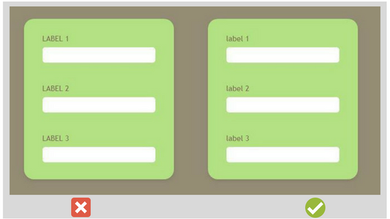
It is better to design a web form having short and simple labels. It enhances better understanding of the users and avoids frustration among them.
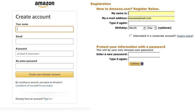
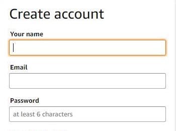
Amazon has created a new user registration form which includes short, clear labels. It has resulted in increased UX and a much better user engagement.
Avoid all uppercase labels
You must avoid all uppercase labels in your web forms since they are difficult to read and acts as annoying figures to the users.
Avoid placeholder text as labels
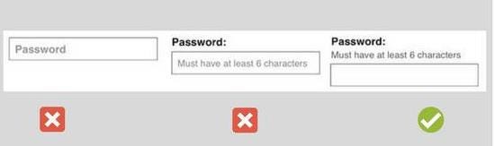
While designing a web form, you should avoid placeholder text as label due to the following reasons:-
- Including label or hint as a placeholder text would mean the information is less glance-able to the user. It is nearly impossible for the user to revise the form after completion when labels are not present.
- If a user forgets the label you included as a placeholder text, he has to either delete the entry in order to view that placeholder text again or click outside the box.
Nielsen Norman Group, a leader in the UX field, has clearly stated the reasons why you should avoid using placeholder text as labels in their article.
Placement of labels
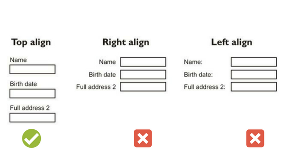
Web forms designed with top-aligned labels are more accurately completed and easy to comprehend in comparison to left align and right align labels. In addition to this, top-aligned levels have close proximity to the input fields. Forms designed with top label alignment are a boon to mobile screens as they do not require much horizontal space.
Here is an article by SitePoint that mentions the position of labels while designing a web form. It also focuses on the pros and cons of the alignment of labels in a web form.
Help the user with hints
Sometimes, there arise situations where just providing labels to the fields is not enough. The hints help the user to know about the format of the input field, conditions to follow. This makes your web form easy to comprehend and also prevents the user from doing mistakes while filling the form. The hints can be displayed as a sub-label.
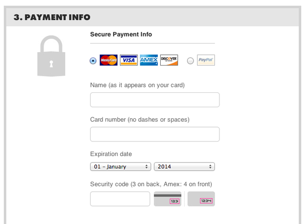
For example Threadless, in its payment form, has provided a meaningful description for fields such as name, card number, CVV number.
The user while filling up the form should be supported with appropriate hints to give users an idea related to the context of the field. These hints can be displayed in the form of a popup box, tooltip text, etc.
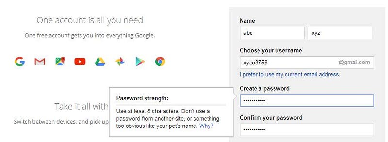
For example, Google displays hints in the form of a popup box when the user enters the password in a field. The pop-up provides information about the minimum length of a password, password strength, and other information.
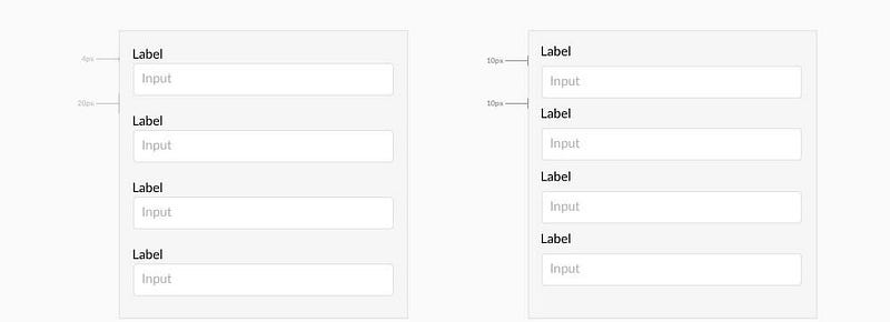
Proper spacing between elements
The position of labels with their field entries is an important thing to keep in mind when designing your web form. The inappropriate spacing between a label and its input field can cause confusion among users as to which field the label points.
Modify field size according to entry
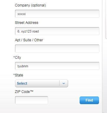
While designing a web form, you must ensure that the column size justifies the field entry. Form entries such as phone number, zip code, the city, etc. should have a limited field size. The field size must speak for the form entry itself.
For example, United States Postal Service(USPS) has the field size of zip code based on its character length. This technique ensures a better structure of your web form and provides the user with an idea about the size of characters which he would enter.
Avoid asterisks(*) for mandatory fields
You should avoid marking fields with asterisks as many users wouldn’t know what the asterisk actually implies. It is much better to use an optional keyword for inessential fields. With this, users can easily identify which fields are optional and which are not.
Highlight the currently active field
To really optimize user experience, consider highlighting the field which is active in the web form. It not only helps in better presentation of your web form but also reduces the time it takes for the user to track the location of the cursor.
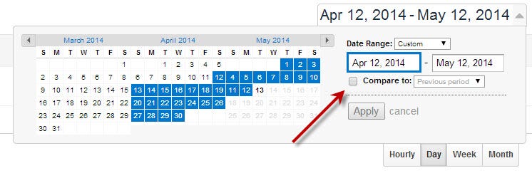
Context-awareness
Making a web form such that it is aware of the context and reacts to expected input makes it easier for users to complete details. This is the principle at play when the cursor moves to the next field when you’ve entered the expiry month of your credit card and the form automatically switches to the corresponding year field. This small addition creates a delightful experience for the user and eases the interaction.
For example, Google Analytics has designed its web form brilliantly keeping in mind the user actions. In their date range section, when the user finishes entering the beginning date, the cursor automatically jumps to the last date field. This helps the user save their time and effort of manually selecting the last date field.
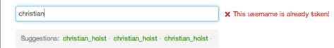
Inline validation for incorrect details
Inline validation for fields such as username, email, zip code, password, card credentials, etc. should occur after user pauses. This method gives users feedback based on the information they entered. You can increase the user experience of your web form by giving a message regarding the problem and also providing suggestions for alternate options. Twitter utilizes username suggestions in the sign-up form.
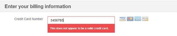
For example in the image given below an error message displays when the user pauses after entering the incorrect card number. The message displays that the entered card number is invalid and alerts the user to enter valid card details.

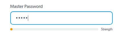
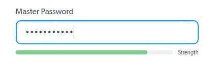
Password strength indicators
Password strength indicators act as a visual display to encourage users to create strong passwords for better security. It helps the users know about the strength of the password created thus results in a better user experience. LastPass utilizes these indicators while creating the account to give users better judgment about the entered password
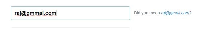
Handling input errors
You can increase user experience by resolving common email address input errors which save the time of user.
Grouping of related fields
It is an effective technique when designing a long-form. The multiple form entries can be grouped together into sections to give a better understanding to the users. It reduces the complexity of the form and provides a better sense of information to the user.
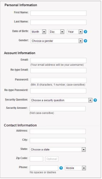
For example in the web form shown below the input entries are categorized on the basis of personal information, account information, and contact information. It provides information to the user in a structured manner, reduces the complexity of the form, and thus increases user experience.
Use of Tabs
This is an alternate option to the grouping of related fields and is a much better option to follow to present your web form to the users in a more convenient way. Tabs are an excellent way to indicate form completion progress to the user. This technique increases user experience as users are aware of the form completion status. Users are guided with structured information when filling the form.

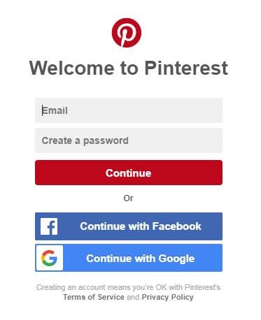
Social login
If you want to make the process of user login quick and effortless, then you should include social sign-in in your web form to avoid users wasting their time in creating a separate account for your site. You can directly use your existing account on Google, Facebook, Twitter to create your account on third-party websites. It serves as an alternate to the sign-in forms.
Conclusion
Web forms are a key element of the user interface. The ease of completing a web form can translate to how comfortable a user feels when using the application. Before designing a web form, you should be aware of your business goals and be precise about the information you want the user to enter. Web forms must not be a source of annoyance to your users otherwise it might lead to a terrible user experience. Good practices to design web forms like the ones mentioned above make your form clear, explicit, and easy to comprehend. The bottom line is that a clear, descriptive, and trustworthy web form wins you user appreciation.
Written for the zipBoard blog by Shubham Gupta