E-Commerce Websites Done Right
04 May
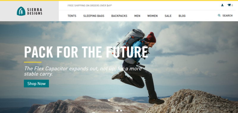
Table of Contents
ToggleDesign inspiration to create a successful e-commerce website
There are certain essential features that are a must-have for any successful e-Commerce website. These include
- Clear and concise choices for customers
- Simple and quick navigation
- Product information and pricing displayed clearly
- Distinct Call To Action (CTA) button
- Smooth checkout process
- A landing page that retains customers and decreases bounce rate
Visual stimuli and ease of use are your biggest assets in an e-Commerce website and getting those aspects right will help make the shopping experience a rewarding and successful one for customers.
These are 15 websites that give a good example of what constitutes a great design and development for an online store:
Sierra Designs
What’s Good: An image slider that does well and doesn’t change too often, Clear and bold copy, Distinct CTA button, Good description above the fold
Di Bruno Bros
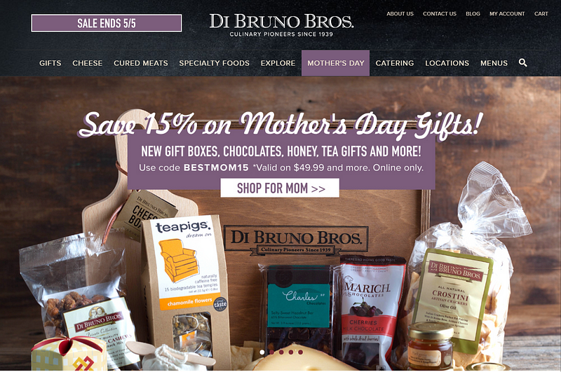
What’s Good: Bold and unique colors palette, Clear CTA, Lots of catchy images to supplement the text
Au Lit Fine Linens
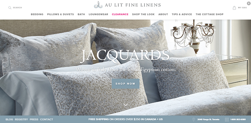
What’s Good: Images that go well with the website design, well placed CTA, option to pin designs in Pinterest so that customers can revisit
Bill Blass
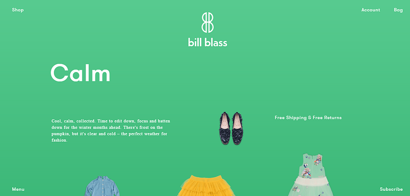
What’s Good: Good color scheme, Smooth scroll, and interface, Minimal distraction from the products
My Own Bike
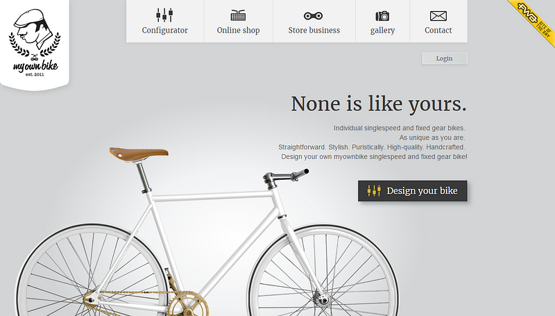
What’s Good: Minimal clutter and lots of whitespaces, Simple walk through for designing a bike, Clear value delivery
XK Glow
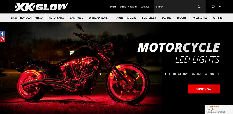
What’s Good: Color scheme, Clear CTA for every screen
JM & Sons
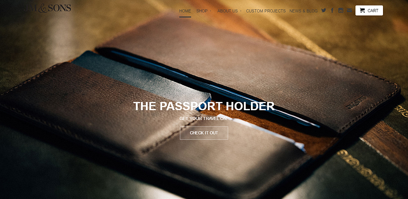
What’s Good: Clean layout, uncluttered navigation
Bonobos
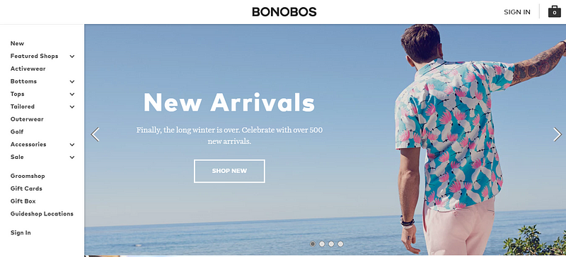
What’s Good: Well placed navigation menu, Good copy that catches the eye, consistent CTA placement
Kippis Design
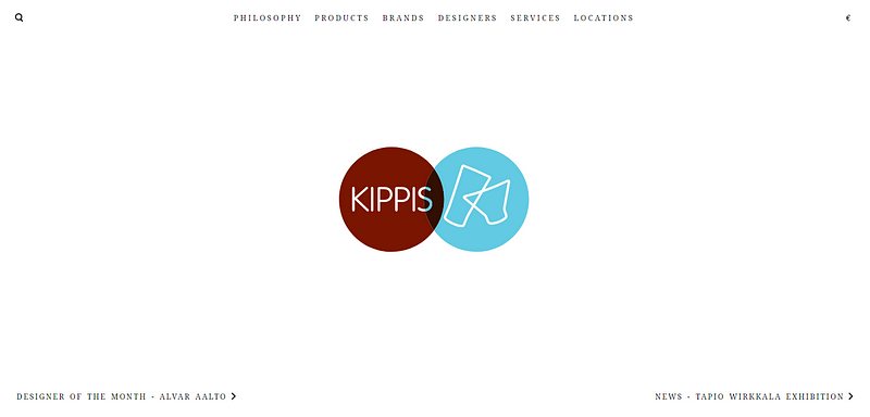
What’s Good: Great design that doesn’t distract from the product, Intuitive navigation (for example screen transitions to the right when clicking on a product)
L. Novum
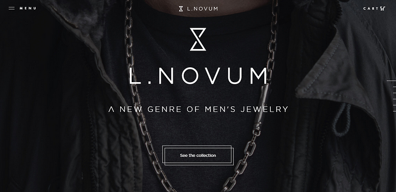
What’s Good: Minimal design, Catchy CTA
Bonfire

What’s Good: Good amount of information above the fold, Clear value delivery, Testimonial
Nyde
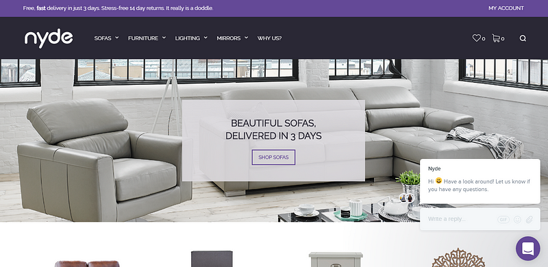
What’s Good: Great color scheme, Well placed text, and CTA above the fold
Peel
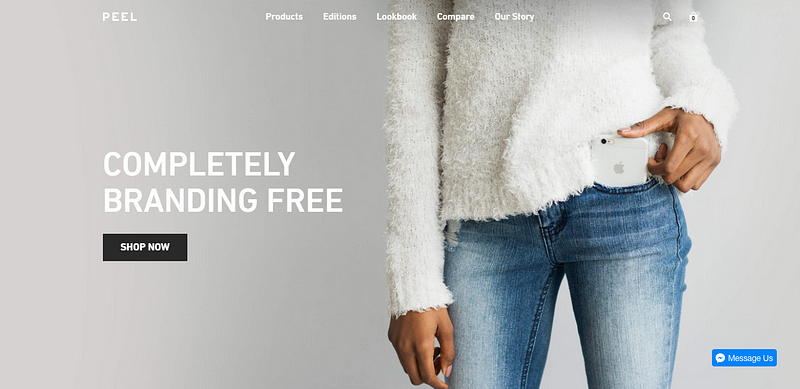
What’s Good: Clean design, Ample spacing
ALLT
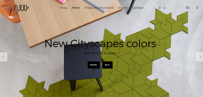
What’s Good: Intuitive design
Cute+Broke
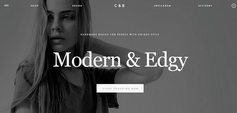
What’s Good: Clean design, Well placed CTA, Concise copy
Final Thoughts
When setting up your online store, it’s important to strive for identity and have a clear design philosophy that resonates with your customers. Taking care of the basic design elements can do wonders, improving the user’s experience and making the shopping process a breeze. This means better sales for your store and more chances of customer retention.
Request Demo
Request a personalized to create websites faster and better. Collaborate with your entire team in one place. Review and provide feedback along with all stakeholders, without the fuss of endless emails and messages
Get DemoRelated Post
Recent Posts
- How Construction Teams Manage Drawing Reviews (Without the Chaos) March 24, 2026
- Technical Writers Best Toolkit: Review & Documentation Calculator March 16, 2026
- User-Friendly E-Learning Review Tools: Trends for Teams in 2026 February 20, 2026
- Your Digital Asset Review Workflow Is Broken (And How to Fix It) February 3, 2026
- Best Practices for Efficient Document Reviews and Collaboration December 18, 2025
©️ Copyright 2025 zipBoard Tech. All rights reserved.


