A non designer’s design lexis
07 Jul
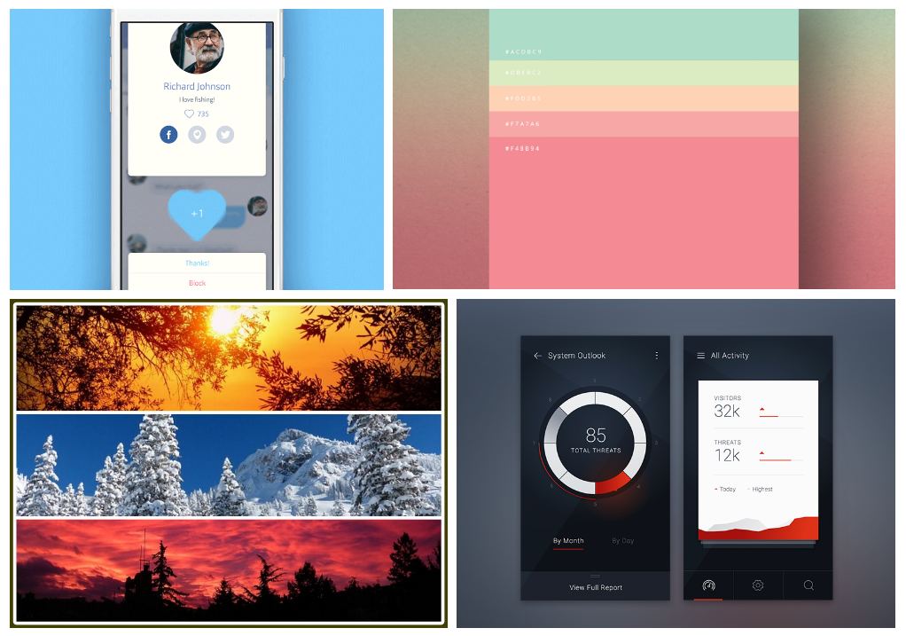
Table of Contents
ToggleAs different geographic regions have different languages, similar is the case with individuals from different professions. What if you need to work closely with people from different professional domains? Is it actually tough? Especially when you are not aware of, even the basic terminology they use in and out.
Being a content team member at zipBoard, I’m dealing with designers, developers, and marketing professionals all day. And it’s now when I realize, how difficult it can be, to deal with people from divergent work areas. Marketing people are an easy go for me as I’m into the same space and my technical educational background helps me keep pace with developers but when it comes to working with designers, it feels like I’m into an altogether different world. Now, to understand the design sphere well and be an active contributor to design discussions, I juggle new design terms every day. So I thought, why not put together my findings somewhere, which might assist others too, going through a similar phase.
Here is my list of key design terms for non-designers:
Thumbnail sketch
Dictionary meaning — ‘A short description mentioning only the most important features.’
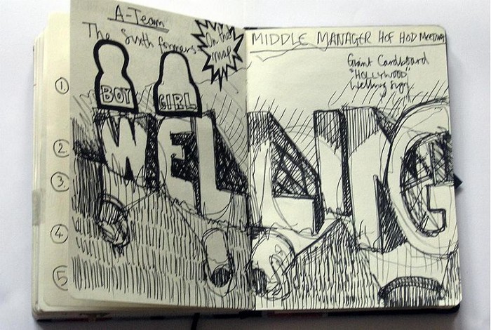
As per Designers — Thumbnail is a tiny representation of an actually larger image. But thumbnail sketch is a preliminary sketch/paper drawing that showcases just the important features of the final design for quick visual reference and to explore and choose among varied ideas quickly.
For Layman — A rough initial sketch to represent the final design.
Stock photo
As per Designers — Stock photo is available as an online resource with licensing(Rights-Managed, Editorial Use, Royalty-Free, Royalty-Free Extended, Creative Commons, etc.).Images with CC0 type licenses can be used for free even for commercial purposes. Such a photograph can be used incase
- Designer lacks an appropriate image in his/her inventory or cannot use images from his/her personal inventory
- The project budget doesn’t allow hiring a professional photographer
- A quick fix/replacement is required.
For Layman — An online resource for high-resolution images.
If you are looking for some free stock photo resources visit here.
Palette
Dictionary meaning — ‘The range of colors used by a particular artist or in a particular picture.’
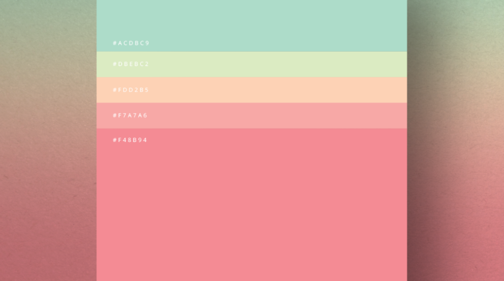
As per Designers — The collection of tints, hues, shades that can be used in a project or are used in a project. The basic criteria when selecting colors for collection is that all the color elements included works in harmony with each other.
For Layman — A collection of matching colors.
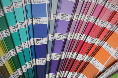
Pantone
Dictionary meaning — A system for matching colors, used in specifying printing inks.
As per Designers — Pantone or Pantone Matching System(PMS) is a standard color matching system, where each shade has a unique code(defining the percentages of the inks mixed and the standard color) to make it easy to identify and reproduce exact shades whenever needed.
For Layman — Color matching strips to get the color you actually wish to choose.
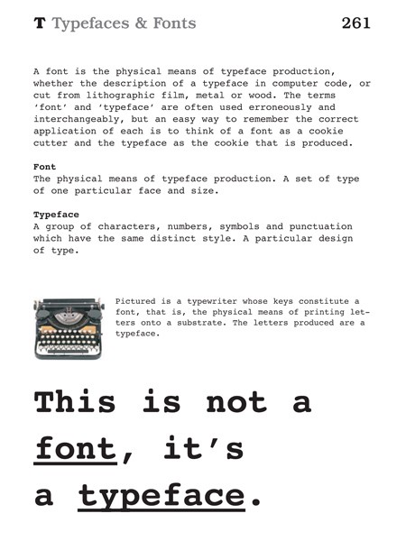
Typeface
Dictionary meaning — ‘Letters and numbers in a particular design, used in printing or on a computer screen.’
As per Designers — Typeface defines one particular style(design) for complete character set(uppercase alphabets, lowercase alphabets, numbers, special characters, etc.)
For Layman — Font and typeface are synonyms.
If you are looking for a step-by-step guide to choosing the right typeface visit here.
Leading,Tracking and Kerning
Leading
As per Designers — Leading defines the distance between lines of type. To ensure the legibility of text, proper spacing needs to be maintained between the bottom of the words in a line and the top of the words in the consecutive line.
For Layman — The spacing between text lines or line-height.
Tracking/Letter spacing
Dictionary meaning — The amount of space between adjacent text characters.
As per Designers — Tracking refers to adjusting the spacing between letters for the whole copy, in order to increase/ decrease text density for text blocks. This impacts the overall appearance. Beware, overdoing(loose or tight) can spoil things as well.
For Layman — Spacing between a group of characters
Kerning
Dictionary meaning — ‘Adjusting the spacing between (characters) in a piece of text to be printed.’
As per Designers — Typography trait to have an optimum balance of space between a pair of characters(letters, numbers, punctuation, etc.). Default spacing sometimes leads to overlap of characters for some typefaces which can be sorted with kerning. It makes the text more readable and uniform but is rarely done enough.
For Layman — The spacing between individual character pairs.
For kerning tips refer here.
Need more insight into how the 3 typography terms are different, visit here.
Wireframe Vs. Mockup Vs. Prototype
Wireframe
Dictionary meaning — ‘An image or set of images which displays the functional elements of a website or page, typically used for planning a site’s structure and functionality.’
As per Designers — Wireframe is an early phase, black & white(or grey) representation of a website, simply containing placeholders for different web elements. It acts as a collaboration reference to discuss details like page layout, colors, positioning of elements, content, interactions, etc. Although wireframes are less formal but quite important for documentation and to get better feedback in the initial stages.
For Layman — Basic layout(low fidelity)for any web design.
Mockup
Dictionary meaning — A full-size model of something large that has not yet been built, showing how it will look.
As per Designers — Static visualization of a design similar to wireframe, but has more details and can be used as the basis for real-time feedback. It’s not just the colored version for the wireframe but a detailed(almost close to the real design) representation, to make stakeholders have a look and lock-in design for final production.
For layman — Middle to high fidelity representation, with actual data and images.
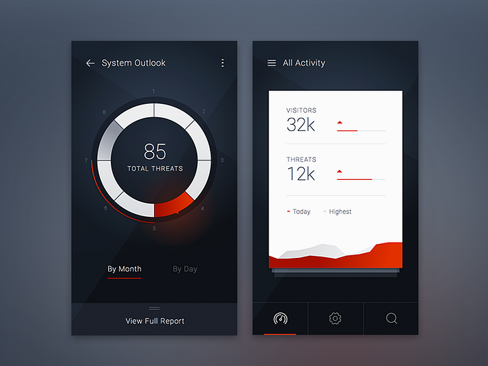
Prototype
Dictionary definition — Something analogous to another thing of a later period.
As per Designers — Built with a purpose to provide an interface that can make users experience the interactions of the final design. Users can click through different sections of the design but the connection with the backend is avoided at this stage(to make the process swift and to lower the cost). It deals with a user experience more than the user interface.
For Layman — A working model for a web project. Low fidelity, if wireframes are integrated together and high fidelity if mockups are integrated together.
Negative space/white space
Dictionary meaning — Negative space, is the space around and between the subject(s) of an image.
As per Designers — White space or negative space refers to the area of a design that is left blank, in order to make the design look appealing, simple, and clean. White space can also be used to make visitors focus on CTA(call to action) and to let users view all design elements as separate entities.
For Layman — The empty space in a design or webpage.
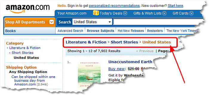
Breadcrumb trail
Dictionary meaning — A series of connected pieces of information.
As per Designers — Navigation element that represents the hierarchy of the current page. Generally appears on the top of the current webpage indicating all the webpages or sub-pages that appear before reaching the current page in the navigation order.
For Layman — Navigation order to reach the current page.
I’ll keep updating the list, as my journey goes forth. So, stay tuned!
Collaborate visually with your team and clients
Request a personalized demo of zipBoard to mark up issues and collaborate with your entire team on design projects in one place
Request DemoRelated Post
Recent Posts
- How Construction Teams Manage Drawing Reviews (Without the Chaos) March 24, 2026
- Technical Writers Best Toolkit: Review & Documentation Calculator March 16, 2026
- User-Friendly E-Learning Review Tools: Trends for Teams in 2026 February 20, 2026
- Your Digital Asset Review Workflow Is Broken (And How to Fix It) February 3, 2026
- Best Practices for Efficient Document Reviews and Collaboration December 18, 2025
©️ Copyright 2025 zipBoard Tech. All rights reserved.

