Building Better MVPs with Visual Feedback
11 Feb

Table of Contents
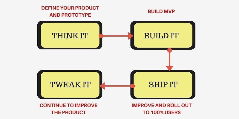
ToggleSpotify has had great success in developing products that people love. They went from zero to a million paying subscribers in the US in just a year! Spotify’s approach to building lovable products wouldn’t be new to most of us. Their insane growth is proof that the 4 step cycle of “Think-Build-Ship-Tweak” is one of the most brilliant ways to stay Lean while simultaneously minimizing risk. Their approach lets them build products that are both useful and delightful.
I’m a big fan of this approach as it helps you quickly test your ideas without investing too much into them. You can “fail quickly and cheaply”, as they say in the Silicon Valley, without the risk of losing too much at once. The best part of this approach is that it validates every idea with feedback. After every iteration, data is collected and improvements are made.
Since the “Think-Build-Ship-Tweak” approach is so effective, we decided to build a product that takes it to the next level and helps product delivery teams iterate quicker, thus improving their overall efficiency.
Most designers use tools like InVision to create quick, interactive prototypes and gain feedback internally from their own team/squad members. It helps them take a look at multiple prototypes at once and decide which one is most worthy of pursuing, so they can take that idea and start building the MVP.
“Ideate multiple user experiences and quickly modify or discard the weak ones.”
So why stop at prototypes? Why not collaborate during the actual development process and use visual feedback from your team members to constantly improve the product?
This is where zipBoard enters. We developed zipBoard for the sole purpose of making the iterative process quicker and more efficient so product teams can deliver faster, especially the ones that work remotely.

Think It + Build It
Let’s talk about the “Think it” stage. This is possibly the most important part of the process and exhibits the core of MVP thinking. It’s in this stage that multiple narratives are tested and the one that seems most promising is chosen to be built in the next stage.
When you’re testing different ideas and prototypes, you want to collect a lot of data about user behavior and their response to the presented narratives. You want to know what the users want instead of trying to predict it with your own assumptions, so you ideate multiple user experiences and quickly modify or discard the weak ones.
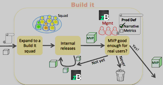
And then you start building your MVP, a physical product that is ready for the outside world. It tests your assumptions about the product. Multiple internal releases take place, and there’s a lot of internal testing and feedback sharing between team members. The management finally decides whether the product is ready for external users. During this stage, using zipBoard can significantly cut your time to market by providing you with a common platform for sharing visual feedback with each other.

“No product can withstand the test of time without continued experimentation and improvement.”
When we first created the home page for our website, we crammed a lot of information at the very top, which confused the visitor and gave the impression that we weren’t clear on what our target demographic was. When we noticed this, we decided to revise our home page. We had to show that zipBoard is for instructional designers, freelancers, and product teams, but we had to do this without cramming too much information in one frame.
So we collaboratively reviewed the website in our app itself, and annotated the parts that needed to be changed, and then discussed how we could improve the website. We decided to use cyclic auto-typing text and make some other small changes, which instantly fixed the messaging without making it look overcrowded. All the changes agreed upon were added as tasks in the app and assigned to the appropriate team members.
Ship It + Tweak It
Just like in the “Think it” stage, in the “Ship it” stage too, a lot of user data is collected by gradually releasing the MVP to small percentages of users, testing whether the hypotheses studied in the first stage are valid externally too. This means a lot of A/B testing, iterations, and continuous changes over time. As the product starts becoming truly great, it is rolled out to all users, and after that comes the final and longest stage, the “Tweak it” stage.
No product can withstand the test of time without continued experimentation and improvements, so everything done in the previous stage is repeated here. User data is important because that’s how you know where you should be heading, what your users actually want out of the product.
Using heat analytics and eye-tracking can help a lot in these stages. They can tell you to a good degree of accuracy what interests the users, to what extent, and what doesn’t interest them at all. Once you know what isn’t working, you can start making appropriate changes.

zipBoard helps you iterate quickly by letting you review your products with all the stakeholders in real-time. It’s exceptionally useful for remote teams because you can hold discussions and give each other visual feedback, just like in a real meeting. You can assign tasks and manage them on a single platform, thus saving a lot of time.
Request Demo
Browse. Capture. Comment. It’s as easy as that.
Request a personalized demo of zipBoard to visually track bugs and resolve them collaboratively
Related Post
Recent Posts
- How Construction Teams Manage Drawing Reviews (Without the Chaos) March 24, 2026
- Technical Writers Best Toolkit: Review & Documentation Calculator March 16, 2026
- User-Friendly E-Learning Review Tools: Trends for Teams in 2026 February 20, 2026
- Your Digital Asset Review Workflow Is Broken (And How to Fix It) February 3, 2026
- Best Practices for Efficient Document Reviews and Collaboration December 18, 2025
©️ Copyright 2025 zipBoard Tech. All rights reserved.


