How To Create A Flat Design Website?
27 Jun

Table of Contents
Toggle10 Tips to Help Create Magnificent Flat Design Websites
It seems flat design will never go out of fashion. It was listed among the trendsetters during the last couple of years. In 2017, it still retains its position among the most-implemented styles of the contemporary age.
Why is flat design so popular? With its help, you can create an effective website layout that emphasizes the essentials. Web designs built-in flat style are commonly so much easier to perceive. These do not include any heavy elements that would distract the audience and affect the content’s perception. Different from the year 2010 (when web designers were trying to show off their professionalism by means of flashy illustrations and animations), flat design creates a more simplified presentation of web pages.
The main secret of flat style that lures web audiences is its simplicity, which produces an incredible UX. A minimalist approach to the content presentation provides for faster loading speeds and better site performance overall. So, how can you achieve a similar effect on your own site? Let’s have a look at the pro tips to consider when working with flat design.
Keep It Simple
When it comes to flat design, you should forget about adding three-dimensional elements to the pages of your site. The flat design presents objects and shapes in a two-dimensional orientation. Whenever you need to present complex objects, the best way to do this is to try and simplify the elements. A common pattern seen when representing a complex object is to display just its silhouette. This way, you make an object recognizable without digging into details and ensure a simple interface.
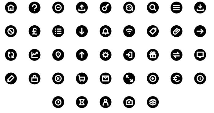
Flat icons demonstrate this trick perfectly. While representing some widely-known objects in a schematic manner, flat icons make designs comprehensive yet two-dimensional.
Use Basic Colors
The use of colors is one of the most essential features of flat design. All elements of flat websites are commonly painted with a few basic colors. Bold and saturated colors are the best indicators of flat design in a website.
Flat design isn’t limited to displaying a particular set of colors only. Such websites can also include various shades of popular hues. The color choice is heavily dependent on the things that you are going to reveal, your business niche, and the target audience.
If you are an experienced web designer, then you should have no difficulty choosing the most optimal color scheme for your site. However, if you think that you still miss practice and design intuition, then you can refer to free online tools for help. For example, you can come up with the most optimal color scheme with the help of Coolors or FlatUIColors.com.
As you work on the color scheme for your site, simply keep in mind these two common principles of flat design:
- slightly desaturated colors will add more aesthetic beauty to a web page, without overwhelming the users with very bright hues;
- brighter hues can be used to place emphasis on specific content placed on subdued backgrounds.
Make Navigation Simple
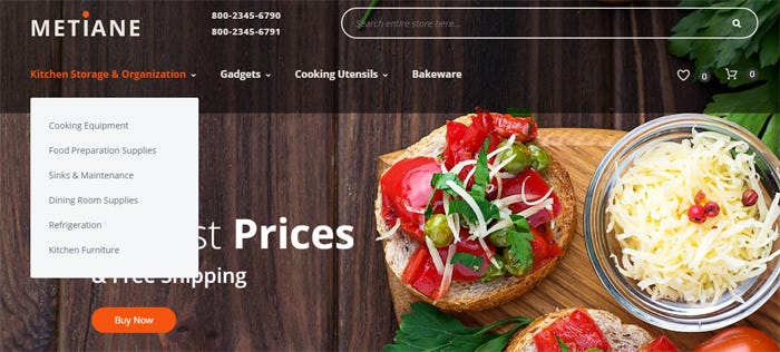
Speaking about websites’ built-in flat style, we should remember that their simplicity is not only focused on the color schemes. The ease with which web audiences can navigate through content is another defining factor of flat design. Flat designs are easy and intuitive to browse. The key navigational elements should be placed where they would seem most logical and essential. Organizing the main navigation panel into a horizontal bar will be a nice move. Avoid using hamburger menus. If you have a multi-page website, then enhance your site’s navigation by means of drop-downs. This will help save space yet reveal all the key menu items.
Use The Right Typography
Not all types of fonts will fit flat design nicely. Just like working with colors and a site structure, it’s better to give preference to simple, straightforward fonts from the Sans-Serif family. Simpler typography is easier to read and quicker to load.
Consider the following tips when choosing the most optimal fonts for a flat-styled design:
- Use a simple sans serif type family with different variations and weights. This will bring a clean, fresh, and trendy look to your text.
- Try to avoid using an overly embellished font in simple designs. The tone of fonts used on a flat web page should match the overall design scheme.
Use Illustrations
A well-written piece of content will communicate your message to the audience in part. To further enhance your story, use illustrations. Good content and fitting illustrations make the right combination to winning the attention of your audience.
It’s a generally known fact that pictures speak louder than words. This is especially true with custom illustrations. Remember the way Dropbox created its designs? Their web page and emails feature custom drawings, which enhance the perception of the message.

Add Motion
Adding elements of motion to a flat design, increase user engagement. Just recollect any Android app that you have ever installed on your smartphone. A sense of motion in the interface helps guide the users in the right direction towards the right action. This can aid in significantly boosting your site’s conversion rates.
Adding motion to the flat web design, you can also attain the following effects:
- reveal what exactly will happen as a user completes a click or a gesture;
- provide visual guides within interface;
- provide visual feedback and validation.
Animation is a great way to add a sense of motion to websites. Check out this post for getting some cool ideas for inserting animated elements into your design:
Add Strips
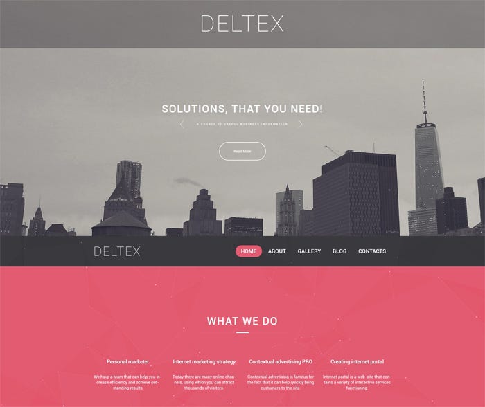
Strips are such elements of web design, which can add a clearer and more balanced look to a site. These are horizontal sections that help you structure and organize your site better. As a rule, each strip features its own design and purpose, thus making it easier to separate different content blocks one from another.
For example, take a look at the following flat design with strips. Each strip is added to a specific type of content, i.e. software features, timeline, donation, etc. Due to their visual division and organization into separate horizontal lines, a web user can scan through the web page quickly, and find a piece of data that is of the biggest interest to him/her.

Use Icons
Every element of flat design should be used for a reason. The same goes for icons. Every icon added to a web page should make sense while adding a touch of visual decor. The use of icons should be functional rather than aesthetic. So, make every icon used is easy to understand for the visitors.
You can find great free icon resource in this post:
Clickable VS Non-clickable
This is one of the most common issues of flat designs. Distinguishing between clickable and non-clickable elements is not as easy as it seems. In order to guide the web audience to the clickable fields, distinguish those by means of shapes, frames, or underlying color patterns.
Put Emphasis on What’s Important
A user will never know what’s important unless you show him/her. In order to establish a clear content hierarchy on a web page, make use of symmetry and size of the elements. Pay attention to the order in which the design elements are organized. Put them in a way that guides the users’ eyes just the way you want it. Creating a visual hierarchy helps accomplish this.
Final Thoughts
The flat design includes all the key elements and attributes to make any online project more usable and functional. By integrating simple fonts, icons, colors, etc. into web pages; creates a special harmony in the design. The aesthetics and visual flow of the design guide the web users through the web content more intuitively and enhancing the overall perception.
This is a guest post by TemplateMonster for the zipBoard blog.
Request Demo
Request a personalized demo of zipBoard to provide design feedback for all your website development projects
Get DemoRelated Post
Recent Posts
- How Construction Teams Manage Drawing Reviews (Without the Chaos) March 24, 2026
- Technical Writers Best Toolkit: Review & Documentation Calculator March 16, 2026
- User-Friendly E-Learning Review Tools: Trends for Teams in 2026 February 20, 2026
- Your Digital Asset Review Workflow Is Broken (And How to Fix It) February 3, 2026
- Best Practices for Efficient Document Reviews and Collaboration December 18, 2025
©️ Copyright 2025 zipBoard Tech. All rights reserved.

