The Design Life Of A Product Designer — Interview with Matej Latin
02 Aug
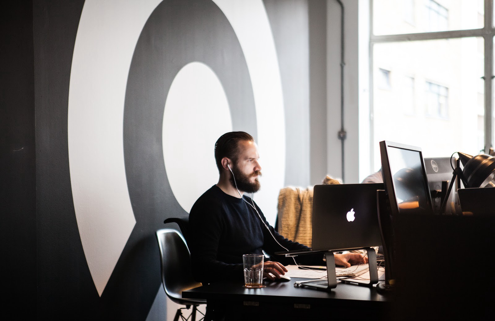
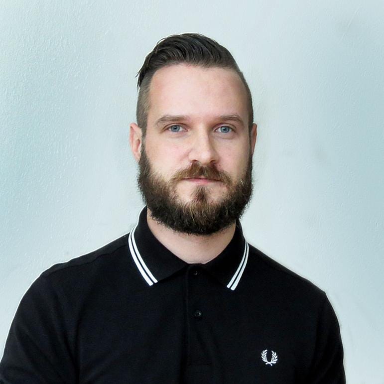
Matej Latin is the lead UI/UX designer at Auto trader UK, UK’s number one motoring destination. He handcrafted his first website at the age of 13 and loves to work on projects out of his comfort zone. While working on redefining web typography for one of his company Matej created Gutenberg, a web typography starter kit and he will soon launch his product Better Web Type, an online web typography course for web designers and developers.
zipBoard recently interviewed Matej, learning a lot more about product design and a product designer’s thought process. After interviewing Nikkel and Arlo we got some sort of understanding of who really is a product designer but it’s always better to know new people and learn from their experiences. Right?
Our conversation with Matej included topics like Collaboration with developers, his side projects, his product designer journey, his inspirational design websites, UI/UX, and much more.
So you handcrafted your first website at the age of 13. What inspired you to do it?
Matej: “I joined this after-school class called ‘web design workshop’ when I was 13. I didn’t have a computer at home back then, so joining this class was more of an excuse to get access to the internet. I remember that I spent most of the time just surfing the web (especially when the teacher wasn’t around) and doing web design stuff only when I needed to. Still, I learned the basics of HTML and how to use FrontPage in that workshop. My first website was a very simple one, I coded it by hand in windows notepad and saved the file as index.html instead of .txt. That was it. I can’t remember the exact content of that website anymore but it was probably just a little info about me and my hobbies (read: video games) + lots of animated gifs.”
What gave you the idea to start with your project, Gutenberg?
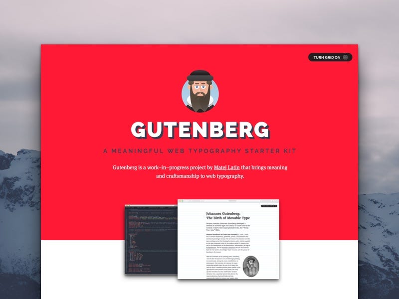
Matej: “I and my team had been working on redesigning the Wondermags brand and identity when I came up with the idea that eventually turned into Gutenberg. Other designers were working on redesigning the logo, I was working on redefining the web typography. I wanted to do it in actual code so that the devs would get something they could use. I even tweeted about the progress of this project and there you can already see the vertical grid that would become the core of Gutenberg. So in short, I never really intended to create a project like Gutenberg. I just got the idea while working on redefining web typography for my current company at that time.
I was learning Sass and how to use Grunt while working on this project and got stuck. I didn’t know how to do some things that I wanted to so I started to think about compromising with something less. Then I abandoned the project for a few months. I only restarted working on it after moving to London. I scrapped all the code I had written before and started from scratch. The funny thing is that it turned out exactly how I wanted it before I gave up. Gutenberg is now a great tool to create typographic styles for the web. Exactly how I envisioned it right at the start.”
What according to you should be the main focus of a designer while creating a design?
Matej: “If you asked me this question when I first started calling myself a designer I’d probably just say that a designer needs to make sure that things look good. If you asked me the same question just a few years ago I’d say something around ‘focus on users’. You know, create something that helps them in some way. But right now I consider both of these answers wrong. Design is not only about how things look or how much it helps users achieve their goals. There’s a business side to design. There’s a psychological side to design. There are so many perspectives on a design that it’s really hard to define it. Right now, I would say that designers need to focus on balance. Help users achieve their goals but make sure you achieve the business goals as well. Make sure it looks good but that it also works very well. Build a prototype of the right fidelity level to learn what you need to learn. Create something with users for users. Something developers can actually build in the required time. It’s these kinds of things that distinguish great designers from the rest. Constraints aren’t really constraints. They’re there to push you towards a better design. A design that will work in the real world, not just as a pretty picture on your laptop.”
Great products are not built for the users, they’re built with the users. — By Matej Latin on Creating Products That Users Love
How do you collaborate with Developers?
Matej: “I find collaboration with developers daunting and exciting at the same time. My first official job was at a bank in a very corporate working environment. There I’d be told by someone what needs to be done and I had to get it done with the IT department. But 9 times out of 10, I was rejected and told that it couldn’t be done. I soon learned that developers don’t like to be told what to do and how exactly to do it. Later I took my coding skills to the next level and it helped me a lot in improving my communication with developers. Now I prefer to work very closely with developers. Whatever company I work for, I always advocate for lean and agile methodologies.
I believe that tightly-knit, small, cross-functional teams have a much better chance of delivering value and delight to users.”
Can you tell us more about your upcoming product, Better Web type? How is it helpful for web designers?
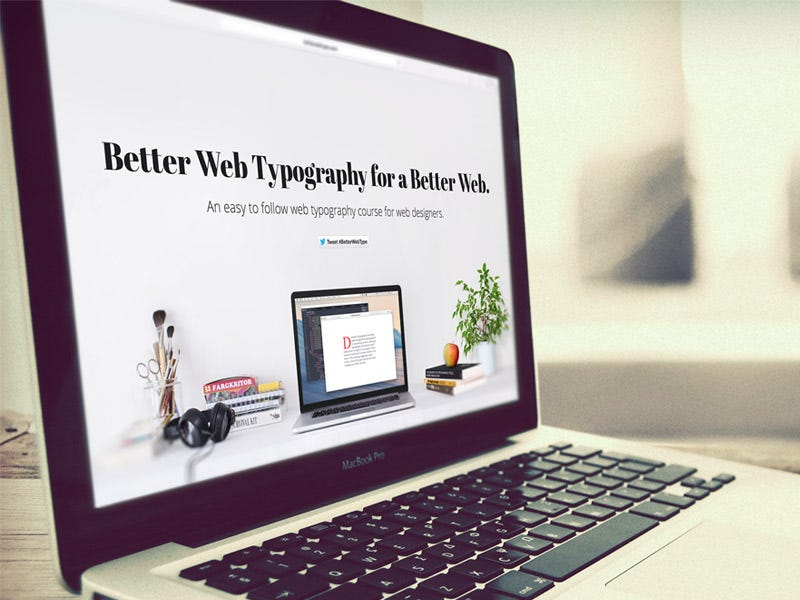
Matej: “Better Web Type is a product that I’ve been postponing for way too long. I came up with the idea for an online web typography course for web designers and developers while I was living in Germany. I created a simple landing page, explained what the product will be, and waited to see if people respond. If there’s a demand for a product like this. Around 1000 people signed up in a few weeks but I hadn’t had time to actually create and launch the product. I intend to slightly change it including the brand/identity and launch in September 2016. The goal of Better Web Type is to teach people who have anything to do with web design about typography.
Simple, short, digestible lessons on a weekly basis.
I believe every designer should have good typography skills (and ideally web developers as well). This is just one step towards the better web typography.”
Can you share some of your best designs?
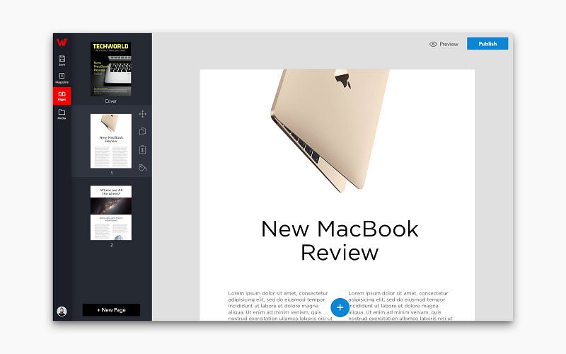
Matej: “The design that I’m still the proudest of must be the redesign of the Wondermags Editor simply because of the process that we used to resolve usability issues. We started by conducting extensive usability testing to define and prioritize usability problems that needed to be solved. After that, we came up with a low-fi solution that we prototyped and tested. After a few more changes we then proceeded with the redesign. The new design was much easier to use and also looked much nicer.”
How do you do rapid prototyping with your team?
Matej: “When it comes to prototyping it really depends on what needs to be done (or learned), how quickly it can be done and what do we already know. If we have no clue how helpful a solution is we’d do a low-fi prototype in Balsamiq and ask the users to click through. If we’re quite sure that what we’re doing is good but need further answers or insight we’d do a higher fidelity prototype in InVision. At that point revamping the whole thing is less of an option, so we really need to make sure we’re doing the right thing with that first low-fi solution in Balsamiq. In some cases, we’d develop HTML & CSS prototypes and this could happen at the very beginning of the project. It really depends mostly on what needs to be done, for what reason, and how quickly.”
Where do you look for inspiration for design patterns?
Matej: “This really depends on the type of work I’m expected to do. If it’s visual designs then I’ll go to Dribbble. If it’s trying to find a solution for a design problem then I’ll go and look how others have solved it or tried to solve it. I had a list of competitors when I was Head of UX at Wondermags, and the design team would do scheduled weekly research on what they do and how. So whenever we needed a solution we’d be better informed on how others approach similar problems. The tricky thing about doing things as others do them is that your users will be likely to have a better experience with your product. That’s why most websites have logos on the top left, followed by navigation and search form on the top right. But that’s not good when you need something to stand out. In that case, even a bad design solution is something to consider. An example of this would be the extensive use of red color in UIs for Wondermags.”
How is your work experience at DueDil?
Matej: “Funny question because I just switched job again. I recently decided to leave DueDil and join AutoTrader UK. DueDil had an established process of product development which I didn’t agree with. I decided to join AutoTrader because they’re looking for people that can work in a lean environment on tasks that push individuals out of their comfort zone. That’s exactly what I’m looking for from my professional role as it’s the only real way of continuous learning and skills development. If I was happy by simply drawing UIs and making nice visual designs I wouldn’t be where I am today.”
As a designer what social channels do you love to hang around?
Matej: “London is a great place for designers. There are events, workshops, or just simple meetups every week. I haven’t been to many of them but the ones I’ve been to were great. But I like to go, again, beyond just design and hang with people who love creating stuff other than ‘designs’. Entrepreneurs, product management/development people, developers, and engineers. I love the idea of getting together with 3–4 people and just create something.”

More from Matej
Matej Latin is active on Twitter and writes inspiring stuff on medium. To see his work you can follow him on dribble and to know more about him, you can visit his personal website. If you love his idea of Gutenberg, a web typography starter kit you can start using it here and do stay updated with his upcoming product, Better Web Type, an online web typography course for web designers and developers
zipBoard is still on with the interviews of great product designers. In case you missed the previous ones you can visit our blog and enjoy reading the experiences of these amazing product designers.
Request Demo
Request a personalized demo of zipBoard to manage your design projects remotely and collaboratively with your stakeholders
Get DemoRelated Post
Recent Posts
- Technical Writers Best Toolkit: Review & Documentation Calculator March 16, 2026
- User-Friendly E-Learning Review Tools: Trends for Teams in 2026 February 20, 2026
- Your Digital Asset Review Workflow Is Broken (And How to Fix It) February 3, 2026
- Best Practices for Efficient Document Reviews and Collaboration December 18, 2025
- MEP Document Management: How to Streamline Reviews & Avoid Rework October 3, 2025
©️ Copyright 2025 zipBoard Tech. All rights reserved.
