Hey LinkedIn, I Really Like You But…
27 Nov
Table of Contents
Toggle… a few of those quirks really tick me off. How often does it happen that you really like a product, want to use it often, but some small things become a pain for you? You wish there was a way for you to quickly give some visual feedback.
LinkedIn is a powerful tool and over 300 million individuals, including me, use it to network with other professionals. There are enough reasons to love LinkedIn, but sometimes there are small design changes in a product that make it even more lovable!
So here’s my wishlist of improvements I would really like LinkedIn to work upon.
Important Notifications
Okay, so you’re new to a discipline. You really want to dig deeper and connect with the experts, try to get a better understanding of this by discussing with others, that sort of thing. Or maybe you’re writing something and really need an expert opinion on the subject quickly. What do you do?
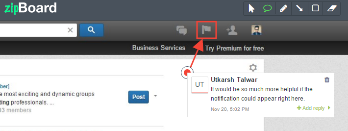
It’s great that LinkedIn gives me a chance to connect with people of my interest group. Now, it would be even better, if I could just get notified about getting accepted for that group on the Linkedin platform itself. Unfortunately, the only way to know is through an email received in the registered email account. So Linkedin, like all other notifications, why not this one is also in the interface itself?
Showcase Page Preview
If you run a company page on LinkedIn and don’t yet know this, you can create a showcase page for your company. A showcase page is basically a dedicated page to one aspect of your company.
For example, we at zipBoard have been working on our app for the last few months, and now that we’re in beta, our app has two main uses: a) to review web-products; b) to review eLearning SCORM courses. Both of them have two different types of target customers. It means we have two aspects of our business, in a way.
Now, if you want to create a Showcase page for your business, you fill in the relevant information and add a banner. Naturally, after this, you want to preview your page and see how it looks. But there’s no option to let you preview your page, which is a bit restrictive.
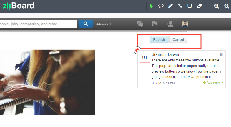
It would be great to see a preview button, not just for a Showcase page, but for everything else you want to publish.
Group Join Request
A while back, I was looking for a group dedicated to Digital Marketing, and when I found it, I requested to join.
Now, when you do that, LinkedIn tells you that your settings have been updated, which basically means your request is yet to be accepted and you can see that down below. It says “Pending” under the group name.
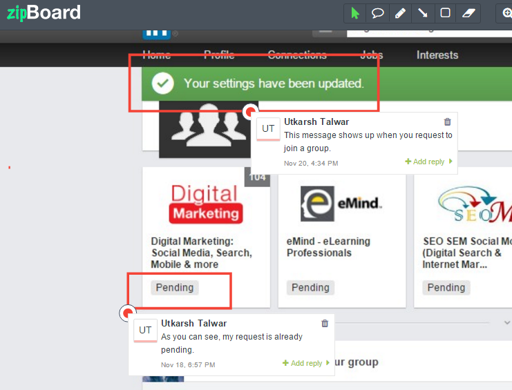
Let’s say you want to join another similar group after that. So I searched for “Digital Marketing” again and looked for relevant groups, but when the results showed up, there it was again, the group I had just requested to join, not giving me any indication that I had already requested to join it.
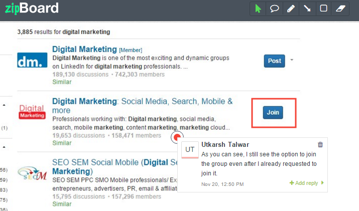
It led me to believe that something had gone wrong, and I submitted a joining request multiple times before I realized nothing was wrong. It was all really confusing because the “Join” button never goes away. It stays there until your request has been accepted.
I can only wonder if I (and possibly many others) had accidentally spammed the group moderator with joining requests. I hope not!
Invitation Messages
You can’t see the messages people send to you along with their invitations, so I’m not sure what their purpose is. The message only shows up in your email. It makes sense if you’re inviting someone who’s not already a LinkedIn user, but when you want to connect with someone who’s already a LinkedIn user, you would want your message to be delivered to their LinkedIn inbox, especially if it’s not the standard message.

If you write a custom message to help someone remember you from, say, a conference you met in 3 months back, you would want them to read that message. But emails, as I already mentioned, have a way of getting lost among hundreds of others.
So LinkedIn should give users the choice to send the invitation as an email or a LinkedIn message wherever applicable.
See Invites
I’m pretty sure I’m not alone in this when I say I would really like to view the people I have already sent out invitations to. Easily, that is. I will shamelessly admit that I wasted a full 10 minutes trying to search for the said option the first time around.
It’s on the “People You May Know” page by the way.
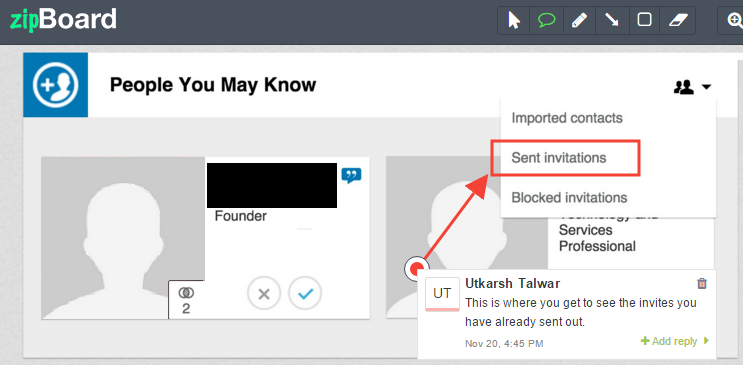
Users don’t really take the time to experiment and click on everything. They want everything easily accessible and visible. So LinkedIn should really think of a way to make this more visible.
These are some of the things I felt LinkedIn could really improve upon. The important thing to notice here is that all of these are relatively small things that enhance the usability a lot, which just goes to prove that small changes really can make a big difference, be it design, UX, anything. I guess in the end, I am just asking things to become more visual, show the little things and make them speak for themselves. It makes the product much more useful.
Request Demo
Request a personalized demo to know more about zipBoard and how it can make your review process hassle free
Get DemoRelated Post
Recent Posts
- How Construction Teams Manage Drawing Reviews (Without the Chaos) March 24, 2026
- Technical Writers Best Toolkit: Review & Documentation Calculator March 16, 2026
- User-Friendly E-Learning Review Tools: Trends for Teams in 2026 February 20, 2026
- Your Digital Asset Review Workflow Is Broken (And How to Fix It) February 3, 2026
- Best Practices for Efficient Document Reviews and Collaboration December 18, 2025
©️ Copyright 2025 zipBoard Tech. All rights reserved.
