Optimizing eCommerce User Experience: Interview with eCommerce Specialist Melvin Simpson
10 Jan

Table of Contents
ToggleBusinesses of all sizes today have an online presence. The eCommerce space is not just about sales but about establishing a credible brand that is visible to customers across digital channels.
Online retail sales in the US itself have exceeded $230 billion and form an increasing chunk of the total retail sales. For brands that want to be a part of this runaway train, a good user experience is something that cannot be overlooked.
We spoke to digital and eCommerce specialist Melvin Simpson, who has been working in this space for more than a decade and a half. Melvin has worked in a variety of roles across the digital space from in-house agencies to an independent consultant, having been part of brands like the Ministry of Sound and Zavvi. He specializes in multi-channel strategy, user experience optimization, digital transformation, and re-platforming.
Here are Melvin’s insights on user experience in the eCommerce space.
Please tell us a little about yourself and how you came into the digital and eCommerce space.
Melvin: “I started as a marketer in the home entertainment (music and video) industry, moving into product acquisition. I then switched to corporate communications and events, eventually founding my own agency. My first foray into digital was with an internet start-up in 1999, and I’ve been in the digital space ever since. It’s a move I’ve never regretted making.
In 2005 I did some consultancy for Virgin Digital and later, when Virgin Megastores was reborn as zavvi I was asked back first as a consultant and then to head up eCommerce operations. After zavvi, I was head of the digital at music and lifestyle group Ministry of Sound before joining Biglight, an eCommerce and experience design agency where I spent almost 6 years as a senior consultant and account director.
I left Biglight last year and have been working as an independent consultant since, while also taking the opportunity to do some things for myself.”

How do you see your time now as an independent consultant as compared to when you were working in-house with agencies?
Melvin: “There are a few significant differences. First, of course, when you are independent everything relies on you as an individual. That includes engaging with clients and doing the work but also finding and winning new work. So you don’t just turn up in an office with work ready for you.
The other side of the coin is that you have much more scope to do things the way you want. There are no colleagues or bosses pointing you in different directions, and there are no corporate or political undercurrents. And because you’re generally working on just one project at a time, you can focus 100% on that project and that client.
On a personal note, working from home does mean you don’t have the social interaction of a busy office, and I won’t deny I miss that.”
What kind of projects do you undertake for clients and what are the services you offer them typically?
Melvin: “The projects I’ve undertaken so far have mostly been driven by a client’s needs for advice and support, which can be for a number of reasons: because they lack digital expertise, they don’t have enough bandwidth or they want an objective third party view.
The range of services I offer is quite broad, but generally take place at the intersection between business needs, technology and user experience.
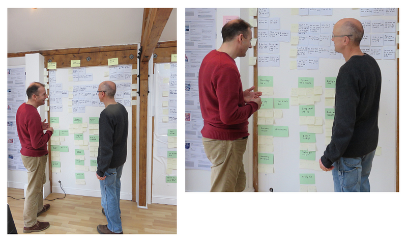
I’ve advised one client’s CEO and digital team in a strategic planning session. I’ve reviewed and audited client websites and recommended improvements. I’ve defined the requirements for a site re-platform and validated development agencies. I’ve written content to support a new omnichannel commerce platform launch.”
What kind of clients do you generally work with? Are they from a particular industry or spread across various verticals?
Melvin: “My background is very much in retail and lifestyle so that’s where my work tends to happen — or with companies servicing those sectors.
I tend to get involved in smaller projects where it’s useful to know a bit about lots of things rather than be a real specialist at one thing.”
Can you give us a walk-through of how you typically approach and work through a project, right from establishing the client’s needs to working towards the goals established?
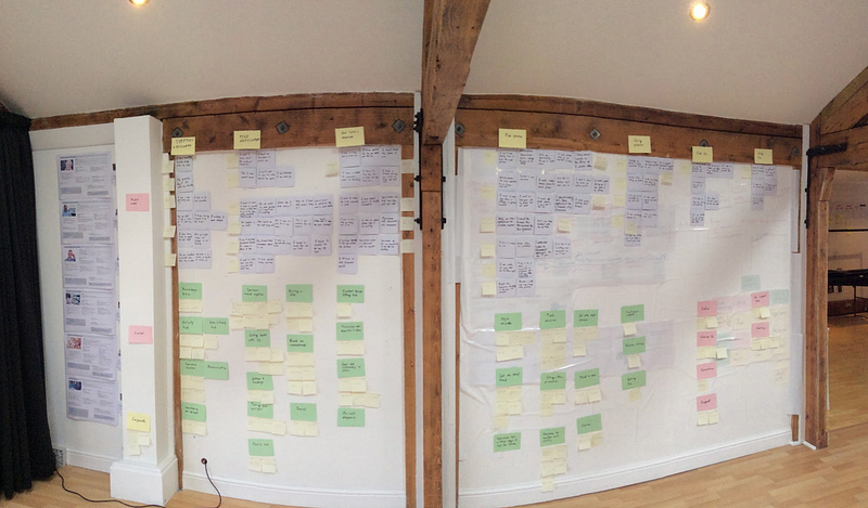
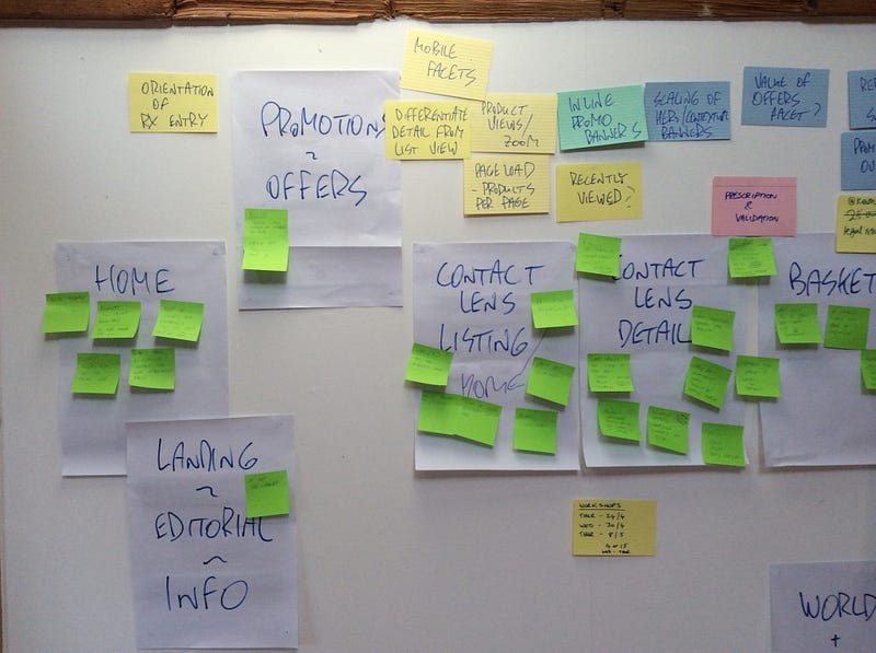
Melvin: “I like to take the simplest approach that I can to any project — I’ve learned that unnecessary complexity can be the enemy of successful work. So in simple terms, I’ll listen to what the client says but also drill down into what they really want and need — what are the real goals, where are the pain points, what are the priorities?
I’ll try to articulate this clearly in a plan that the client agrees with so that we are working towards the same goals right from the start and there’s no confusion over what is needed from me.
Then, it really depends on the project. It may be something that I’m delivering independently, or perhaps I might be working with an existing team to deliver a project. Either way, collaboration and clear communication with the client and any other stakeholders is a vital part of any successful engagement.
Wrapping up a project well is also important. Partly to ensure that when I depart from a project I’m not leaving a gap behind me and, of course, to make sure that the client talks favorably about me and would work with me again.”
Do you have certain go-to strategies when you start evaluating websites from an optimization perspective?
Melvin: “I think the main thing is to try to take a step back and think what is the purpose of the website?
Very often websites try to cram more and more into the user experience at the expense of the core actions that users come to the site to perform. So I think about the main two or three user journeys and look for evidence that the website is either supporting or hampering the flow of those journeys.
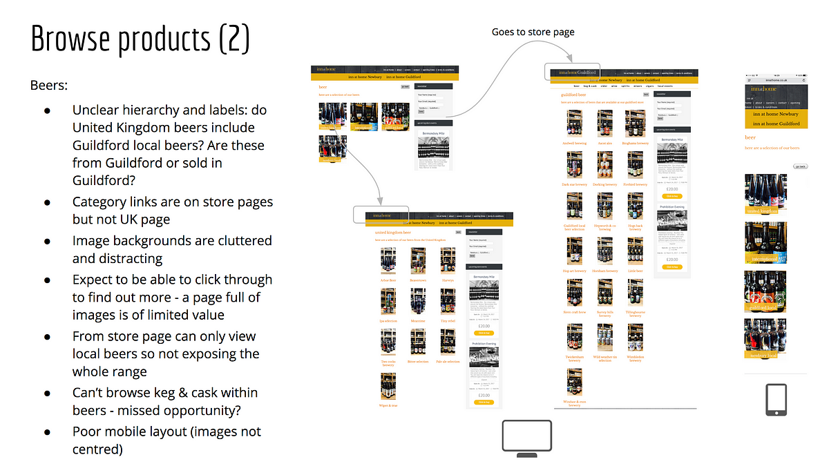
At a more micro level, little details can make a big difference to the user experience. I’m a big fan of Steve Krug’s classic book “Don’t Make Me Think!” and even though the internet has moved on dramatically from the days when he wrote that book, the principles are the same: if you force the user to figure out how something works, you’ve designed it wrong. So I like to bring my pedantic side into play and look for the little issues that add up to poor user experiences.”
Do you run experiments to gauge what requires the most attention? If yes, what kind of tests and how?
Melvin: “When I was working in the agency we used to run all sorts of experiments: moderated and unmoderated user testing, group sessions, remote user tests, eye tracking, etc. Tools like WhatUsersDo and Hotjar can provide very useful insights at a relatively low cost.
There are of course lots of ways to test from an analytical point of view. At a simple level there’s A/B testing to see which of two alternatives performs better, and (at a price) there are more advanced tools that can support multiple variants at the same time and report with statistical confidence.”
As an advisor on digital transformation to businesses, how do you start breaking down the task of translating an entire brand or product experience online?
Melvin: “Digital transformation has been one of the hot topics in recent years. The more I see, the more I think that the term is a bit of a misnomer. They are really business transformations that are made possible by digital technologies and in particular data. But to a certain extent, these are tools. Implementing new digital tools isn’t enough: underpinning these has to be a cultural change from top to bottom that is customer-centric, agile in approach (if not 100% in methods) and introduces a test-measure-learn-improve mentality.”

What are things that you would advise a business to keep in mind if they are planning to go from an offline presence to an online one? What are typical steps in that process?
Melvin: “I doubt there are many businesses these days that don’t have an online presence, but if they are trying to enhance their services by improving their online presence then the first thing to remember is to make the customer experience as seamless and consistent as possible.
Remember, your customers don’t think about channels — they think about how your business can help them achieve their goals.
I’m a firm believer in getting the basics right. If you’re selling a product or service make it really easy for customers to buy it. If you’re providing information, make it clear, simple, and above all helpful. If you are serving up rich content, don’t waste time on the bells and whistles unless you know it’s relevant and useful to your customers.
Get the right people involved so that you can gather input and add the best from each area into the overall mix. This needs to be managed carefully though, to avoid slowing down the process — everyone will have an opinion on everything, and in this context, not all opinions are equal.
And if involving the right people internally is important, it’s equally vital to get feedback from real users throughout the process. As I’ve mentioned earlier, there is a huge range of tools available to UX and design teams to help with this. Test, learn, improve and test again.
Finally, set goals and measure them. But make sure you focus on metrics that matter, not just a dashboard full of numbers. Concentrate on the important stuff: what does good look like?
As far as the process is concerned, that’s another topic on its own but the way the project is started can have a huge bearing on its future success. Most of the platforms available will offer similar basic functionality, so when outlining your requirements it’s important to identify the features and functionalities that are particularly important for your business: for example, do you need to sell unusual product configurations, take subscriptions, manage events or offer your business customers unique services or privileges? Getting that focus right is the key to what follows.”
You’ve been the Head of Digital Strategy for the Ministry of Sound and zavvi. Can you tell about your experience leading the teams there, what kind of projects you worked on and what were some of the challenges that stood out?
Melvin: “At Ministry of Sound the initial focus was building new websites for some of the key brands. It was made more difficult due to the fact that the agency we were using went out of business within two weeks of my arrival, so that created a different type of challenge!
In fact, we solved that by hiring the agency team and bringing development in-house. The biggest commercial challenge was that while the business wanted to sell directly to its customers it was just impossible to compete with the likes of iTunes and other digital services for music, and while we sold a high proportion of the available tickets to the club, it was only open two days a week and had finite capacity.
If I had my time again I’d have focused more on the website as a brand engagement tool.

At zavvi, while the business had been born as a management buyout of Virgin Megastores, it was still very much a challenger brand and so we had to find areas of focus where we could gain a competitive advantage: games became a massive category for us.
When I joined zavvi the online side of the business was very much the poor relation to the physical stores, but with the support of the business, a fantastic team, and a lot of hard work we grew the website to become the number one store in the business well ahead of schedule.
My role at zavvi was more operational, so I experienced a range of challenges. At one point we had a major fraud problem that we had to use all our wits to resolve otherwise the business would have been at serious risk. I introduced features such as customer reviews and online self-service while dealing with numerous supply chain and customer service issues and improvements.”
As a liaison between the business side and the design side, what kind of collaboration challenges do you face?
Melvin:
“I think the biggest challenge — and it’s been a challenge for a long time — is to divorce objective feedback on design from subjective opinions on what looks good. “
“Generally the people I work with understand this, but when people outside of a project get involved there’s always the possibility of unhelpful feedback without a clear understanding of the objectives and the reasons that design choices have been made.”
How do you generally collaborate with clients?
Melvin: “I’ve always been a nut for new tools and processes. Obviously different clients have their own established methods, but I’ll use Skype, Slack, or Google Hangouts for communicating, as well as clients’ own JIRA or Confluence. Google Sheets, Slides and Docs, and Dropbox are excellent for collaborating; I’ve also used Trello, Evernote, and Smartsheets. I’ve always loved mind maps: iMindmap is visually amazing and Xmind is great for mapping and sharing ideas.
And now zipBoard, of course!”
How does zipBoard help in your work?
Melvin: “I regularly review websites either to make recommendations for improvements or to feedback my comments on work in progress as part of a project. In the past, this could be a tortuous process generally involving recording comments in spreadsheets, which is a pretty manual way of doing things. It’s also very difficult to integrate screengrabs seamlessly into this process.
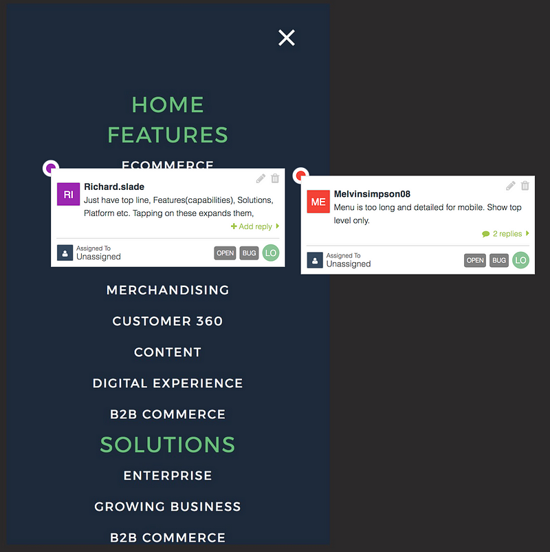
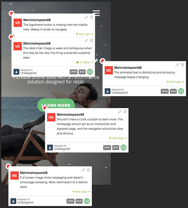
zipBoard makes life so much simpler. Making comments and turning them into tasks that can be assigned to someone — with clear visual reference — is easy. I particularly like the ability to view a site in different screen resolutions and capture comments on individual screengrabs related to a single view so that there is no potential for confusion.
There are powerful annotation tools, tagging, and prioritization that become useful as a project grows. And it’s easy to share with clients and other collaborators.”
Certain interactions, like the checkout process, are common pain points for many eCommerce websites. What are some of the common patterns or pitfalls that you see businesses run into with designing the UX for an eCommerce site?
Melvin: “One of my pet hates is having to remember whether I’ve created an account on a site that I might not have visited for a year or two. It drives me mad when I try to create an account only to be told that one already exists, or I try to log in but don’t remember which email address I may have used.
Just let me enter my email address: if it exists on the system, ask me for a password; if it doesn’t, ask me to create one. (Offering guest checkout is an even better solution, of course.)
Given the importance of the checkout process, I see examples of extraordinarily messy checkout pages, with a lack of information, poorly designed forms, ridiculous password restrictions, and unclear payment options.
In more general terms, there are still too many examples of responsive sites that offer a second-class experience on mobile. Coming back to design, I think this happens because everyone loves to see a beautiful desktop site, and they don’t get so excited by the mobile version which in all likelihood will have more visitors.


Also, while brands are rightly investing a lot in content, it can often seem divorced from the rest of the site when it should be built into the fabric of the customer journeys.
And a common failing in many websites is simply trying to do, and say, too much. Trying to keep everyone in the business happy can sometimes result in too many competing messages.
As a UX colleague of mine once said, “Too many messages = no message”.
About a year ago I started writing a series of articles on LinkedIn entitled “You’re Making Me Think!”. They’re my observations on user experiences that I encounter in random situations, and I’m continually surprised at how bad some experiences are.”
You’ve seen the eCommerce space grow from its infancy to the mammoth it is today. How has the industry changed/evolved in terms of user experience, beyond better aesthetics?
Melvin: “I remember we used to get excited when a website was launched with a stunning new design. Now I find that excitement from seeing new and better ways of interacting with users. Without a doubt, the rise of UX and the increasing focus on listening to customers (with tools to make it easier) has resulted in huge leaps in user experience.
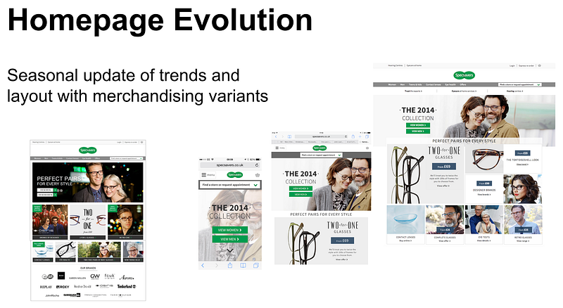
Ecommerce has grown into multichannel and now omnichannel commerce. Business channels can’t operate in silos anymore since customers expect a consistent, unified experience regardless of where, when, and how they interact with brands.
Data is playing a far greater role in understanding customer behavior and matching products and services with individuals’ needs. And the use of data is becoming more sophisticated, both in creating relevant, personalized experiences and in driving powerful CRM programs.”
How has the development side, and the technologies used to create eCommerce platforms, changed in the time you’ve been in this space? Do businesses prefer using services like Magento or Squarespace to make things simpler now?
Melvin: “For small to mid-sized organizations, I think the biggest change is the ability for pretty much any business to set up and run a transactional, content-rich website in a matter of weeks, using services such as Shopify, WooCommerce, BigCommerce, or Squarespace. Magento is also massive of course but relies on finding a good agency to implement it.
I should also mention a new platform that I’ve been involved in. OmniCX is an omnichannel commerce platform with a really powerful feature set straight out of the box, built with a 100% API-first philosophy that makes it easy to design, extend and integrate regardless of language.
For bigger enterprises, the technology has come on in leaps and bounds, with platforms such as Hybris, Oracle, and Salesforce Commerce Cloud adding more and more features (often by acquiring other specialist services), focusing on omnichannel performance, and using data to provide essential business information. We’re starting to see innovation using technologies such as AI and machine learning in those platforms.”
Commerce platforms are moving towards ‘Headless’ commerce, where the front-end is decoupled from the backend, allowing front-end developers to create a completely unique user experience that fits exactly what the business needs. A Headless solution avoids having to define a perfect generic front-end by simply not having one.
What trends do you see emerging in eCommerce?
Melvin: “There are some really interesting things going on right now. Imagine spending the last 10 years designing screen-based interfaces and suddenly Alexa comes on the scene and you’re designing a conversational interface. How will that change things?
AI and machine learning are becoming more and more pervasive. As well as powering chatbots, AI will increasingly take on analytical tasks, learning about customer behaviors and looking for patterns that human analysts might not see.

Augmented and virtual reality has been around for a while but hasn’t really crossed into the mainstream. As brands look for more interactive ways to engage with their customers, perhaps the types of AR and VR experiences that now exist in gaming will cross over to e-commerce. But they’ll have to add value as well as wow people.
These new trends and new technologies will be complemented by the greater capabilities of existing technologies. Personalization still has a long way to go, optimization tools will get more sophisticated, and the ability to track customers across all channels and interactions will get better.”
For more insights from Melvin, you can follow him on Twitter and LinkedIn.
If you liked this article, you can find more such interviews on the zipBoard blog here.
Request Demo
Request a personalized demo of zipBoard for better collaboration which ultimately helps build better brands and experiences
Get DemoRelated Post
Recent Posts
- The 5 Best SCORM Review Tools for 2026: Why Friction-Free is Winning April 14, 2026
- The Project Manager’s Guide to Drawing Approvals and Submittal Tracking April 10, 2026
- How Construction Teams Manage Drawing Reviews (Without the Chaos) March 24, 2026
- Technical Writers Best Toolkit: Review & Documentation Calculator March 16, 2026
- User-Friendly E-Learning Review Tools: Trends for Teams in 2026 February 20, 2026
©️ Copyright 2025 zipBoard Tech. All rights reserved.


