6 surprising things you can learn from usability tests
31 Jan

Table of Contents
ToggleFixing bugs during the product development stage can be ten times more expensive than during the design process. That is why usability tests become a real money-saver for companies helping avoid serious product malfunctions developers will later struggle to fix.
It’s been accepted by the UX community that five users are just enough to identify the most crucial usability issues that can considerably harm the user experience. Not only can these five users share valuable feedback about your application, but they can also make an incremental impact on your company’s bottom line.
In this article, we will explore six ways usability tests can help you save money on building an eCommerce app and meet customer expectations better to increase sales.
Understand why users do certain things
Quantitative data such as Google Analytics reports or surveys with open-ended questions can help you understand how users interact with your application or webpage. However, qualitative UX research won’t tell you why users take specific actions.
Imagine you have created a user interface that complies with all usability and design standards.
However, when you start analyzing how users are interacting with it, you can discover that the new interface has not positively influenced your user behavior.
They stubbornly don’t want to click the buttons, which are begging them for a click! What is the problem?

By conducting usability tests, you can discover why users behave in a particular way. The most crucial aspect is observing what users are doing with your app and what they are saying in the background.
As you remember, during usability tests, it is important to encourage users to speak their thoughts out and share their impressions about a product.
By getting them to talk more, you can discover that users find it easy to click buttons or find relevant information about your product. However, there are some bits of information that cause their mistrust.
If you get users to talk and not only engage with the app, you can get to the source of the problem faster.
If you want to know the truth behind users’ actions, ask them!
Achieve more clarity with value proposition
Every test is an opportunity to learn more about your users’ changing needs. Recordings of usability tests can be a source of inspiration for marketers working on improving page copy and conversion.
By listening to what users say about the products similar to yours, marketers can discover what value your product delivers that your competitors haven’t nailed yet.
Get marketers to analyze the evidence collected with usability tests to understand better how your brand can stand out and outshine your competitors with more effective sales pages, helping generate more leads.

Taking part in usability tests and listening to users regularly helps make better business decisions. Usability tests also help better understand why users would choose your product over the others. Go for it and engage your marketing department in the user research process.
Learn users’ language and apply in copy
When creating marketing materials and crafting web page copy, your marketing colleagues often rely on their gut feeling instead of using customer research as a source of inspiration.
By analyzing user research, they will understand customer needs and desires better and, as a result, launch web pages driving higher conversion.
As the whole organization can benefit from diving deeper into customer insights, you have to promote the use of voice of the customer analysis, a research technique exploring customer’s pains and desires, aversions and expectations.
Let’s take a look at how PetDoors.com utilizes the voice of the customers on the webpage.
Here are the phrases they took from customer feedback forms, reviews, and online questionnaires.
- the world’s largest selection
- built-to-last
- weather-tight pet doors
- give your dog complete freedom
- go as they please
- “pet accident” free
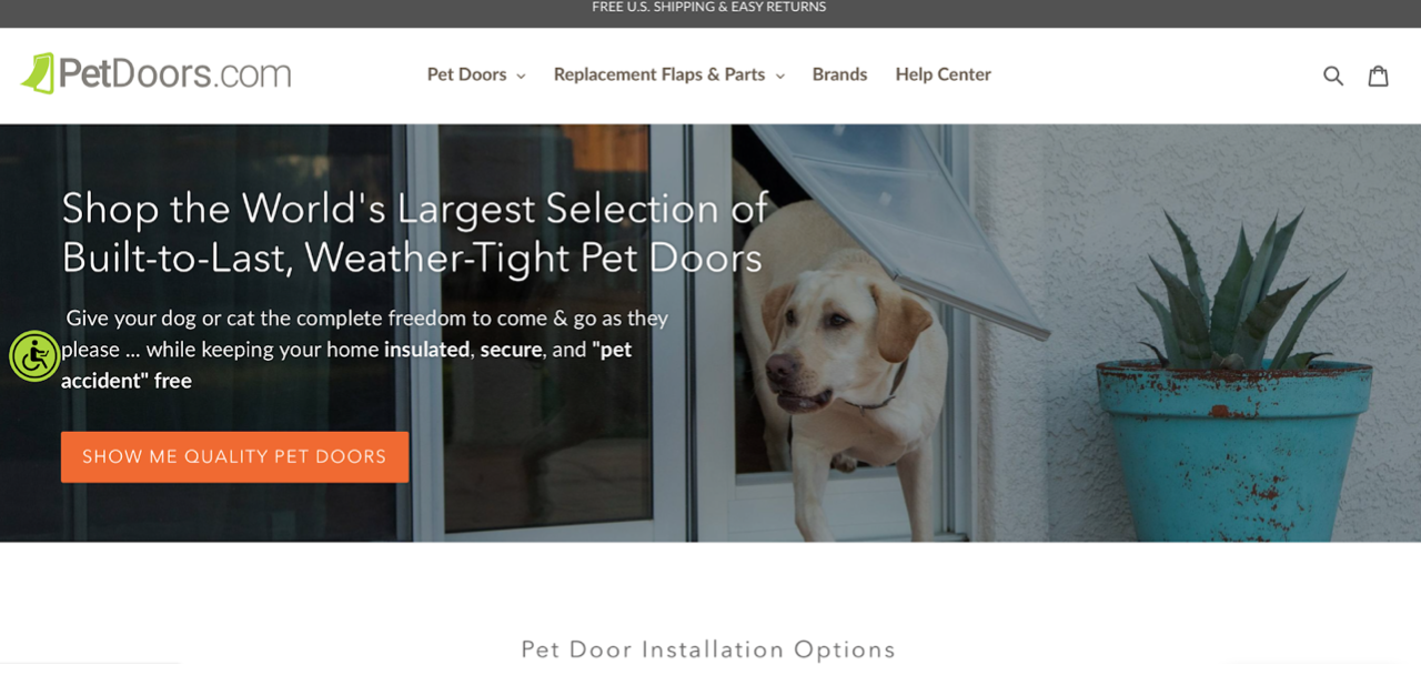
By merely “listening” to what customers are saying about their brand, PetDoors managed to saturate their webpage copy with just the right phases to reflect customer needs and desires. Voice of the customer makes this copy much more persuasive than a regular copy.
There are multiple research techniques that will help gather these customer insights and usability tests are one of those.
When conducting usability tests, you should keep an eye for some juicy quotes and record them in an Excel sheet.
Share the recordings of usability tests with your team – it’s going to be useful for them to analyze the evidence, select the most valuable insights, and later use it in their A/B test.
Get ideas for fixes you have never thought of
When conducting tests with users, you can discover the information your interface provides is not sufficient for a user to make a purchase decision.
You could think that a security certificate on checkout will build trust with eCommerce users making it easier for them to leave money with your online store. During the tests, it can turn out that users don’t recognize the trust badge and, as a result, started having objections.
Extra costs are one of the reasons for users to abandon a cart. Take a look at this example of an app checkout and the additional charges that appear when a user is just about to order.
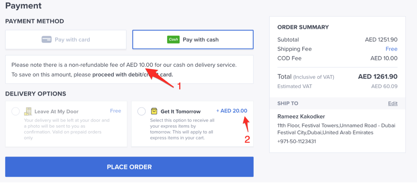
Extra payment for cash on delivery is not communicated at the “Pay with cash” button as it was done with the option “Get it Tomorrow”, displayed below. As a result, the changing total order amount creates confusion.
There are multiple elements of an eCommerce app you can test to find small UX inefficiencies, which cause user’s confusion or objections.
Determine what your page haven’t addressed
During usability tests, users can communicate what other information they lack to finalize the purchase. In some cases, the missing data can be much more important than the one you have already included on the page.
Here are some of the questions that users can be asking when proceeding to checkout:
- How long does shipping take?
- What payment options are available?
- What is the return policy?
- Where can I read product reviews?
- Is the website safe?
Make sure to answer them as you can end up losing website or app visitors.
Most importantly, it is easy to forget addressing them all at once, and that’s where usability tests can help explore those you haven’t covered yet.
In some instances, users might need a bit more visual information – a better product overview.
To answer this need, you can consider using more video content such as explainer videos.
Watch how Soak&Sleep are showcasing their product using video.
Formulate user objections and fight them
There are multiple reasons for users to choose one online store over the other. Objections are a contributing factor and a common denominator for deciding to look for a product somewhere else.
If you don’t want user objections to cause a horrendous churn rate for your eCommerce, you should apply usability tests to help spot these and think of overcoming them on your website or app.
Here are some of the most common objections users might have about online stores:
- The checkout process is too long
- Navigation is complex
- Unexpected costs
- Concerns about security
- The overall price is too expensive
- Delivery options don’t suit
- Better price elsewhere
If not addressed in due time, user objections can cause cart abandonment. That is why you have to spot the most common complaints and figure out how to answer them on product pages.
Let’s deal with one of the most common objections customers have – product price.
According to Statista, price is one of the biggest reasons for cart abandonment.
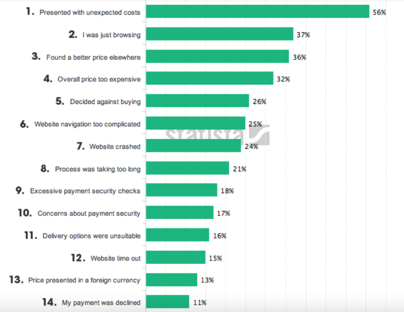
So how can you deal with the price dilemma if you can’t lower the price?
Consider incorporating a value-first pricing strategy.
This strategy focuses on bridging actual product value with what customers are willing to pay.
Often, customers won’t pay for the product because they don’t realize it. In other words, they believe the product is not adequately priced to the value it delivers.
Some eCommerce brands, such as Everlane, approach the pricing topic with radical transparency. This brand shows what a customer pays for by breaking down a product’s price into derivatives – materials, hardware, labor, duties, and transport.
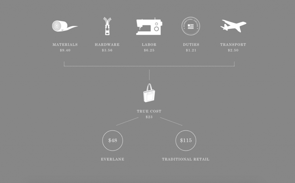
They later visualize what is the product’s cost before and after Everlane adds its margins. They are also showing how much a user saves by ordering with Everlane by comparing it to traditional retail.
Next steps
You have learned about six ways usability tests can help save development costs and improve the way your eCommerce application works and empower other stakeholders, especially marketing and management.
This is the time to communicate the power of usability testing to your colleagues and engage them in user research so that you can have a more substantial impact on the company’s bottom line together.
About the Author
 Margo Ovsiienko is a Growth Marketing Strategist. She creates content that converts website visitors into paying customers for SaaS companies and tech agencies with sales funnels.
Recent Posts
- How Construction Teams Manage Drawing Reviews (Without the Chaos) March 24, 2026
- Technical Writers Best Toolkit: Review & Documentation Calculator March 16, 2026
- User-Friendly E-Learning Review Tools: Trends for Teams in 2026 February 20, 2026
- Your Digital Asset Review Workflow Is Broken (And How to Fix It) February 3, 2026
- Best Practices for Efficient Document Reviews and Collaboration December 18, 2025
©️ Copyright 2025 zipBoard Tech. All rights reserved.


