How User Onboarding Can Drive Better Activation and Conversions
07 Oct

Table of Contents
ToggleUser onboarding means informing the user so that they adopt your product better.
But is that the only goal? Absolutely not. Onboarding is not just about ‘educating’ the user on how to use the product. If that were the case, why not just call it user-ed?
Onboarding is a chance to show your users that their goals can be accomplished better by using your product. In short, it is about communicating value to users.
Why onboarding is essential?
Onboarding is an essential part of every product’s interaction with the user, irrespective of whether the workflow is complicated or incredibly simple. The reason for this is not to spoon-feed the user about how things are to be done, neither is it to babysit their interaction with a new environment.
Every user that comes to a product do so because they have a need or a pain point. Products are the solutions for them.
So, users approach products with certain goals in mind. And the product lays down the path to reach that goal, becoming a key part of the user’s workflow. Every onboarding experience, done right, demonstrates to the user that their goals are achieved by using the product, which is the ‘Aha’ moment. To do so, it is important to take into account what motivates the user to use the product, and then demonstrating to them how they can accomplish that.
Once users see how valuable the product is in accomplishing their goals, they are more likely to explore it further and convert it into paying customers. This is why user onboarding helps not just in activating new users into power users but also in convincing them to convert to paying customers.
Onboarding to drive activation and conversions
Show value
One of the most important parts of onboarding is to reduce friction for the user to discover value. Getting users to the ‘Aha’ moment as quickly as possible is a great way to get them hooked; the lesser the distraction in their workflow quicker will be the realization of the value of the product.
Duolingo has a great example of this.
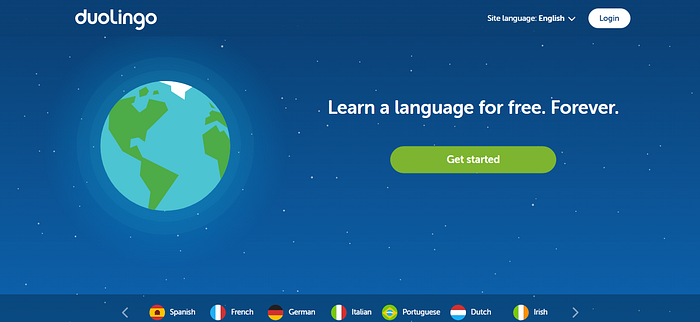
The landing page for Duolingo is clear and to the point. Users have come to learn a language and that is exactly what it offers, with a very clear button to get started. This takes them to a catalog of all the languages available, along with the information of how many users are currently enrolled in one particular language.

If you’re a Game of Thrones fan like me, then High Valyrian is the obvious choice from this selection! Beyond this, the users have to pick a goal that informs them about the estimated time commitment per day on their end, whether they want to make their goal public (aka Setup a profile via Facebook or their Google account), and whether they want to start with the basics or take a proficiency test.


And that is it.
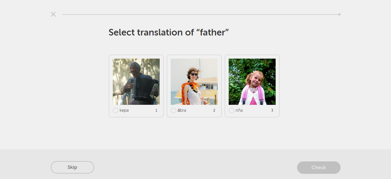
Boom, you’re now about to learn what father is called in High Valyrian.
Apart from the incredibly cool fact that there is now a way to speak like the people in Game of Thrones, what is notable here is that at no point does Duolingo make you take any steps that are not in line with your goal to learn a new language. There is no forced create an account or sign up page holding back the user’s progress. It’s sweet and simple and leads to the ‘Aha’ moment as quickly as possible.
In fact, only at the end of the first lesson does Duolingo prompt you to create a profile.
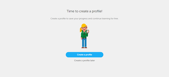
This prompt also carries a clear line about why you should be creating your profile and states the value proposition is that you can save your progress and continue learning for free.
Context and user expectations
Context and understanding user intention is important for good onboarding. While Duolingo is an example of a more personalized product, Atlassian’s products like JIRA, HipChat, and Confluence come on the other end of the spectrum in the SaaS (software-as-a-service) space.
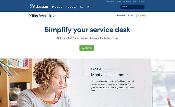
Users in the SaaS domain typically come with a more business-oriented approach. Atlassian’s own design guidelines break down the expectations for a SaaS user and the aspects of onboarding their team focuses on:
- Evaluation: Allowing the user to first try the product before they make a buying decision. Having a trial period is important in this aspect.
- User invites: The onboarding should be accessible to both new and old users. It should cater to a variety of different use cases in a clear manner.
- Product updates: Educating users about new features and changes in the product. Introducing the user to navigation changes and nomenclature with empathy.

Atlassian applies these principles by using a combination of removing friction in the sign-up form, in-app messages/tutorials, and email-based onboarding.


The language and workflow are crafted so that it is accessible to new users as well as experienced ones. To cater to new users, more advanced features are introduced progressively and not straight away, so that users are not overwhelmed from the outset.

For this reason, a special intro mode toggle is provided. Power users can turn it off to suit their needs.
Demonstrate benefits with examples
Showing actual value delivered to the user’s workflow through examples and suggestions can be a smart move to turn new users into power users. Basecamp is a good example here.

Both the landing page and sign-up page for Basecamp communicate the benefits that teams can derive from using a project management tool like Basecamp. Clear website copy like ‘How it works’ and ‘Real results’ are well written. So is the headline staring right in the face of new and returning users — ‘We’ve been expecting you.’ A subtle and effective way to get them hooked.
The sign-up page follows suit with clear numbers indicating the number of businesses that have come to Basecamp in just the last week looking for solutions like you, the new user. There are customer testimonials to reinforce and validate the faith users are about to place in them. The next five steps are interesting because they ask users for input like company name, types of teams, what kind of projects their team is working on, and gives them the option to invite team members.
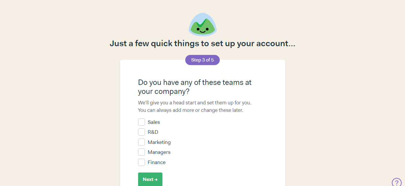
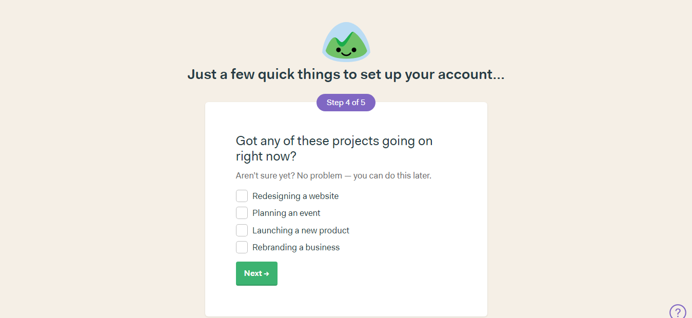
This adds extra steps between the user and their ‘Aha’ moment but this investment from the user is transferred into demonstrating benefits by setting up sample templates for projects and teams.
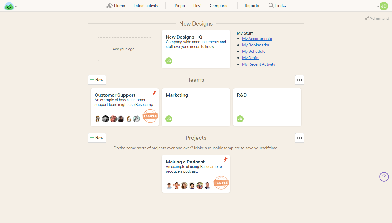
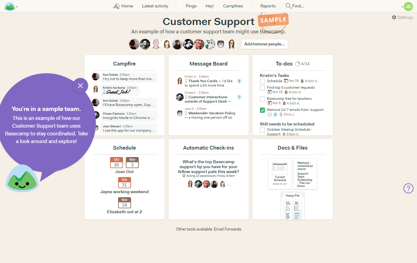
By showing the user how they benefit, the onboarding workflow has cut down on a lot of setups that would be needed from the user later on, like setting up their own team and projects. This cuts to the chase and users have a handy sample of how Basecamp is going to solve their problems, whether in marketing or R&D.
Running Experiments to Optimize Onboarding
Merely building a good-looking, covers-the-bases like onboarding is not enough. Given that onboarding gives a golden opportunity to convince users to convert, it would be a mistake not to optimize it. Let’s take a look at two examples of how experiments in onboarding helped boost activation and conversion.
ProdPad
Like a lot of products do, ProdPad started out by offering their users a 30-day trial period to get well versed with the product before they made a decision.
Apart from the conversion rate, however, they were also tracking the time-to-convert for their users. Using this metric they were able to determine with 85% of the users by Day 9, whether they would convert or not.
Since their users, on average, seemed to have decided in a week or so whether they wanted to pay for the product or not, ProdPad decided to halve the trial time to 14 days.
This doubled their conversion rate.
Based on their success with this, they decided to abandon the 14-day trial as well and moved to a 7-day trial followed by a reward system to unlock more trial days. For each step that the user completed in the trial, ProdPad extended the trial days by a certain amount of time.
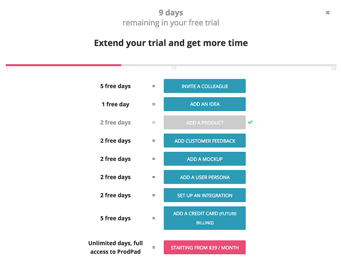
It still wasn’t a fixed onboarding workflow. Users could still try out various dashboard features as they wished, but by completing key, value-demonstrating tasks in the workflow, they were able to move towards unlocking more trial days.
By recognizing their audience and running a bold but effective experiment, ProdPad was able to optimize their conversions.
Canva
Canva is great graphic design software. Their growth team is always on the lookout for identifying opportunities to optimize activation. I really recommend reading this blog post to learn more about their growth process and how they execute it.
Canva found a growth opportunity in their poster feature, which was a high volume channel but had low activation rates.

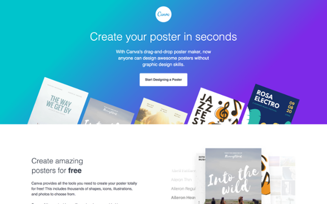
Xingyi Ho, who is the international growth lead at Canva, ran user tests to uncover pitfalls in the onboarding experience and then engaged users with surveys to better understand their needs and goals. Finally, he looked for patterns in the data and formulated the hypothesis that a personalized onboarding experience for users would help them branch to the correct path and help them reach their goals faster, thereby allowing them to discover the value in Canva quicker.
To test this hypothesis, Xingyi and the design team crafted a welcome message that initially showed up for 5% of new users. It contained options to start creating posters in the most popular categories, as uncovered by earlier surveys, like fundraising, holidays, advertising, events, etc.
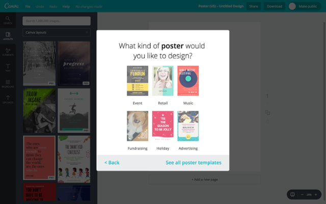
When Canva analyzed the results after 2–3 weeks of implementing this experiment, they found that personalizing the experience for users resulted in a 10% increase in inactivation. For a product like Canva, which has a massive user base, that is a considerable increase.
Onboarding is constantly evolving
Optimizing onboarding is a constant endeavor. This article on Inside Intercom discusses the factors that influence onboarding. The key aspects that shape how a user goes through onboarding are:
- Context
- Time
- Behavior
All these are dynamic. As the product evolves and more functionality is introduced, the context of workflows changes. Every user works through the product at their own pace and so there is no fixed time that can be generalized across user segments. Instead, users can be nudged in the right direction with prompts that are in line with their motivations and goals.
As your user base expands, so will the persona that the onboarding is catering to. To keep up with the ever-evolving needs and motivations of the audience, it is important to look for ways to craft better onboarding experiences and keep experimenting.
To demonstrate the impact of onboarding on the business goals, it is worth revisiting Atlassian’s example. When Atlassian launched its IPO in 2015, revenues had grown to almost $320 million thanks to a low-touch funnel that converts users into paid users at an incredible rate. A large reason behind this is the clear and concise workflows in each of their products and the nudges to make users understand the value of these products.
Resources that can help with onboarding
- useronboard.com : Extensive and insightful teardowns of the onboarding of many products and services.
- Intercom : For creating effective onboarding campaigns and educating users. Also a wealth of knowledge on their blog.
- Appcues : Run experiments and create quick onboarding workflows to test with users. Their blog is another great resource.
- zipBoard : For gathering feedback from both design teams and customers on workflows and product experience.
- Customer.io : Trigger customer engagement with targeted messages based on their behavior.
- Inline Manual : Create walk throughs, tooltips, launchers and support articles to assist your users as they discover the product.
- Userlane : Automate and personalize user onboarding, as well as staff training.
- WalkMe : Digital adoption platform to ensure user success with intelligent guidance.
- Whatfix : A performance support platform to ease onboarding, improve support and reduce training effort for users.
- TourMyApp : Increase user activation by creating in-app tutorials.
- Tutorialize : For website owners, front-end engineers and training managers to educate and engage with their audience, whether that’s new site visitors or employees.
Related Post
Recent Posts
- How Construction Teams Manage Drawing Reviews (Without the Chaos) March 24, 2026
- Technical Writers Best Toolkit: Review & Documentation Calculator March 16, 2026
- User-Friendly E-Learning Review Tools: Trends for Teams in 2026 February 20, 2026
- Your Digital Asset Review Workflow Is Broken (And How to Fix It) February 3, 2026
- Best Practices for Efficient Document Reviews and Collaboration December 18, 2025
©️ Copyright 2025 zipBoard Tech. All rights reserved.


