7 Web Design Tips to Increase Lead Conversion
25 Feb
Table of Contents
ToggleConverting a lead doesn’t happen in a wink. Rather, lead conversion is a journey during which prospects make a few pit stops, all equally important to successfully reaching their destination.
However, pit stops often turn into pitfalls. Namely, recent data suggested that an average lead conversion rate falls between 2% and 5%.
In addition, studies show that around a fifth of leads are ready to do business after only one contact with a brand, whereas the majority requires six to eight touchpoints before converting.
While leads may drop the conversion journey for a variety of reasons, such as price or project conditions, there’s one touchpoint that businesses can optimize to increase their lead conversions.
A Stanford University study suggested 46.1% of users judge a website’s credibility based on its design. In other words, nearly half of potential leads will drop their conversion journey if the site is outdated, unintuitive or misleading.
Converting leads is the backbone of any successful, growing business. Therefore, we will discuss the best ways of optimizing your website design for lead conversions.
Optimized Page Loading Speed for Lead Conversion
A study by the Aberdeen Group suggested that every extra second in your page load time results in a 7% drop in conversions. So we guess it turns out Google isn’t the only one that cares about page speed – users do too.
Yet, even though the significance of having a fast website is a story already told, many sites still struggle to reach the two-second load time.
Leads are on the lookout for a solution to their problem, and they want it instantly. The internet users’ impatience indicates a new norm that websites need to follow if they wish to stay relevant and convert leads.
Lightweight pages, accessible and able to fully load within a couple of seconds, even on slower network speeds, immediately boost the reputation and trustworthiness of a brand.
While drag-and-drop website builders can help create beautifully looking sites, these tools could never achieve the performance custom web development can bring to the table.
Limited Choices Prompt Faster Action
Named after the British psychologist William Edmund Hick, Hick’s law is a theory frequently leveraged in web design.
According to Hick’s law, a person will take more time to decide if they’re given more choices.
In web design, Hick’s law translates to limiting options that may disrupt the user from performing the desired action. For example, we could apply this theory to the navigation menu by decreasing the number of links the user can click on, increasing the lead conversion.
In addition, your landing pages websites should send leads to a single product rather than a category page.
Landing on a web page with abundant products will steer the attention away from the user’s primary objective – converting. It’s more likely that the prospective lead will get disheartened and abandon the website before performing any action.
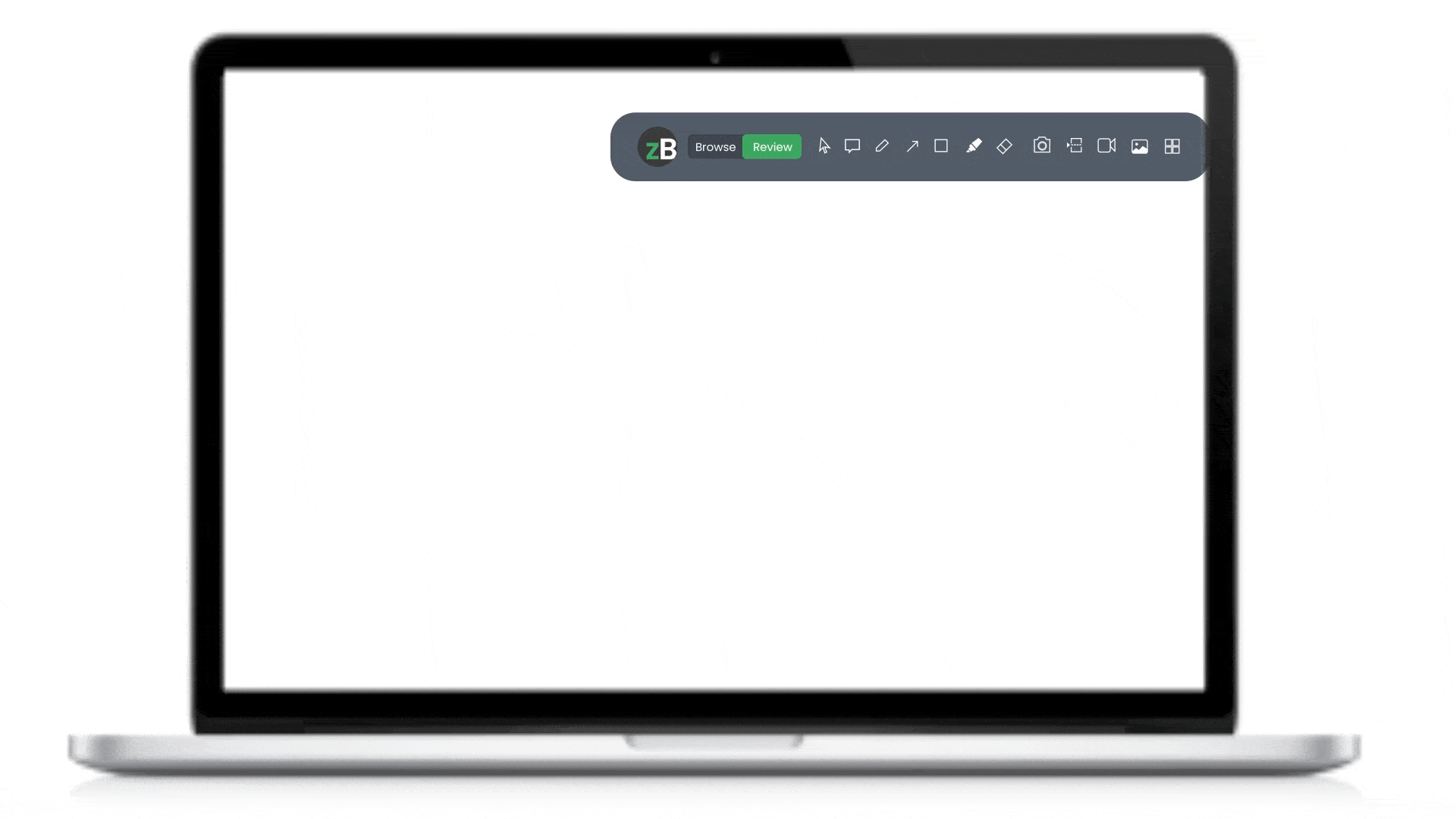
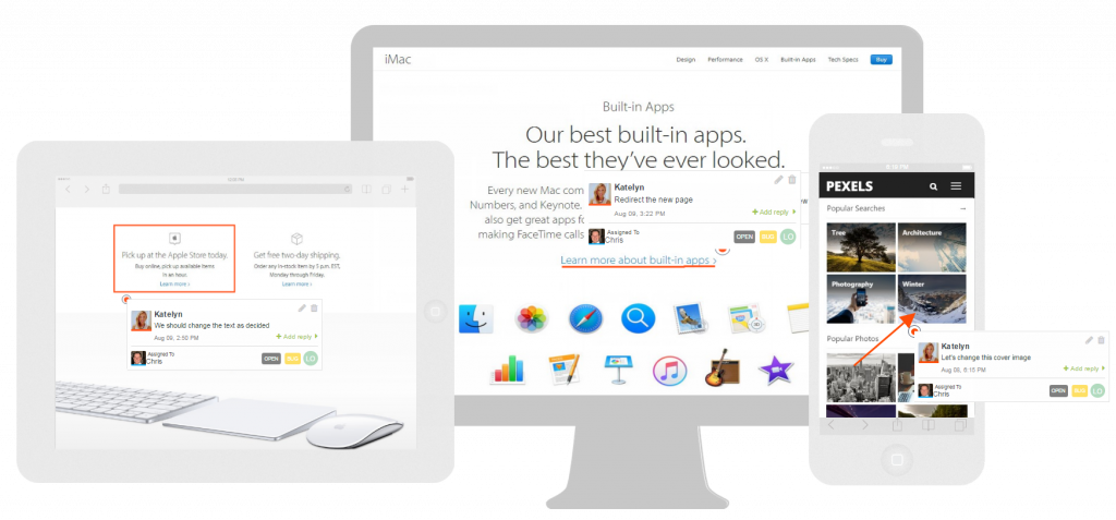
This is why getting your site reviewed by experts before publishing is always a good choice. With a visual review tool like zipBoard, you can easily get contextual feedback on your live/static page.
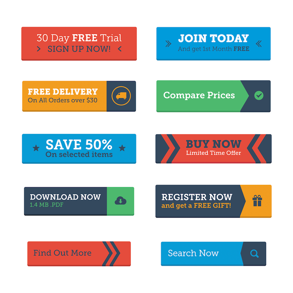
CTAs: Unique, Clear, and Early
Calls-to-action is just as important, content- and design-wise – as any other website element.
CTAs give that final nudge to leads to open their hearts (and wallets) to a brand; thus, they ought to be crafted masterfully.
CTA buttons don’t necessarily sell. Depending on the business or web page, they can convert leads by asking them to subscribe to a newsletter, leave contact information, become followers on social media, etc.
Regardless of the specific conversion action, there are some general CTA design practices to follow on landing pages.
First, each landing page should have multiple buttons yet a single CTA. In other words, one landing page should promote one action only, whether that’s a purchase, subscription, etc.
Focusing a page on a single call-to-action prevents prospective leads from getting confused about what they should do now they’re on the page.
Conversely, repeating the CTA multiple times while the user is scrolling reinforces the message and encourages them to click on the button.
CTA buttons should start above the fold so that users can instantly understand which action they ought to take. In addition, the buttons should be prominent and clickable – features especially important on smaller device screens.
So, make sure you take care of the responsiveness of your site. Many users will visit your site from a mobile or a tablet. Many even use a mobile-first development approach for this very reason.
Instead of generic copies such as “Learn more” or “Sign up,” CTAs can be funny, personalized, controversial. Nevertheless, they must remain unambiguous, as users need to be informed as to what their click implies.
Social Proof Convinces Leads to Convert
According to the ReviewTrackers research, 6 out of 10 consumers read customer reviews, and 94% of them decide not to convert after reading a bad review.
Reviews and testimonials are a great way to show off business professionalism and expertise through the words of those leads trust the most – others just like themselves.
eCommerce websites should integrate comments and reviews sections on their product pages. That way, potential leads can instantly see other users’ experiences. Moreover, allowing reviews on the website makes the site transparent and thus more trustworthy to users.
Client testimonials should take centre stage when designing a website for a service-providing brand. In addition, testimonials that convert contain a key phrase that emphasizes the purpose of the landing page.
This is why brands spend so much energy on creating case studies. They give social proof of work to your potential buyers. Showing that the product works and isn’t just fancy words. Like this case study, we did on an e-commerce agency that used zipBoard for their e-commerce website reviews involving multiple collaborators. This particular case study has helped us gain multiple leads and potential clients as they can see first-hand the effect of zipBoard for website review purposes.
For example, a page that sells Magento online shop development ought to sound something like: “Reliable and expert Magento eCommerce developers that brought my business to life.”
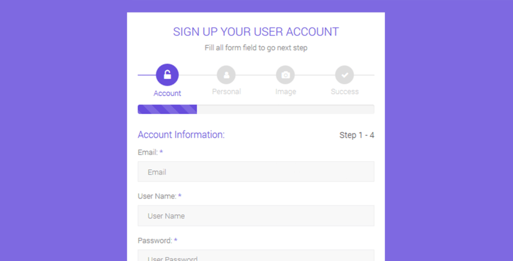
Fewer Form Fields Boost Lead Conversion
Quicksprout’s research found that limiting the number of form fields on a website significantly reduces lead abandonment rates. Moreover, by removing a single field, websites can increase their conversion rate by 50%.
In addition, 37% of people will leave a website form asking for their phone number. Yet, making the field optional nearly doubles the form fillups.
Numerous factors impact why leads quit converting at the last step – lengthy forms, privacy concerns, password fatigue, lack of access to the needed information, etc.
A website design optimized for lead conversion alleviates the form filling process by:
- Cutting the number of required fields
- Asking only for the necessary information
- Enabling auto-population of form fields
- Stating how user data will be processed and used
- Integrating random password generator
A more user-friendly solution to long website forms is a multi-step form. Multi-step forms are less overwhelming as users can’t see their real size.
In addition, splitting one long, straight form into individual questions appears more straightforward and not distracting.
Personalized User Experience for Better Lead Conversion
Website cookies collect invaluable data about leads, such as their location, age, behaviours, and interests. This data allows a deeper understanding of the lead persona and thus aids in comprehending their wants and needs.
Better Marketing noted that 94% of companies experienced a rise in conversion rates after personalizing their websites. Another study found that conversion rates increase with the number of personalized page views.
For example, visitors who viewed three personalized pages had a conversion rate of 3.4%, double the rate of those who visited two pages with personalized content.
Personalization can be applied across various aspects of website design. For example, once a user creates an account, the website can automatically integrate their names into the CTAs or offer products based on cookie data.
In addition, websites can fetch data about the users’ referral source and serve web copy based on that information. Another method of personalization that can nudge leads to conversion is adjusting content to users’ geolocation, device type, or time of day.
Creating an impression of familiarity with the user builds trust that quickly transforms into a conversion.
Still, businesses should be transparent about how and where they will utilize user data. For example, dedicating a website section to explaining data collection and processing to site visitors can save companies a lot of headaches.
The Rule of Thirds for Lead Conversion Boosts
The Rule of Thirds is a famous photography principle of visually dividing an image into thirds, both vertically and horizontally, to make nine equal parts.
The rule suggests that the four middle intersections are the areas where a viewers’ interest is drawn to. So, photographers use these four points to strategically place their image focus.
In terms of web design, the intersections can be leveraged to place the most important elements and thus get visitors to focus on them. In the above-the-fold view of a website, the intersections should be used to place CTAs, testimonials, images, etc.
The rule of thirds helps in understanding where not to place certain elements. For example, the navigation bar shouldn’t be anywhere near the intersections as it may distract leads from performing the desired action.
Also, performing AB test and UX research before deploying the site is always a good idea.
Get Visual Feedback on Your Webpage
See how using a visual review tool for your website can boost lead conversion. Start your free trial or book a demo today.
Book DemoStart Free TrialFrank Garnett is a digital marketing blogger and technology enthusiast. He picked his first computer at the age of five and hasn’t stopped exploring the internet and writing about it ever since.
Related Post


Recent Posts
- Procore Alternative for Small and Mid-Size GCs: What You Actually Lose (and Don’t) by Switching July 23, 2026
- Protected: How TMS Brazil Transformed Digital Content Review with zipBoard | Case Study July 15, 2026
- The Ultimate Guide to Online Document Collaboration Software for Construction July 14, 2026
- Document Collaboration for Efficient Workflow Management July 6, 2026
- Subject Matter Expert (SME) Review: A Complete Guide June 30, 2026
©️ Copyright 2025 zipBoard Tech. All rights reserved.