A Guide to Understanding Micro-interactions for Improved User Experience
08 Jul

Table of Contents
ToggleWhen you click send on an email, you expect some confirmation that your message has been sent; perhaps a pop-up with “message sent” or a sound effect to signify the email has been sent on its way.
When you “like” a post on social media, would you feel apprehensive if there was no feedback that your interaction had been received? A highlighted “like” button or a heart popping up on the screen confirms your action and instantly reassures you.
These little touches we encounter online are referred to as micro-interactions, and they are a hugely important part of good web design. Because they are such a small detail of UX design, they are often overlooked, but micro-interactions are the building blocks of an excellent user experience.
These dynamic interactions might be small, but they can have a huge impact, so it’s essential to understand them. In this post, we will cover:
- What micro-interactions are
- The four components of a micro-interaction
- Types of micro-interactions
- The benefits of using micro-interactions
Let’s get started!
What are micro-interactions?
A micro-interaction describes a small and subtle interaction between a user and a digital product. They are usually triggered by the user and serve a specific purpose, such as to provide some feedback throughout the user experience.
As we touched on in the introduction, one of the most recognizable micro-interactions is the confirmation you receive when you “like” a post on social media. Depending on the platform, the button might change color or become highlighted, or perhaps you will hear a sound effect or see a heart pop up on your screen. This lets you know your action has been recorded.
Although they are subtle, micro-interactions serve an important purpose. With these tiny interactions between the user and the digital product, you can build strong client relationships and improve the user experience.
The four components of micro-interactions
Micro-interactions consist of four components:
- Trigger
- Rules
- Feedback
- Loops and modes
Whether you use a web design tool or design your website from scratch, it’s important to understand these components.
In this section, we will examine each one in more detail.
Trigger
The trigger is the action that initiates a micro-interaction. It can come from the user or the system.
User-prompted triggers (sometimes referred to as explicit triggers) might include clicking a button, refreshing the page, filling out a form, or hovering over a link.
For example, when a user hovers over an article link on Forbes, the headline is automatically underlined.
System-prompted triggers or implicit triggers might include notification badges or automatically updating information based on a predefined condition.
Rules
Rules are the instructions that guide a micro-interaction and define what happens after the trigger is performed.
Rules guide how the system responds to the trigger, as well as user constraints (i.e., what the user can or can’t do). For example, after receiving a notification on the screen, the user can decide whether to view or delete it.
Feedback
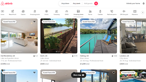
Feedback is the visible part of the micro-interaction that lets the user know their task is complete. This might be visual or audio-based (or both). For example, an on-screen button may change color or shape, or users may hear a sound effect to signify their action has been recognized.
An obvious example of this in action is on the Airbnb website, where the category buttons change color and size after a user clicks them.
Loops and modes
Loops and modes define what happens during and after the micro-interaction. They help to create a more dynamic and personalized user experience.
Loops set the duration of the micro-interaction. For example, saving payment card information or remembering your username means that the trigger will result in a modified response next time.
Modes define the different states and variations of a micro-interaction dependent on the user behavior or a change in circumstances (e.g. change in location or browsing history).
Together, loops and modes improve the user experience by providing more intuitive and personalized interactions.
Different types of micro-interactions
It would be impossible to provide an exhaustive list of micro-interactions. As technology evolves (hello generative AI applications), new types of micro-interactions are constantly being created.
However, it is useful to understand some of the core types of micro-interactions.
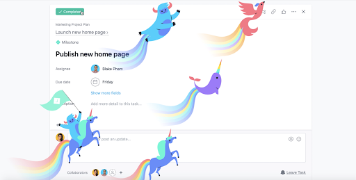
- Single animations: Engage users with a single animated detail in response to a click, hover or tap. They provide immediate feedback and acknowledge the user’s action. Asana’s celebration creatures are a prime example of this. When a user clicks the ‘Complete’ button on a task, one of several animated icons dances across the screen.
- Page animations: Encourage users to explore your website or application by adding engaging elements such as swipe effects or page transitions.
- Page status: System-initiated micro-interactions such as loading wheels or progress bars that let your users understand the status of the page they are interacting with.
- System feedback: These micro-interactions provide audio or visual feedback to users based on their actions within the system.
- Data input: Guides users through actions such as signup forms and contact processes with helpful micro-interactions. These can increase user satisfaction and reduce abandoned forms.
- Error messages: Micro-interactions related to errors are used when a user encounters an issue on your system. This could include a visual cue or a message containing information about the error and how to resolve it.
The benefits of using micro-interactions
Just as a virtual call center solution can improve your customer service, micro-interactions can improve your user experience. We’ve explored exactly what micro-interactions are, but let’s delve a little deeper into the benefits of using them in your web design.
Improved usability
While exciting graphics, fun animations and eye-catching page transitions will bring your website to life, it is the usability of your site that really matters. In fact, 49% of consumers have left a brand behind due to poor user experience.
Micro-interactions improve usability by adding functionality and feedback to help visitors navigate the site and get what they need from it.
For example, simply using a highlight effect when a user hovers over a link helps them to know the link is active and clickable. Patagonia does this with a simple hover effect that triggers a new Shop button.
Increased user engagement
Using micro-interactions makes your site more intuitive and engaging. This encourages users to keep exploring and to stay longer on your site. The added interactivity and responsiveness that come with them lead your visitors to engage more with your website and foster a sense of connection to your brand.
Online sustainable pet brand Beco combines subtle micro-interactions with social proof to drive engagement. A grid of customer social media posts are displayed on the homepage. When a user hovers over a featured post, it triggers a shopping bag icon. The subtle change makes it obvious to users that they can interact with the image, giving them the option of shopping directly for the product shown in the post.
Boosted user satisfaction
Naturally, if you improve usability and increase user engagement, you will boost user satisfaction. By using micro-interactions throughout your web design, you guide users through a seamless user journey, and, therefore, your visitors will be more satisfied with their experience.
Ensure your beta testing addresses bugs and usability issues by testing that micro-interactions are fit for purpose and will boost user satisfaction.
Clear communication
While there are many examples of AI in communication, micro-interactions are actually a form of communication with your website visitors. After all, they are a type of interaction. Helping to convey information concisely and efficiently, micro-interactions keep visitors informed and reduce ambiguity when they navigate through your site.
For example, an error message that prompts a user to fix a mistake in a form is valuable feedback for users. A loading wheel lets customers know that the content they are looking for is on its way or that their action is being processed.
By providing real-time feedback, micro-interactions improve communication with your visitors and help to improve the user experience.
Prevented user errors
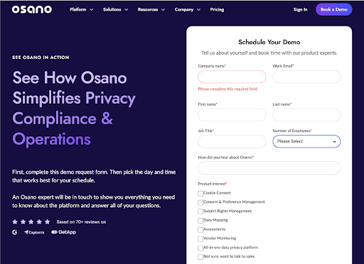
Micro-interactions help prevent user errors by providing constant and valuable feedback throughout the user journey. When errors occur, the right type helps users solve their issues quickly.
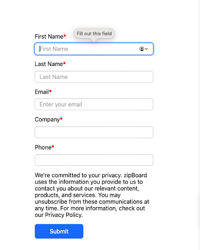
For example, a user might input invalid information into an online form or not complete all required fields. A micro-interaction may display the information in red or highlight missing fields to indicate that something isn’t quite right. Perhaps an error message will be displayed to explain how to solve the issue.
Our form micro-interactions do this in a simple yet intuitive way, prompting users to complete the required fields with pop-up alerts.
Clearly, this helpful form of micro-interaction can reduce user frustration and result in a better overall user experience.
Develop brand identity
Micro-interactions help to give your web design some personality. By carefully embedding micro-interactions throughout your site, not only do you improve the user experience, you also develop your brand identity.
You don’t have to go all unicorns blazing like Asana does. Adding a loading bar in branded colors, incorporating on-brand wording into error messages, or adding animated CTAs themed to your offering are great ways of tying in your style and tone for brand cohesion.
Whatever you do, match your micro-interactions to your brand values and show off your brand personality. Perhaps your interactions show off the playful side of your brand with unique sound effects or visuals. Or, for a more serious brand, your micro-interactions can help to build credibility and professionalism.
Final thoughts
By incorporating micro-interactions into your web design, you can increase usability, improve user engagement, and boost user satisfaction. Your website visitors will feel more connected to your brand and will be happy to visit your site again and again.
Micro-interactions can drastically improve user experience. From the small touches that bring your web design to life to the essential feedback that reduces user errors, micro-interactions should be a key element of your web design.
Related Post
Recent Posts
- The 5 Best SCORM Review Tools for 2026: Why Friction-Free is Winning April 14, 2026
- The Project Manager’s Guide to Drawing Approvals and Submittal Tracking April 10, 2026
- How Construction Teams Manage Drawing Reviews (Without the Chaos) March 24, 2026
- Technical Writers Best Toolkit: Review & Documentation Calculator March 16, 2026
- User-Friendly E-Learning Review Tools: Trends for Teams in 2026 February 20, 2026
©️ Copyright 2025 zipBoard Tech. All rights reserved.
