21 Nov

Any tricks on websites and apps that make users sign up for or buy things they did not intend to, or mislead and manipulate users are called dark patterns.
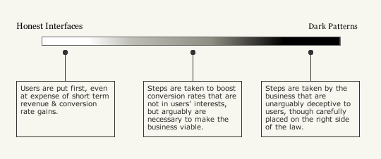
Dark patterns in design are one end, an ethical issue. How fair it is to try and push the user into a direction that benefits your goals is still debated. In some cases, there’s a fine line between prompting the user for more active engagement or tricking them into diving deeper. In other cases, dark patterns can simply be misleading and manipulative.
However, from the point of usability and user experience, dark patterns are not a good practice either. Even if they may result in short-term gains, there are long-term consequences that are difficult to mitigate.
Dark Patterns in the Mainstream
The case of LinkedIn settling out of court for spamming users is perhaps the most well-known example of dark patterns coming to the fore in the mainstream.
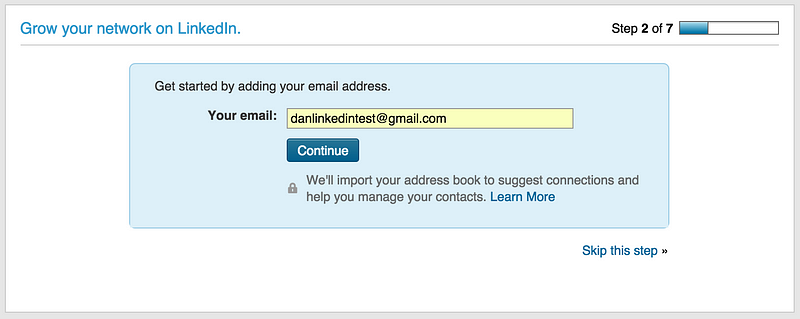
In 2015, LinkedIn was ordered to pay $13 million in a class-action lawsuit for automatically sending invites and reminders to contacts in a user’s account, despite claiming in the sign-up process that LinkedIn does not store the password and email without their permission. It would do this under the guise of importing the user’s address book, as shown in the image above. Such design decisions led to a number of users calling out LinkedIn and even stopped using the service altogether.
The damage for LinkedIn was steep financially. But other than that, any service employing subtle twists in design to mislead and manipulate users also damages the trust that users place in their interaction with the platform or product. This is a core part of the user experience. When a user starts using any product, they are intrinsically placing their trust and investing in the product by providing personal details, such as name, email, etc., and more importantly, their time and intent.
Of course, since then LinkedIn has corrected its mistake and even changed its UI almost entirely, but dark patterns can still be found in many corners of the internet.
Let’s look at some common practices to trick users how they impact the user experience.
E-Commerce Dark Patterns: Hiding Information
A lot of dark patterns emerge in e-Commerce workflows, maybe because new and amateur users are less likely to doubt the veracity of what is being shown to them. The hospitality industry and airlines, in particular, have a bad reputation when it comes to misleading practices aimed at making the user pay extra or hiding information that would otherwise make them better placed to make a reasonable decision.
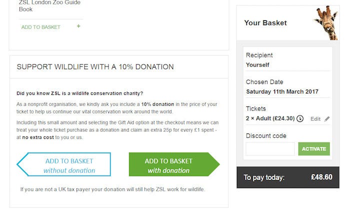
Burying information to mislead users
British Airways, Southwest Airlines, Aer Lingus, and Ryanair are some of the examples when it comes to airlines.
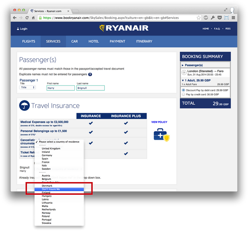
From highlighting fares as lowest when they are not the lowest overall (rather lowest in a particular seating category) to misleading opt-ins for purchasing insurance (and displaying it in a way that makes it seem necessary when it is in fact, not), airlines are among the trickiest.
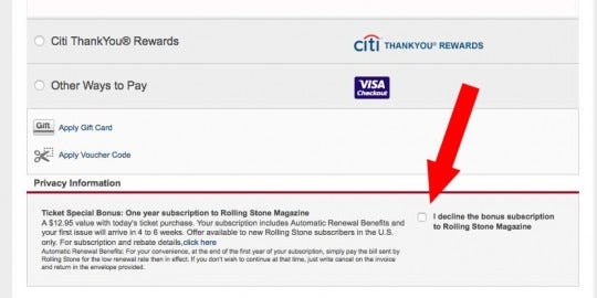
The image above comes from a Livenation booking screen that requires users to click separately to opt-out of a bonus Rolling Stone Magazine subscription and decline to pay the additional cost. Such automatic charges that are levied without the knowledge of the user were found out once the user’s started to see extra charges being levied on their credit card every month.
Skewed Reviews for hotels
Booking.com is another service that was reported for using such practices.
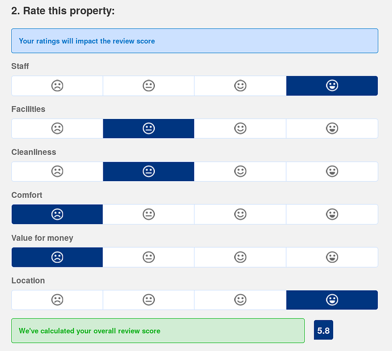
One such practice is boosting the review score of a property despite low ratings and another is hiding negative reviews in fine print so that they become difficult to find.
Newsletters Dark Patterns: Language and Visibility
While not all dark patterns are done for monetary gains, that is often the end goal. It starts with engaging the user and newsletters, many times, become the first touchpoint for this.
It is curious to note the language and placement of the user interfaces for these interactions.
Making it difficult to opt outsource: Dark Patterns by the Boston Globe
For example, the image above is from a user trying to unsubscribe from The Boston Globe last year. The newspaper makes things easy and simple when it comes to subscribing to their paper. Everything related to the subscription can be handled online except unsubscribing. In order to unsubscribe, users have to call in rather than be able to do so from their site.
Confusing statements
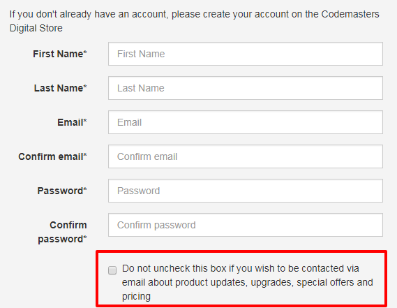
Notice the language used for subscribing (or unsubscribing?!) to emails about updates and special offers. Such complex language may sure lead to many people subscribing to emails if they are not sure.
But more importantly, from a usability perspective, it’s a needless hassle trying to decode what the double negative means and moving on with creating an account. If the idea is for the user to get started with the service as quickly as possible, then this is not helping.
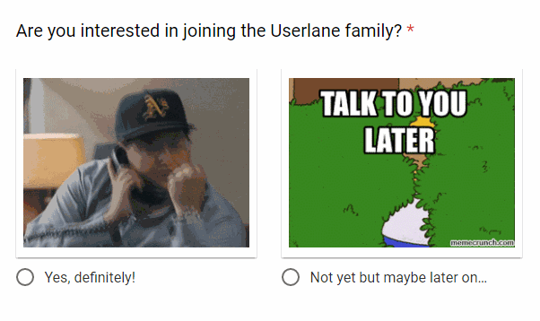
Not-so-kind wording
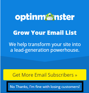
When designing pages that can be the first interaction a user has with your product, designers would like to leave them with an endearing first impression. But the language to differentiate and make a product memorable needs to be chosen carefully. The image above from optionMonster is one example of an interaction, that I think, could be more courteous to its users. Rather than having a reply like “No Thanks, I’m fine with losing customers!”, which in their defense could be well intended in jest, a creative but positive alternate will leave a better impression on the user. Like this one from Userlane:
Some of the other common dark patterns that users may come across are:
Bait and switch
This is commonly seeing during flash sales or festive period offers when users are attracted to a page with the promise of a discount on some item. Once they land on the page, users see that the item is now out of stock but there are multiple suggestions for buying alternatives that have a higher price than the item originally advertised.
Forced continuity
Nudging users into selecting an option by suddenly changing the layout of similar-looking buttons.
Because many users would perceive the green forward button to mean that it is the “right way” to continue, they may end up moving on with the donation added to their payment even without meaning to.
Much like the example of Livenation given above, hidden charges are added to the checkout workflow so that users may end up paying for more than they needed or intended to.
Roach Motel
Think of the newsletters that you so often come across which are notoriously difficult to unsubscribe from. It is named so because it’s easy to opt into but not so easy to opt out of services.
A clever trick that platforms use is to insert a “subscribe to newsletter” checkbox during a signup or purchase cycle. Users often notice they continue to get newsletters even though they keep unsubscribing. This is because that one subscribes checkbox actually signs up the user to multiple newsletters, each of which has to be unsubscribed from individually.
How dark patterns are bad for the UX
They violate the user’s trust
When the user comes to a product, they do so looking for a solution. By using the product, investing in it with their time and personal information, users presume that their problem is being solved.
The downside of violating a user’s trust is not just grounded in ethical arguments but also in the long-term business lost when a user notices extra charges on their card or the irritation of having to unsubscribe from continuous spam in their inbox.
Show lack of empathy for the user
One of the most commonly evangelized ideas of designing for people is empathizing with the end-user. Using dark patterns is certainly not doing so.
This can also be traced to the underlying problem that a lot of designers do not have the final word in strategic decisions. Founder of darkpatterns.org, Harry Brignull, put it quite well in an interview about the ethics in design:
The problem is that most designers just don’t get to have a say in strategic decisions for their employer’s business practices.
In many cases they’re handed tactical work, and the product owner is treated like a client who has to be kept happy. We all know the story. “Move that there” “- Uh, I don’t agree but okay whatever, you’re the boss”.
Increase friction in the workflow
The most obvious problem is that dark patterns add friction to the workflow. If the goal of design is to ensure that a task is completed as quickly and as effectively as possible, then dark patterns hamper this.
Compare a design that automatically subscribes a user to extra services versus one that gives users the option to subscribe of their own accord, without pushing it down their throats. In the first case, users have to take extra action to opt out, adding one more step between the task being completed. In the second case, the users face no such barrier and can complete their workflow even without the extra step.
Limit transparency
Hidden information that is displayed at the last point, or worse, buried under buttons and fine print will make the process less transparent and more cumbersome for the user.
A UI where users have to second guess their actions and backtrack to discard options they did not select, is not great for the user experience. In almost every situation, users are likely to reward transparent interactions rather than come back to muddled and misleading platforms.
Amazon is well renowned for its clean and clear UX, which informs the user of all the shipping charges, processing charges, estimated time of delivery in a well-organized manner so that it is easier to make a purchase decision.
Conclusion
Rewarding the user’s investment into your product with clarity and simple workflows is always better than trying to trick them. Some of the most common design patterns that mislead and misinform users have been captured on darkpatterns.org.
Some people may shrug off criticism of dark patterns as naive but look at any long-running business that sustains its relationships with users and customers. It’s based on managing business goals to align with customer success.
Other UX article you may like:
Hamburger Menu: A Headache To UX?