eLearning Quality Assurance Checklist with use cases and examples
04 Aug

Table of Contents
ToggleeLearning QA is the final and most important process in the eLearning development process. Quality Assurance makes sure that a defect free eLearning course is published. eLearning QA improves the learners experience and leaves a lasting experience on the learner.
However, eLearning QA is a complex process as there are numerous things to be checked. And keeping all the QA check in mind is not possible. So in order to simplify things, one should use a checklist while doing the eLearning QA.
We have created a comprehensive checklist which you can download for free.
For now let’s discuss some examples related to this QA review.
All the assessments are categorized in segments based on the type of element to be tested.
Turn on audio👆
eLearning content development quality assurance testing checklist
1. Instructional Content – Using learning and instructional theory to ensure the quality of instruction
2. Grammar and Typography – Testing related to fonts, grammar rules, spellings, and consistency in brand styles
3. Visuals of the online content – Graphics and Images – Assessment related to Effective use of graphics and visual to enhance the experience of eLearning content
4. Audio, Voice over, and Music – Assessment related to audio, voiceover, and background music for enhancing effectiveness of eLearning
5. Course Navigation – Testing navigation of course content, best practices for navigation
6. Interactivity – Testing the interaction of various features and functions within the course.
7. Quiz and Assessment – Testing the quality of quizzes and scoring users, also some best practice mentioned.
8. Technology – Assessment of cross-browser compatibility, LMS compatibility, etc.
9. Accessibility Testing – Assess whether the course is compliant to be used by users with any kind of disability.
Instructional Content (Questions related to course content only)
QA is not just about proofreading but also making sure that all modules and lessons are arranged in the correct sequence. Also there should be proper instruction as to how to take the course. This allows the learner to understand the index and navigation of the course so that they do not feel lost. This is especially necessary if the online course is going to be a self taught one.
1. Content is accurate:
Make sure every lesson and module is labelled correctly and grouped within correct modules. All of these modules are sequentially listed in nested format in correct order. This allows the learner to look at the whole course in one go.
2. Content is sequenced logically:
Every lesson and module of an online course should be logically sequenced. For eg. for every module/lessons the introduction should come as the first chapter and not last. Similarly all quizzes and tests should appear only once the relevant information has been taught. Similarly even the content taught inside each lesson should be put in order starting from basics to complex ideas. While planning the sequence keep yourself in the shoes of the learner and think as if he/she doesn’t know anything about the subject. And from where they would want to start their learning.
3. Instruction to participate in the course:
Instructions are crucial not only in an online course but in general a instruction guide or user manual is given with every service or product. This has to be there so that the learner knows how to get the most out of the online course, how to navigate, take quizzes, fill information, and interact with other elements of the course. If the course is going to have tests and exams at the end then let them know how to take the quiz, how to mark answers, how many attempts they can give, what’s the time limit etc.
Calculate Your eLearning Content Development Cost
Ever wondered how much money and time you spend developing your learning content?
Download the CalculatorGrammar and Typography
Examining your content for just typographical mistakes is not enough. A through grammar check should include checking all the below points.
Missing titles :
Check all the headers and titles are present. Title should be big and bold and should be clearly identifiable as a header/title.
Missing punctuations:
Not having punctuation in the right place in a sentence can possibly change the complete meaning of that sentence. You sure don’t want that to happen. Make sure punctuation is placed correctly and consistently. Some of the common punctuations used are full stops or periods, comma, colon, semicolon, question mark, exclamation, brackets, braces, apostrophe, hyphen, quotation marks.
Text positioning:
Consistently positioning text is important especially where there are visual/ graphics involved. For eg. There are multiple images on a slide and the text is spilled all over the place, this can confuse the learner as to what content is related to which visual and wrong information can be perceived by the learner.
Spelling mistakes:
The most common of all mistakes in grammar that we all are guilty of is spelling mistakes. This is very common but can change the meaning of the sentence completely. For eg. expect, accept might sound similar and look similar but have completely different meanings. There are even some words that are spelled the same but have different meanings based on the context. These are called homonyms. For eg. book, which refers to a book that can be read, but the same exact word also means the act of making a reservation. That’s how english can be tricky sometimes.
Content review: Missing acronym definitions:
There are certain words made from the initial letter of other words to put forward a set of words in a few letters. For example ADDIE – which stands for Analysis, Design, Development, Implementation, and Evaluation. Now if you belong to the eLearning industry you would have known if already but about someone reading ADDIE for the first time and is completely clueless what it means. So make sure that the acronyms are defined.
Casing of words:
Casing of words (Uppercase / Lowercase) can simply be defined as capital letters and small letters. You can check in detail why and how to use letter casing here.
Missing/ broken links:
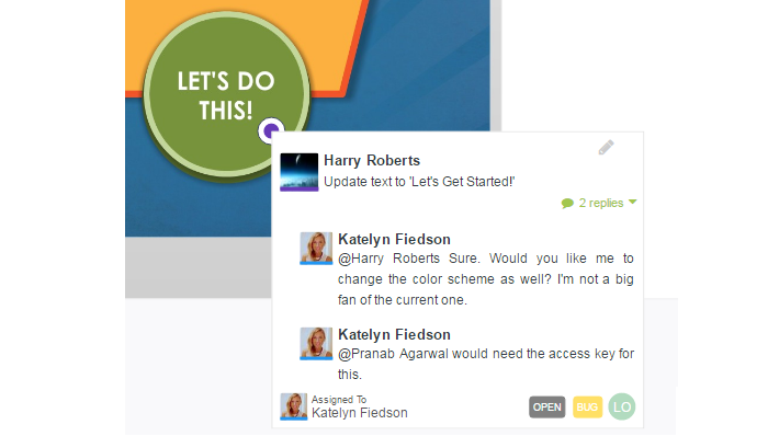
This is not exactly a grammar check but it makes a part of text so is included in this section. Many times for additional reading or reference we add links to external sources. Make sure these links are not broken. Not just the external links but there could be internal links pointing to different modules or lessons, or links to downloadable etc. Check all links points to the right resources. In zipBoard you can simply annotate and highlight on your content were links needs to okay, leaving no confusion at all
Visual of the Online Content - Graphics and Images
The next important element to check after checking typography and grammar is visual, graphics, etc. Visuals bring life to the plain boring text based content. It is scientifically proven that visual aids in any form of learning. It is therefore important that the eLearning content uses enough visual and graphics to explain an idea. But it is also important that visuals are checked for the below mentioned points.
Improve Your Visual Review Process
Create awesome online courses
Brand/design style guide:
Let’s say your brand uses bright and positive colors, but your online course has a very bold and dark color scheme. Moreover how about using comic style fonts for a course on a subject related to project management. You would be making faces right, because it would look too odd and your brain might have a hard time absorbing that content as being made by your company and for that particular subject. This is why when creating a course make sure the company brand style guide is followed. And while QA does check that the eLearning course content is consistent with the brand style guide.
Colors Discrepancy:
Every color represents a different emotion and is being perceived in a certain way by the human brain. For example trying visualizing a yes tick mark in red color and a cross reject mark in green color. Doesn’t sound about right, correct? Similarly for almost all colors there is a certain perception that we have. Try to make sure the right colors are used. For more details on colors and their effect on attention and learning check this article.
Copyright / Logo consistency throughout the course:
A logo in general acts as the face of the business and communicates information about your business. And copyright makes sure that it displays the owner who has the exclusive rights to reproduce, or distribute the content. Both of this is necessary from the perspective of branding. Include the logo and copyright consistently throughout the course. Make sure it looks similar in all places where it is displayed.
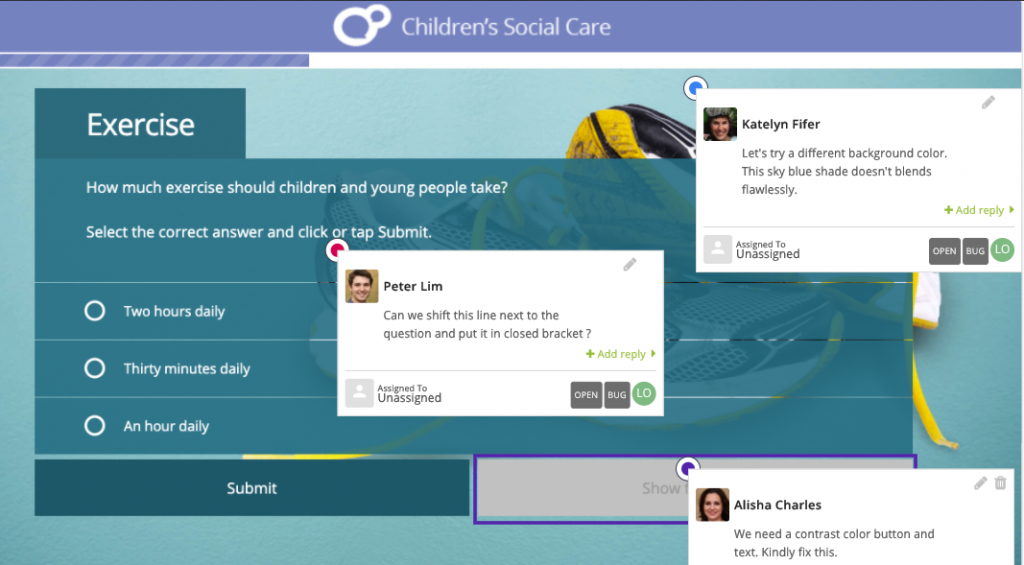
Visual details/confusions (graph, charts and their resolutions are clearly seen – High Res Graphics):
Let’s consider the example of a project management related course. One lesson is about how to prepare project timelines. Know this would have numbers and text mentioned in the graphics but the graphic is not high resolution due to which the learner is unable to figure out what is being taught. All the learner sees is some blurry images with lines and some unidentifiable symbols (which actually are numbers and symbols). This check is also applicable in scenarios where how to use a tool is being taught and the video or images is not clear. It would be so hard for a learner to realize what button to click and what information to look for, where to look for it, how it looks, etc. Therefore also use visuals that show every detail that you intend to show to the eLearners. Visual can be images, charts, graphics, videos and GIFs also.
Appropriate Graphics as per audience (as per approved in the storyboard):
This might not be applicable in every instance. But this check is mainly with regards to any sensitive visual that can have a negative impact on learners. This check can be based on the age group of learners, gender of learners or ethnicity of learners. For example an online course created for kids in the age group of 5-10 yrs having images that are classified as adult only. Or a course created for women empowerment containing visuals that are degrading women in certain ways and can harm the sentiments of females. Also avoid using any other branded images without having proper license to use those, as such visuals are subject to copyright and can attract legal issues.
Visual fade in and fade out as per storyboard:
As the name suggests this is usually a bug that can be found during transitions of images, animations or videos. For example a visual is fading away but the voice over is playing without pause and before the next visual fades in the audio and visual has gone out of sync. Check fade in and fade out timings, sync with content or audio. Another example is let’s say a video starts with a fade in effect but due to bad timing of fade in almost the first 30 seconds of the video where a graph was presented got missed by the learner.
Tabs / UI elements:
Tabs and UI elements assists users to navigate through the online course. While checking these elements see if all tabs are properly labelled, if icons are added then those are correct ones, when you hover on this element the cursors change to a click icon, etc. Any additional feature like hover over to change color etc it was agreed at the time of planning is present and functions accordingly.
Incorrect display / Wrong information displayed for a specific scenario:
Scenarios where the visual might be different than what the content is being discussed or vice versa. For eg, the topic being discussed is about data, statistics and the visual to accompany this information should be a chart or graph but instead some other images is placed.
Accessibility:
eLearning courses should be accessible by people of all abilities and disabilities. Accessibility testing makes training and compliance programs more effective.
Language transition:
Proper transition of language provides great cohesion and shows the relation between two concepts. Check if the language used in the course can be easily adapted by non native speakers of that language. Language transition helps in better communication of the concept to the learner.
Overall formatting of the docs, transcripts, subtitles, any text-based assets as per brand style guide:
Consider starting a course with slides completely filled with text with no formatting whatsoever. It would look bizarre right and you would have no clue what relates to what, moreover it is visually exhausting to see a screen filled with text all over the place. Therefore make sure that the formatting of the documents, slides, PDFs and any other asset of the content is proper.
White space between elements is as per the style guide:
Having too much white space can give less information and having very less white space would make it difficult for the learner to focus. Therefore keep this optimal and discuss this with your client in advance. Basis of that makes sure every piece of the online course has blank space as is approved.
Mobile view is responsive:
It is mostly advisable that eLearning only courses are taken by learners on desktop or laptops to effectively learn from the course. However there can be numerous instances where the learner would want to access the course from their smartphone.
For example while traveling a learner might want to go through a few modules to make good use of time. It has therefore become essential that your eLearning course is responsive to the screen size from which the users are accessing the course.
Missing icons:
This is another common error, chances are that either an icon was not placed at all. Maybe it was decided to be added at a later stage or chance are that the icons were separately designed. And later the team forgot to add it. Icons can be missing in the content, online course player, or navigation menu elements/buttons etc.
Incorrect / irrelevant icons:
Incorrect icons are kind of similar to the previous point except an icon was placed but it is irrelevant. There is a possibility that while creating a module the required icon was not available but in order to reserve the spot a different icon was used. And was decided to be changed when the actual icon was available.
Text and Icon alignment:
Alignment in general makes a huge impact in the overall look and feel of any digital content. Text and icon should be aligned so that it looks centered and in sync with each other. If its not aligned well then chances are, learners would assume A icon is displayed for B point instead of A, this can lead to huge confusions.
Line breaks in slides:
Line breaks are important to let learners know where a particular piece of content ends. And from where a new topic is going to start. Without a line break the user may assume that the topic is continued in the next lesson and maybe the next chapter is talking about something totally different then the previous lesson. This would leave the user confused and they would waste time trying to relate the two topics.
Smooth Animation transition:
Everyone likes to learn from an online course which has a smooth flow of information. If you start bombarding information directly without a smooth animation transition, your course would look too packed with information and the learner might find it difficult to grasp the information.
Blank screen:
Make sure there are no blank screens during slide changes, animation transitions, questions/answer submission. For example a learner submits answers for a quiz and then the screen goes blank, what is the user supposed to do there is literally nothing on screen. This can be very annoying.
Delay is showing elements:
This is somewhat similar to the previous point. However instead of nothing being shown on the screen. It takes a long time to show the next slide for example, meanwhile it’s possible the learners feel nothing is happening and can go back or try to refresh or do some action which can break the flow of learning. And the learner might have to restart the module or even the quiz for that matter.
Missing buttons:
This is one of the worst misses an online course can have. As the name suggests buttons are missing from the course. It could be player buttons, navigation buttons or other type of interaction buttons. For example text on screen say click this button to reveal the image and there is no button there. How frustrating that would be for a user.
Interactive button missing:
We have already covered this in the previous point. But this is added as a separate point as the chance of missing an interactive button is higher than other buttons. Why do you ask ? because interaction buttons would be topic and content specific and would be placed differently in different places.
Button Labels (static or hover as decided during planning/ storyboarding):
Think about this for a minute you start a course and there are 5 buttons but none of them are labelled which one would you click ? Confused right, that is why it’s important to have a label on buttons so that the user knows which button they should use when.
Able to enlarge images and vice versa:
It is possible that a thumbnail image might have been used in the slides but the user may want to enlarge and see the details to get a good understanding of the visual. Ideally clicking on an image should enlarge the image, but you might have planned the interaction in a different way. Either way the point is that the users should be able to enlarge the image. Also the enlarged image should be the high resolution version not the thumbnail version.
Order of items in a graphical image:
With this we are trying to mention that the visuals that are designed should have logical order of items. For example the text on the slide says xyz points are shown in the graphic/image in ascending order. However in the graphic/images it’s in descending order. That would completely make the information opposite of what is intended to be taught.
Text/graphic cut off:
Check for any text or graphics being cut off from the screen. This can happen in slides, docs, downloadable, transcripts, subtitles and in other visuals. It can happen when the course content is not screen size responsive and some portion gets cut off in different screen sizes. To fix this you will have to do the cross browser testing which we are going to discuss in further points.
Audio, Voiceover, and Music
Audio quality is more crucial than the visual quality of any online course. Audio actually explains the complete concept. There can be a single sentence or one visual on the screen but the audio would completely explain all about that topic.
Quality of the audio:
This to check here is that the sound is not muffled, or the playback is very fast or very slow. Sometimes the audio can even be very high pitched or low pitched. In either cases it would not allow the learner for a good learning experience. Moreover every learner might have different kinds of earphones or speakers so it’s necessary to have audio quality optimized for all kinds of devices.
Pronunciation:
We talked about bad audio quality in previous points. But we should not forget about the accent of the language. For example an American accent might not be easily understood by a non-native speaker. So it’s best to keep the language as neutral as possible so that learners from any ethnicity can understand what is being explained.
No background music:
In general putting background music when an important concept is being explained and there is already a voiceover in play. At the same time if it is completely silent throughout the course it can get boring. So make sure to check background music is already used in place where necessary and the volume is soothing and helps the learner focus. Try not to add a dance music tune as a background sound, the user might end up thinking which song the music is from instead of focusing on the content in front of them.
You can take the help of GarageBand music software for adding suitable background music.
Loud background music:
We kind of covered this previous point. But mainly as mentioned background music is only there to keep the user engaged and not feel blank. However if the background music would be loud then it would interfere and not let the user focus on learning.
Voice over sync:
There should be proper sync in what appears on the screen and what is being talked in the voice over. Review the course as a whole with eyes open and focused on the screen to make sure the sync is correct.
Missing part of Voice Over:
There can be scenarios where either the voice over was missed to be added in a certain part of the video or slide. Or it was muted, or the voice was kept down during editing. Check if there is any missing piece of audio voice over.
Overlapping Voice Over:
This can happen when the slides were created with an audio recording and later another voice-over was also added at the time of the video editing process. See if you find any such part in the content where there is an overlapping voiceover. Mark the timing of such parts in your QA report.
Subtitle sync with audio:
The issue that we are discussing here is, subtitles appear before or after the scene is completed, dialogue has been spoken. Ideally the subtitles should appear as the topic is being explained.
Playback Speed adjustment:
Allowing this feature in a course is advisable as it allows the user to take the course at their own pace. Check if users can adjust the speed in case if it is not adjustable by the learner then check if the playback speed is set to normal so that anyone can easily understand and gain knowledge from the course.
Course Navigation
Slide navigation:
There are various navigation available on a slide, decide on what all navigation options you want to provide to the user. This should ideally be discussed already in the planning phase. Basis of what all navigation where approved check if all of them are consistently used throughout the complete course.
Lesson sequence:
Check if the navigation button functions as intended to and points to the right lesson.
For the below items check what kind of navigation is approved at the time of:
Planning/storyboarding
Below checks are based on what was agreed and approved by the client. So while doing the eLearning content QA one might not have to go through each of the test mentioned in this section.
Able to go to the next lesson only by completing:
In some courses it is mandatory that the current topic is completed before moving on to take the next lesson. Check that the next button is disabled or does not function unless the current lesson is 100% completed.
Able to go to the next lesson by skipping current one:
Check whether the learner is able to access the next page by skipping the current content. If so see if they should be able to do that or not.
Able to go to the next lesson upon successful completion of a test in the current module:
Sometimes there can be quizzes and tests at the end of the course. These are at times used to evaluate and rank users and sometimes only to let the user take a quiz and see how much they have learned. Based on the purpose of the course, check if the next button is functioning as was agreed and approved during the storyboarding/planning phase.
Start the next module automatically:
Another important navigation factor is automatically starting the next module upon successful completion of the current module. See if this is agreed, and if this is consistent throughout the course.
Starts next module only upon the click “Next”:
Similar to previous point see if during planning phase it was agreed to build the course to be taken at learners pace. In which case it was also agreed that we pause the module everytime something is completed. And let the user choose to go to the next lesson immediately or maybe after a quick tea break.
Hover over additional info marks lets you access more information:
This is an additional check only if this feature was discussed and approved during planning/storyboarding. We are talking about the feature where there is a small question mark or info icon in certain places. And when you hover mouse over those buttons it shows small bites sized additional information about that content, button, etc.
Stuck at certain interactions:
For example, blank screen or no buttons, no visuals upon completing a test or same thing when clicked on the next lesson.
Create Engaging Navigation Workflow
Share feedback to improve User Experience
Interactivity - Activity functions as is being advised in the course
We already talked about the buttons and their labels in the previous section. In this segment we are going to check whether the elements interact currently when the learner takes some action in the course.
Shows items at click work correctly for every lesson:
For example you might have images, charts or graphics to show but it is hidden behind a button and the instruction in the course says click the button to reveal the image. Now though you see the button you see the mouse cursor changing from a pointer to clickable cursor icon. However when you click nothing happens.
Feedback functions or yes/no interactions functions correctly:
In order to keep the learners engaged it’s an usual practice to ask a quick simple question with a YES/NO answer. All the user has to do is click YES or NO button to keep moving forward otherwise the course is put to pause if no action is taken. In case if you plan to use this feature in your online course then make sure you check this function is working.
Submit buttons functions properly (eg. submit an answer, submit text):
Submit buttons are used on forms, tests, and quizzes. This submit button should usually do 2 things: one is to store the data in the backend (database) and on the frontend it should show if the form/quizzes was submitted and allow the learner to move forward. Sometimes there are also quizzes where not necessarily the data has to be stored. In that case the online course should show when successfully submitted and allow the learner to move forward.
Submit button logic and display of relevant information:
Consider this example – Value field asks numbers but participant adds text, in this case the submit button should not take this input and instead show an error and ask to input the right information.
Other interaction was approved in the storyboarding/planning phase:
There might be custom interactions that were approved at the time of planning or storyboarding. Check if all of those interactions have been implemented and function as intended.
Praising a certain behavior:
It is psychologically proven that when a person is praised for their action / behavior they show more interest and perform better. For this reason it is a great idea to include this interactivity in your course. For example submitting right answers gives you points and if all answers are right the learner gets bonus points.
Form completion:
Form should be created considering the mandatory and optional questions in mind. Whenever a form is submitted the data in the form should get stored in the backend and the learners should be able to move to the next lesson. Basis of what is approved, going to the next lesson can be automatic or interaction based. Check whether all of these actions are functioning properly when a form is submitted.
Form dropdown options:
We all have seen form which provides you with a drop down menu to choose one option from. Additionally there are chances that the provided options are irrelevant to the users in this case there should be another option with some space to add their custom input. Check if the dropdown functions as intended.
Able to pause course if needed:
Any online course in general can be categorized in two formats. One is a self paced course another one is a time bound course. In the self paced course learners should be able to pause the course whenever they want without losing the progress they have made so far. Contrary to this in a time bound course learners should not be able to pause the course once started. In zipBoard you on screen record a short video to show if all the button in the player are working correctly.
Incorrect score displayed:
As the name suggests it’s basically wrong information displayed to the learner or stored in the back. Possible reasons could be multiple submissions of the same form and the displayed score is a sum of all the attempts. It is definitely wrong information, make sure you check that only the latest quiz attempt score is shown and is correct.
Hide/unhide player buttons functions correctly:
Based on what was planned and approved see if the course player button should be constantly shown or hidden once a seconds or minutes in the course.
Go to home or main module buttons available throughout the course:
Throughout the course it is necessary that the learner is able to navigate to the previously completed modules. This is so that in case they want to refer to any old lesson they can go back and see that lesson. For this reason return home or return to the main module button should be there on every slide of the course and take the learner to the intended module.
Able to download files :
A learner should be able to download the additional resources that are there in the course. The downloadable resources are transcripts, images, templates or any other downloadable’s.
Locked menu:
If in case the course content is not skippable and has to be completed in a given order, the menu should be shown but locked for click to go to that lesson.
Disable certain fields based on completion of an activity.
Quiz and Assessment
The below points are the possible options that can be planned and finalized for the quizzes at the time of planning and storyboarding. This is self explanatory and while testing this checks see if the feature functions as intended.
Submit right answer gives you Green signal and additional information about the questions/answers.
Submit wrong answers does not let you go to the next module.
Submit wrong answers shows the right one and tell you why what you choose is wrong and lets you move forward.
Accurate score gets collected in the backend and shown to the participant – Lets say the learner attempted multiple times and had different scores every time. In this case we can either show them latest marks only or all marks segregated attempt wise.
Number of attempts to answer a question as per the storyboard – Basis of how many attempts you want to provide when somebody fails the quiz or test. Check if the learner is able to attempt that many times. And if they pass the test they should be able to move forward.
Hitting the back button during test/quiz – Ideally this should not be allowed however depending on the course test this as was planned and approved by the client.
Technology
Tested content on various browsers for compatibility (Internet Explorer, Firefox, Safari, Chrome.):
For example when a course is opened on a desktop in google chrome browser everything looks perfect. But when the same course is opened in a Mac’s Safari browser the visuals get cut off, or some features do not function as intended. In zipBoard you review your content through different screen resolution to check the compatibility.
Mouse clicks and keyboards function smoothly:
For allowing a learner to engage and interact with the course it is essential that the course allows access to the mouse and keyboard of the user’s computer system. Check if the mouse and keyboard inputs work fine wherever there is an action required from the user.
Course content player menu functions as desired (as per applicable):
Play, Pause, Stop, Volume rocker, playback speed, seek bar) – These are some common functions that should be provided in any online course. This menu allows the user to adjust the content playback as is comfortable to the user. For example let’s say a user has sensitive ears and wants to lower the volume, but if he/she is not able to lower the volume it would be hard for them to take the course when all they would experience is someone shouting in their ears.
Backend tracks participant’s data accurately:
Basically this data would be Personal Info, Pass, Fail, marks in % or no. and any custom additional interactions that need to be tracked. This is necessary from a tracking perspective. Check by interacting with all kinds of form submissions, quizzes and tests to see if the data gets stored properly in the backend.
Learning management system compatibility of the content:
A course has to be uploaded in some system for the learner to be able to access it. This is where LMS comes in picture. Your eLearning course should be compatible with the LMS on which the course is going to be hosted. Also once the course is uploaded run through the course once in the LMS as a student to make sure everything’s functions as intended.
Accessibility Testing
Now that you have completed all the checks for the eLearning course. This is one last thing to check before you make the course live. Compliance is basically a set of standards or set of common rules that applies to your products, in this case eLearning course. Making sure that the course is designed as per this standard makes it easy for stakeholders to design and develop the course, publish it online and provide a better experience to the learner.
There are various compliance issues that might be applicable depending upon the industry that course relates to. For example AICC which stands for the Aviation Industry Computer-Based Training Committee, which was developed keeping in mind the technical standards for computer-based courses in the airlines industry. Similarly there might be others, here however we are going to look at the one that is applicable to any kind of eLearning course in general and not industry specific.
One such compliance is WCAG which stands for Web Content Accessibility Guidelines. This was developed by the World Wide Web Consortium for making online courses more accessible to people with disabilities. Many countries, including the U.S., have passed laws requiring that any material shared digitally is accessible to all – you can check more details about eLearning compliance here
We have tried our best to put up a very comprehensive list of checks, errors/issues examples to explain why a check is important and how you can do it. But eLearning is constantly evolving and there can always be new things coming up. To keep up with the trend we will try to keep this article updated as and when we come across more such errors and issues.
Disadvantages of Conducting eLearning QA with Spreadsheets
While spreadsheets have traditionally been used for various organizational tasks, they may not be the most effective tool for conducting eLearning QA. Here are some notable disadvantages of relying on spreadsheets for this purpose:
1. Limited Collaboration: Spreadsheets are primarily designed for individual use, making it challenging for multiple team members to collaborate in real-time. This can result in communication gaps and delays in the QA process, especially when teams are geographically dispersed.
2. Version Control Issues: Maintaining version control in spreadsheets can be cumbersome. When multiple team members make edits simultaneously, it can lead to conflicting changes and data loss, making it difficult to track the history of revisions.
3. Complexity: As eLearning projects grow in complexity, so does the QA process. Spreadsheets can become overwhelming when trying to manage a multitude of courses, modules, and testing criteria. This complexity can hinder productivity and increase the likelihood of errors.
4. Lack of Automation: Spreadsheets lack built-in automation features, which means QA testers must manually enter data and perform calculations. This can be time-consuming and increases the risk of human error.
5. Inadequate Reporting: Generating comprehensive reports from spreadsheets often requires manual effort. Without robust reporting capabilities, it becomes challenging to gain insights into the QA process and identify areas that need improvement.
6. Scalability Challenges: As your eLearning program expands, managing QA in spreadsheets becomes increasingly impractical. Scaling up the process with spreadsheets may result in inefficiencies and decreased effectiveness.
zipBoard as the Solution for Effective eLearning QA
To address these disadvantages and enhance the efficiency and effectiveness of your eLearning QA process, consider using zipBoard.
zipBoard is a visual review and collaboration platform designed to streamline the QA workflow. Here’s how zipBoard can benefit your eLearning projects:
1. Real-Time Collaboration: zipBoard facilitates seamless collaboration among team members, allowing them to review and provide feedback on eLearning content in real time. This eliminates communication bottlenecks and ensures faster issue resolution.
2. Contextual Feedback with Visual Review and Collaboration Tools: zipBoard provides several annotation features to help give contextual feedback on eLearning courses during the QA process. This helps ensure clarity and saves 60% of time on eLearning QA reviews – thereby leading to faster product launches.
3. Version Control: zipBoard offers version control features, ensuring that all changes and comments are tracked, making it easy to revert to previous versions if needed.
4. Simplified Complexity: With an intuitive user interface, zipBoard simplifies the management of eLearning courses, modules, and testing criteria, making it easier to collaborate with technical and non-technical stakeholders in the QA process – all in one platform.
5. Automation: zipBoard automates repetitive tasks, such as capturing screenshots and tracking changes, reducing the manual effort required during QA.
6. Comprehensive Reporting: zipBoard provides automated reporting and analytics features, enabling you to gain valuable insights into the QA process, identify trends, and make data-driven decisions for improvement.
7. Scalability: As your eLearning program grows, zipBoard scales with you, ensuring that your QA process remains efficient and effective even with larger projects.
Ready to Improve Your Visual Review and Bug Tracking Process?
Building great courses needs collaborative efforts. But what good is a collaboration where two parties cannot communicate the actual ideas or their awesome thoughts.
Visual communication is therefore very important for every professional who is associated in the development of an online training programs.
zipBoard is not just awesome visual communication tool. But is engineered to provide you and your team a complete and satisfying experience of
1. Sharing Feedback
2. Creating Tasks
3. Prioritizing Tasks
4. Adding various file formats for review
5. Being able to video record any defect or issue
Manage multiple project with multiple collaborators from one single cloud based collaborative visual review, bug tracking and client feedback management software
Launch Your eLearning Courses Faster with zipBoard
Start your free trial or book a demo today so that we can create a tailored solution for you.
Book DemoStart Free Trial

Recent Posts
- Streamline AEC Document Management and Collaboration with zipBoard March 17, 2024
- How Kanban-Based Workflow Visualizations Make Construction Progress Tracking Easier for AEC Project Teams March 16, 2024
- The Role of Automated Testing in Bug Tracking and Software Quality Assurance March 10, 2024
- 7 Proven Strategies to Improve Architectural Project Management at Your Firm February 26, 2024
- 11 Best Architecture Design Software Used in Practices (Free and Paid) February 12, 2024
©️ Copyright 2023 zipBoard Tech. All rights reserved.